Scouring through spirits bottles and beverage branding is so much fun. It’s difficult to pinpoint what truly stands out though. There seems to be a go-to look and feel for most spirits brands. It’s the adoption of classic design styles like rough scripts, serif typography, and the use of labels and shapes to create a look that’s old. Maybe this is because the feeling of a new brand doesn’t attract the quality spirits drinker, maybe it’s because we just like the nostalgic vibe of classic design styles.
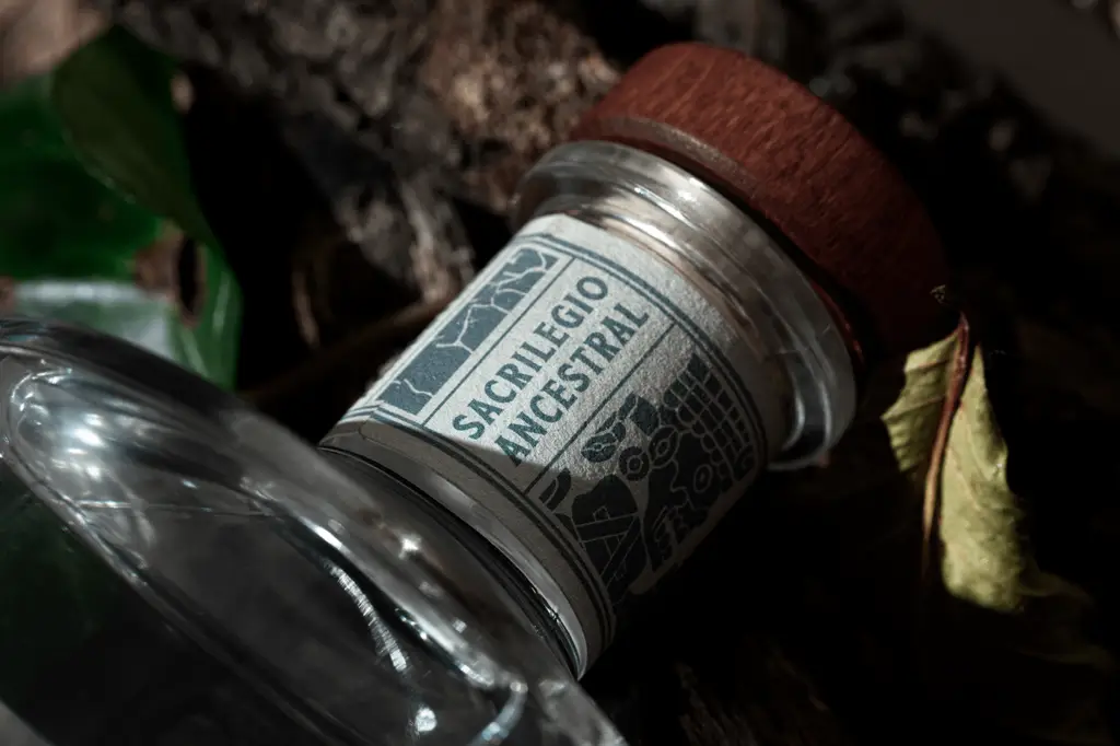
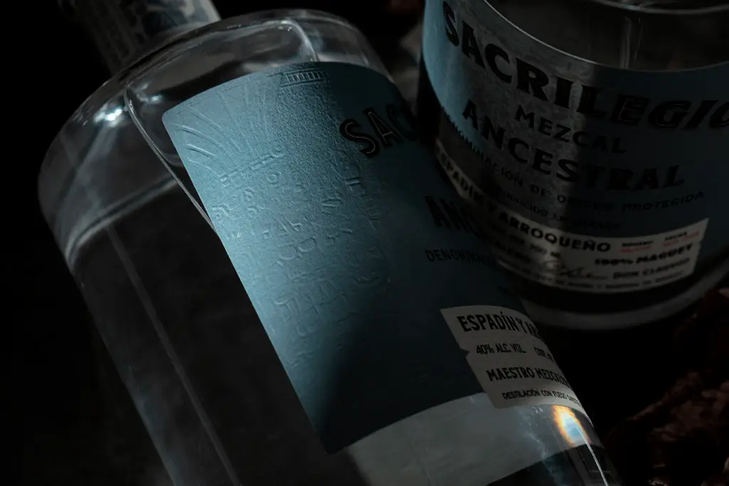
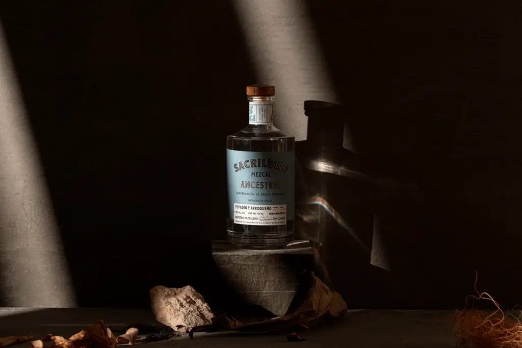
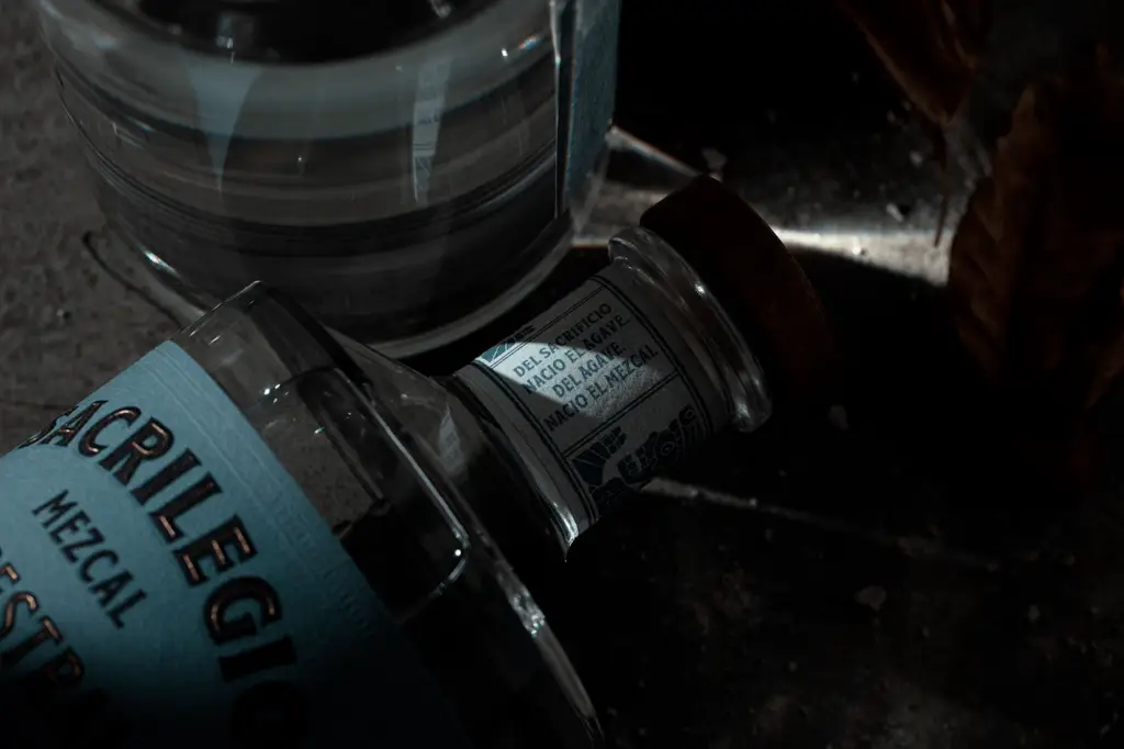
I wish I could say the work for Sacrilegio departed from this path, but it has not. What it does offer is a fantastic look at various finishing techniques and how they interact with that classic style.
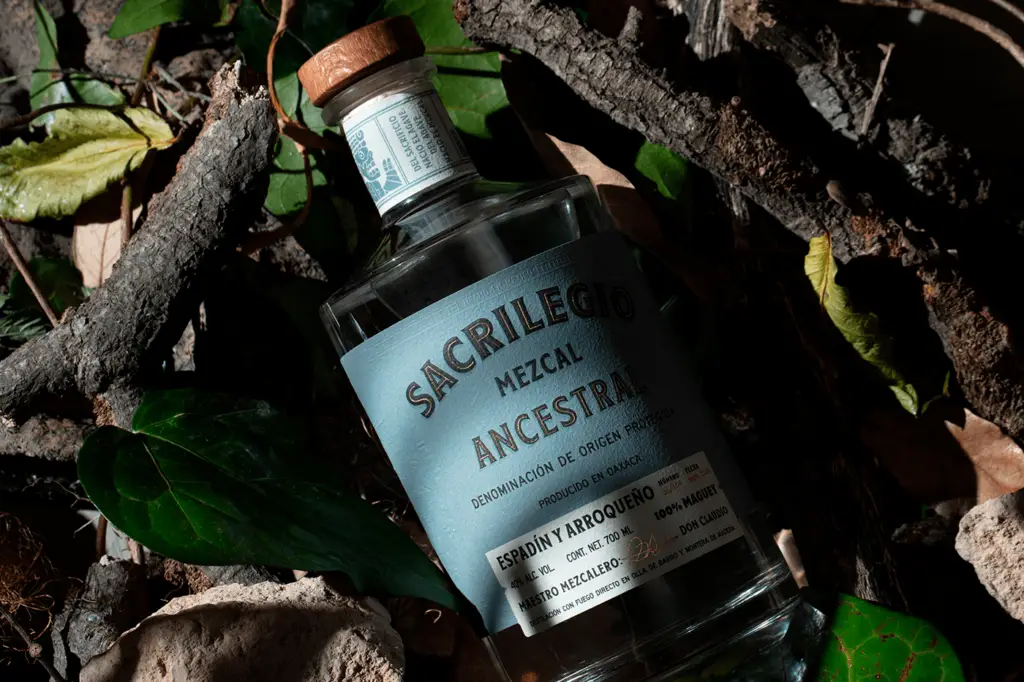
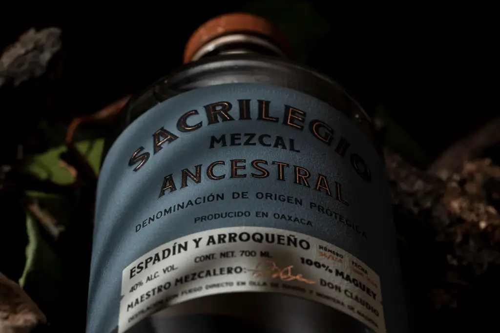
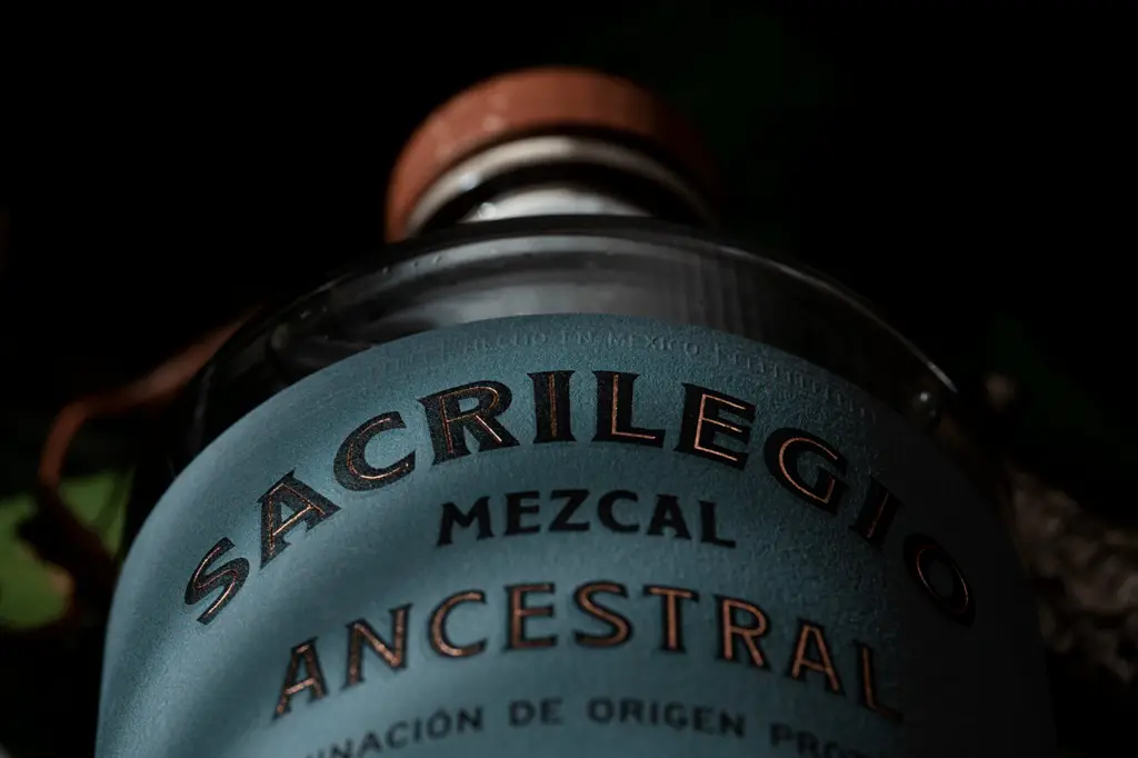
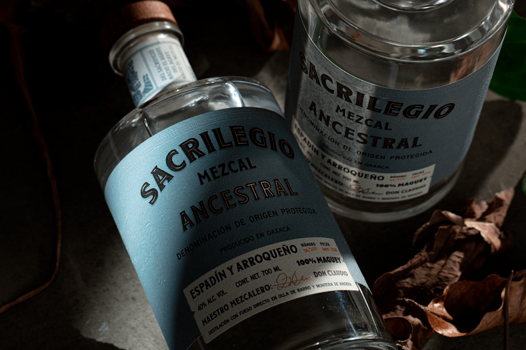
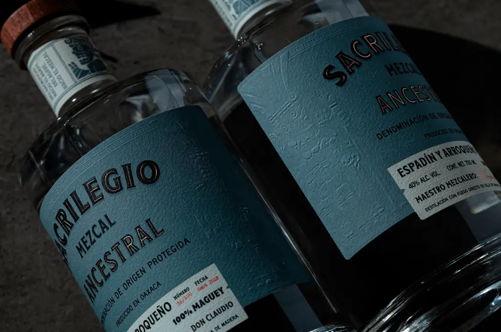
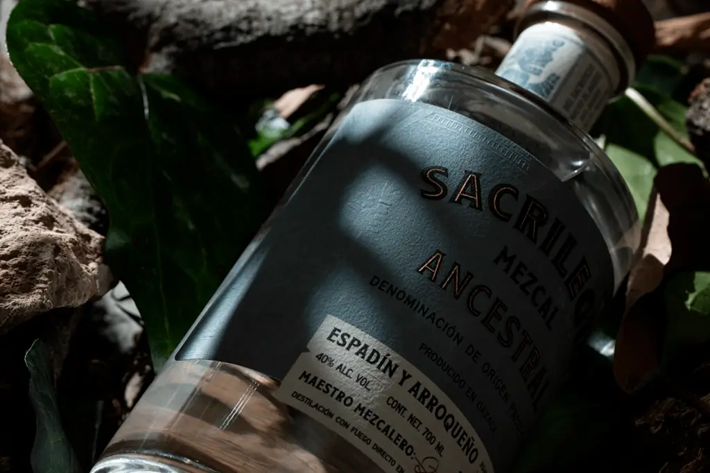
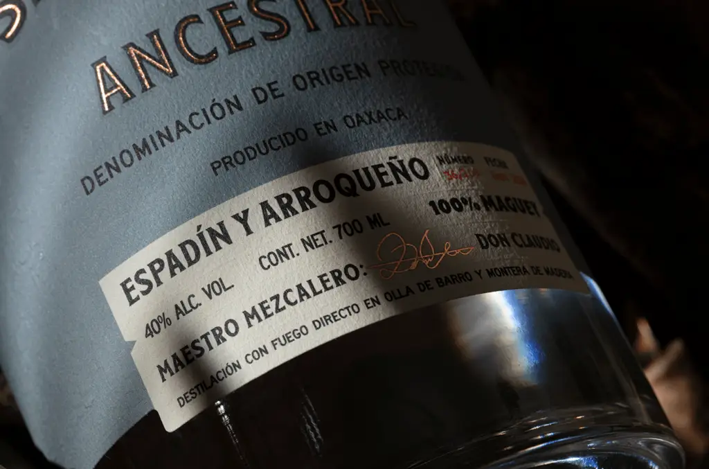
At first glance, the label design for this Mezcal may seem straight forward. Interesting? Yes, but straightforward. Howeve,r when you start to see light hit the label, the beauty of embossing comes through. This is another layer of design that elevates and otherwise one dimensional design.
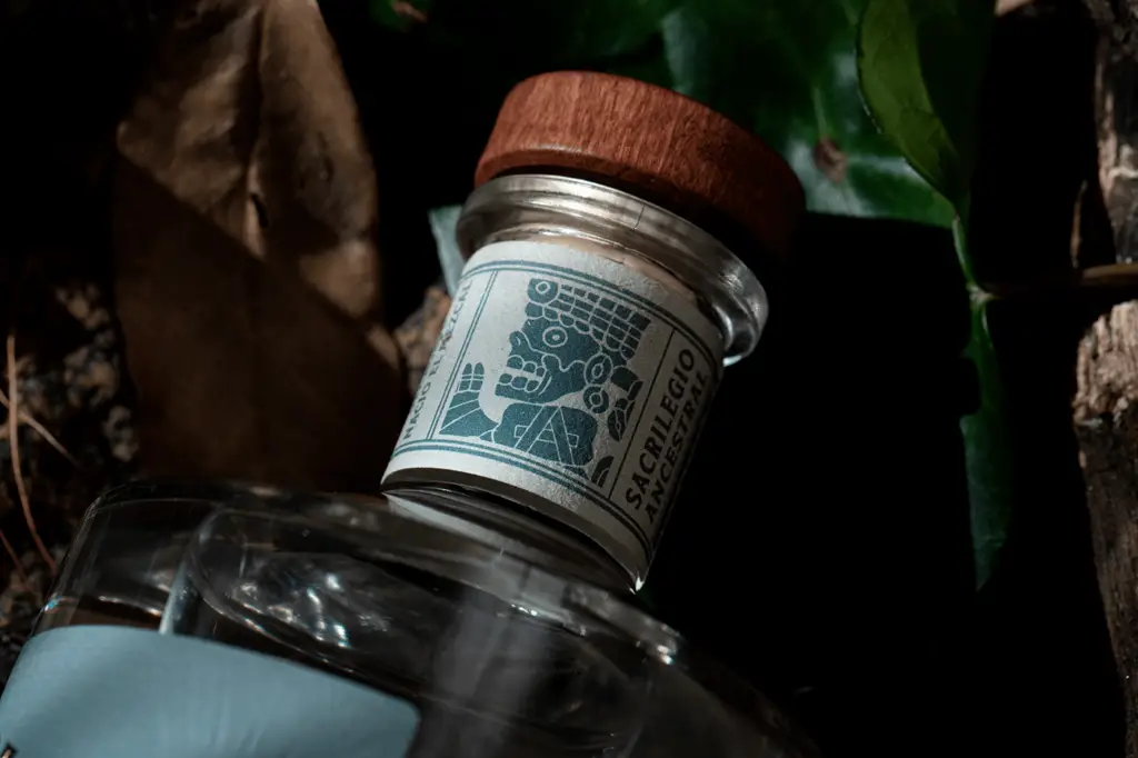
For Sacrilegio, the brand’s strong blue pulls in that agave and smoke vibe. The classic typography root the brand in craft and a sense of origin. Combined with the Mayan/Aztecan illustrations in key areas, the composition becomes quite notable.