Woner Restaurant & Pet Food Branding
Yeah, you read that right. No, it’s not a typo. And speaking of “type” the typography on this project is as juicy as the food itself, I presume. Woner is a five-star restaurant, but rather than spinning food off into retail for humans, they spun it off to cats. Yes, our feline friends can now […]
Marasol Hotel & Resort Branding

Diving into this beautiful, sun-soaked brand is so much fun. While it becomes clear that the applications across touchpoints is relatively flat with either the logo or type pattern being the design element, the sheer volume of touchpoints makes it a great project to review. Marasol’s brand is spearheaded by a sun-meets-compass mark that’s built […]
Bäckerei Wolf restaurant branding
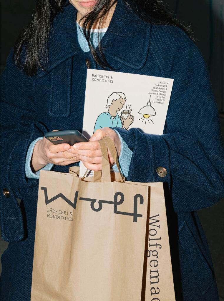
Moodley’s brand identity design for Bäckerei Wolf is an exploration of modernized meets classic design. Supported by a gorgeously strong serif type family, the brand presents as confident, clean, and craft. What initially grabbed my attention was the custom typeface created for the word “wolf.” The thicker, harsh angled line work feels Art Deco era […]
Marianitos food packaging & branding
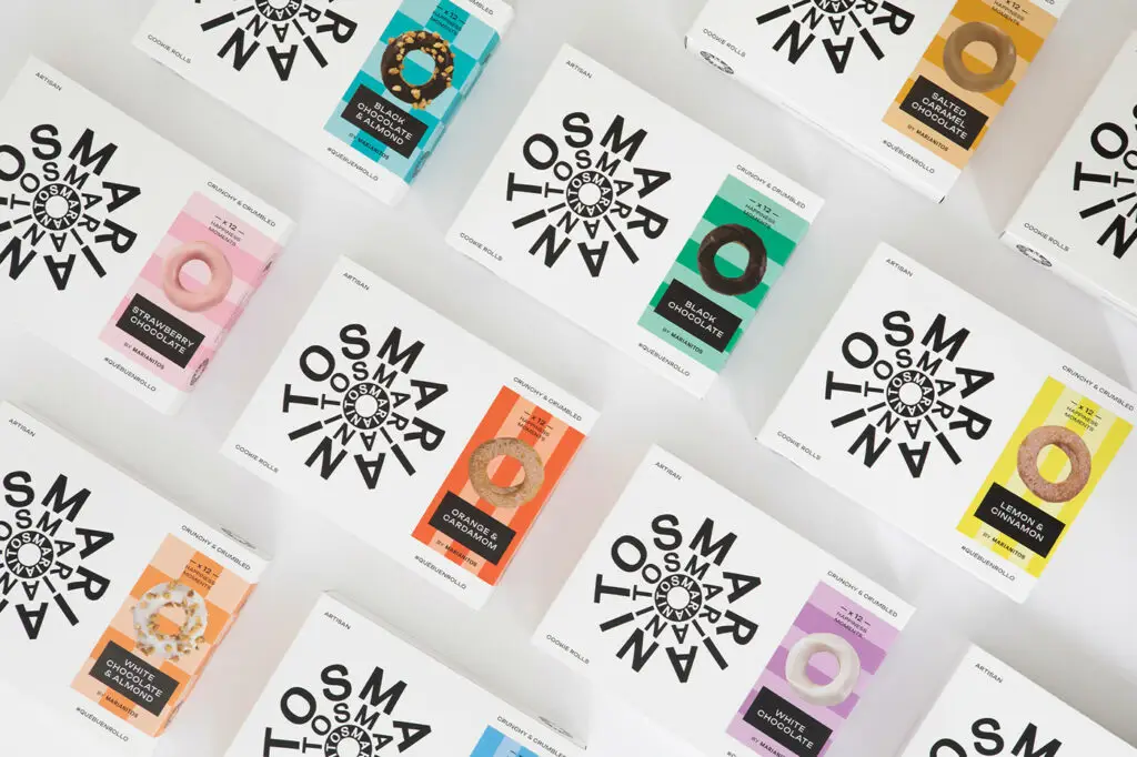
Who doesn’t love a good rebrand. Whether it’s an evolution, or revolution, when executed well, a rebrand injects so much life into a legacy brand. Such is the case for the work for Marianitos by Meteorito. This classic cookie brand is thrust into the modern era with bold, sans-serif typography and a beautiful color palette […]
Sacrilegio Mezcal packaging design
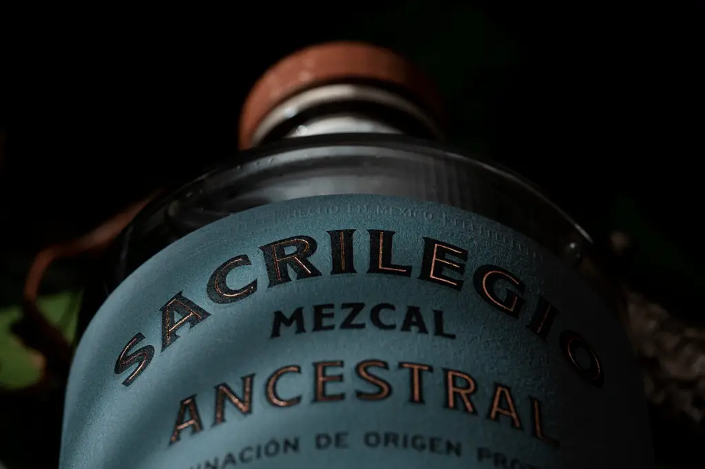
Scouring through spirits bottles and beverage branding is so much fun. It’s difficult to pinpoint what truly stands out though. There seems to be a go-to look and feel for most spirits brands. It’s the adoption of classic design styles like rough scripts, serif typography, and the use of labels and shapes to create a […]
The balance between beauty and SEO for creative agency websites
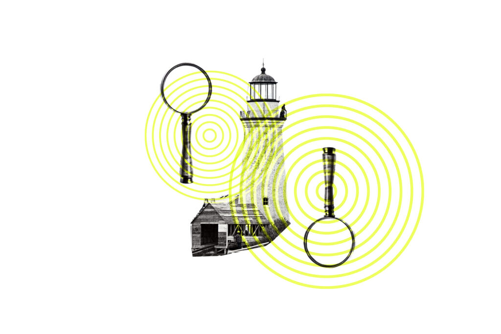
Agency websites – and studios, firms, collectives, et al for that matter – usually are exemplary of beautiful design in practice. Layout, motion and animation, and gorgeous photography dance with creative use of typography, all on a site that pulls you into to view more and more. Suffice to say, agency websites are absolutely top […]
Sucre restaurant branding
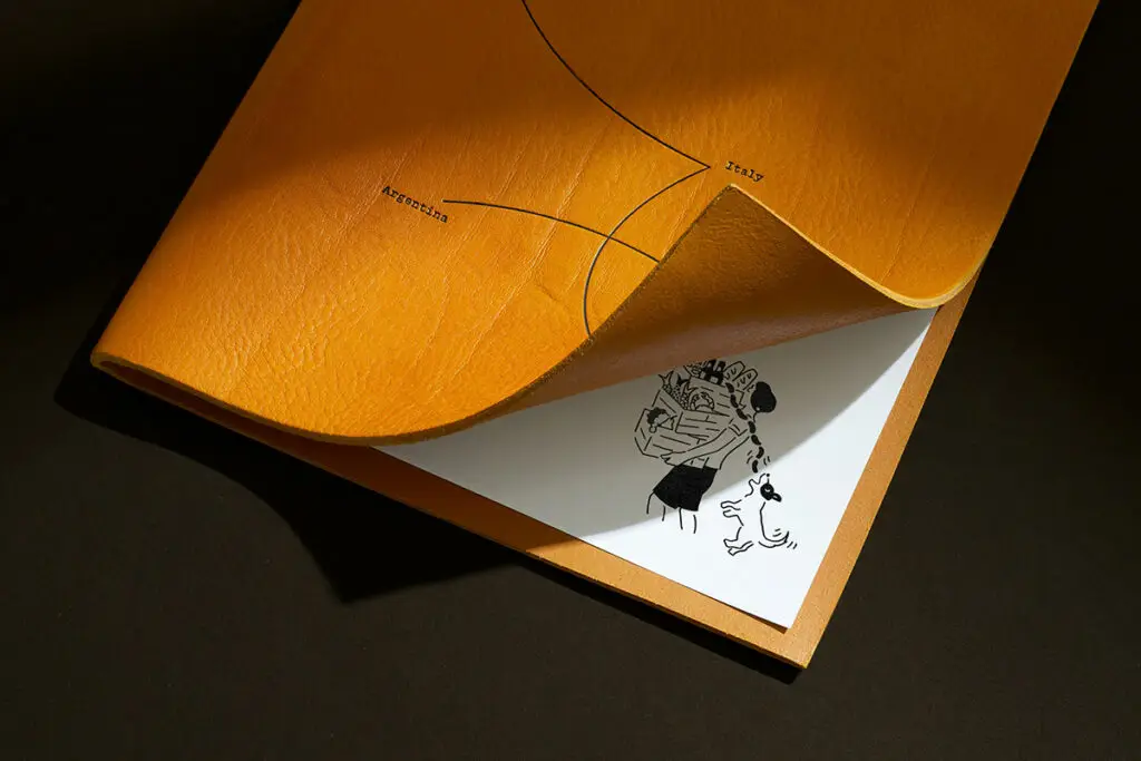
Many restaurants across the world, especially in the United States and United Kingdom, are representations of immigration. Immigrants come to new places and food tends to be the easiest path to establishing oneself in that new place. I find it to be one of the most endearing and attractive parts of the restaurant industry. But […]
Telson tequila packaging & design
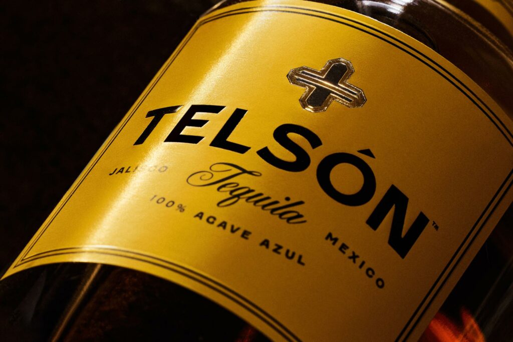
Vicarel Studios’ work for Telson Tequila grabbed my eye on LinkedIn as I was doomscrolling. It’s bright orange-yello color jumped off the feed and as I dug deeper into the full breadth of the work, it just got better and better. Sort of like a fine tequila. Pulling inspiration from Mexican architecture and history, the […]
Co&Co Sausage packaging design
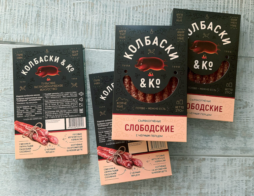
The packaging for Co & Co immediately struck me as interesting because of multiple elements. The illustrations were not the trending styles of moment, and the typography was in the not Latin script alphabet, but was still effective for a person who doesn’t read Cyrillic. The deep black background creates a moody vibe to the […]
Danke chocolate Easter packaging design
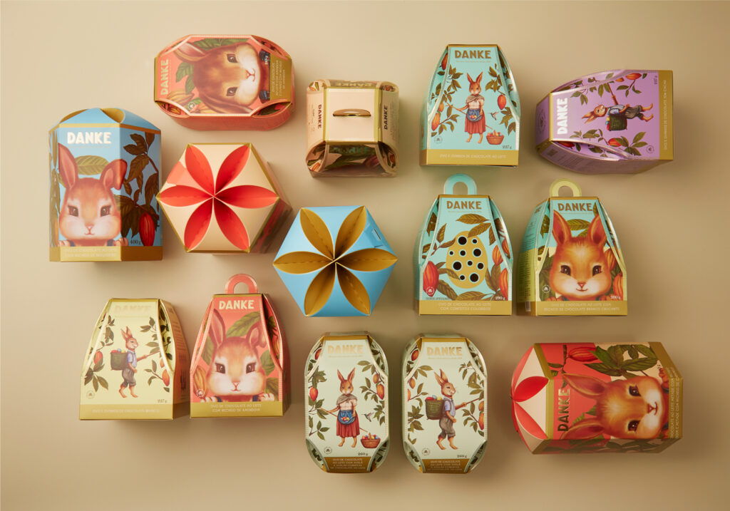
As designers we’re constantly enamored with modern and trendy design aesthetics that often we forget the wonderful beauty found in more classic design styles. Nata Design’s work for Danke Cacao, a chocolate brand in Brasil, is proof positive that classic design still has staying power. Nata Design had the opportunity to create the limited edition […]