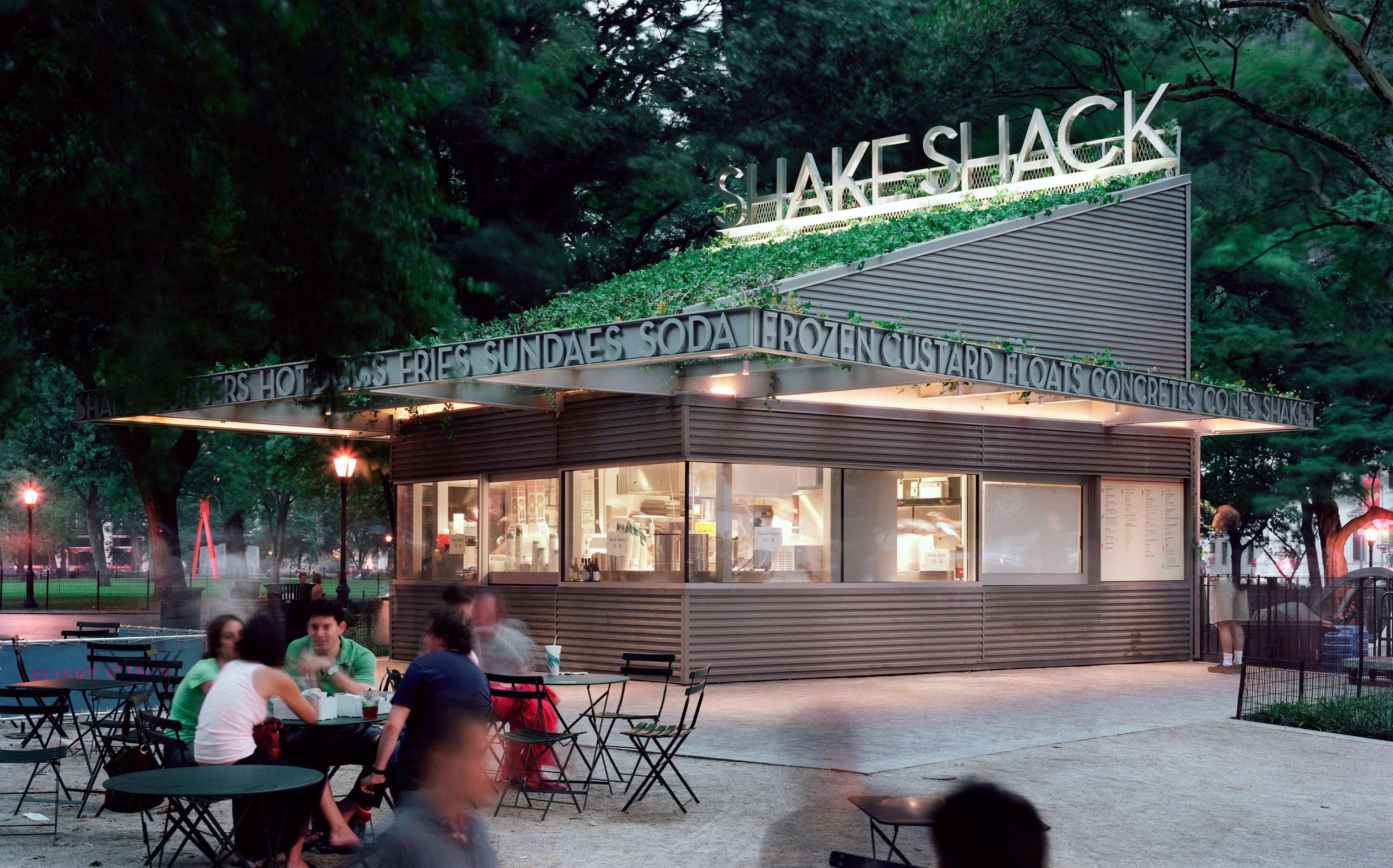
Shake Shack has rapidly risen to stardom inside and outside of the restaurant industry. Considered an enigma by many, the burger chain is a case study in strong design and dedication to simple elegance. Things often shunned by fast food restaurant concepts. But is the brand identity the sole driver of its success, or is there more?
Never is the case that success or failures are attributed to one, single factor. And that’s the case with Shake Shack. The brand started in a revitalized park. The branding work was tacked on to a larger project by the Madison Square Park Conservancy as the burger stand was to be simply an amenity.
Rather than treating it as a second thought, The Pentagram team treated it with the respect it deserved and created a brilliant basis for growth for the brand. The identity design and thinking coupled with a strong location strategy and excellence in operations have all contributed to the brand’s rapid success.
It’s easy to laud a brand that’s reached this height of ubiquity, but nothing is perfect. With an admission that this coverage is granular and a bit nit-picky, I’d like to zero in on places where the Shake Shack brand is not doing well.
The concept, driven by Danny Meyer and his Union Square Hospitality Group, takes inspiration from the classic 1950s style roadside burger stands. They very kind that spawned McDonald’s and other fast food burger greats. This inspiration is one of the core tenets of the brand’s success: Keep it simple.
From that basis, the team selected an art deco typographic solution coupled with simple iconography that translates well across cultures. The simplicity based selections create a correlation directly to the menu offering which in itself is back to basics. And there is the magic, in my opinion.
In a world where the burger experience is reaching all new culinary heights while fast food giants continue to ripple out from their American roots, Shake Shack brought things back to basics, but elevated just enough.
While the identity system is highly successful, where I think the agency went awry is in the menu designs, both handheld and environmental. This has a been a notable gripe since my first experience with Shake Shack many years ago at its first location.
The menus at Shake Shack are congruently simple with the rest of the experience. Simplicity is by far not a bad thing, but in this case the simplicity creates a lackluster experience that’s clearly not optimized for usability.
First, the pricing is highlighted taking a primary focus. This positions the brand as price-first and eliminates the potential to hook people with the food. Tapping people’s hunger and craving impulses is crucial in increasing satisfaction as well as check averages.
Second, everything on the menu has the same hierarchy creating a difficulty in where eyes should go and flow. This puts every food category and item directly on an even playing field diminishing the power and confidence in the core menu item: The burger.
On the environmental menu, the highlighted backgrounds make reading difficult. Coupled with the hierarchy issues, the experience becomes stressed with heightened anxiety.
Beyond the menu systems, the identity never really hits a high note. It smolders in the strength of the foundation instead. Instead of extending the visual language further, the brand rests its laurels on the iconography and logo coming dangerously close to a “logo slap” situation.
Shake Shack can do so much more and be so much more without ruining the foundations. I hope this brand continues to the grow and I look forward to seeing how it evolves as new markets are unlocked.


