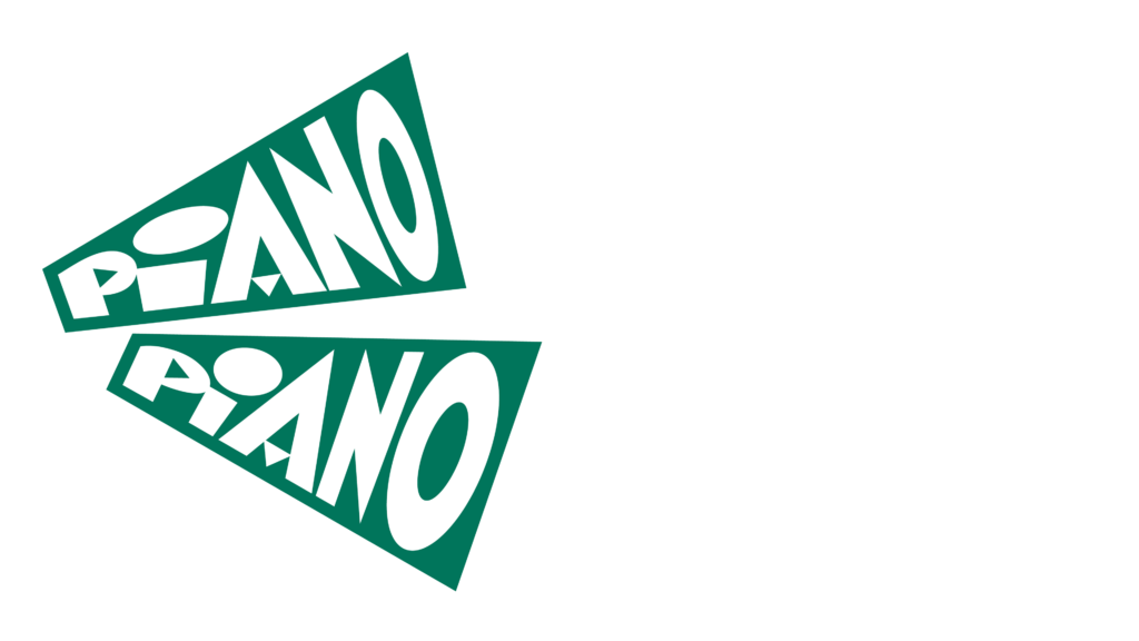
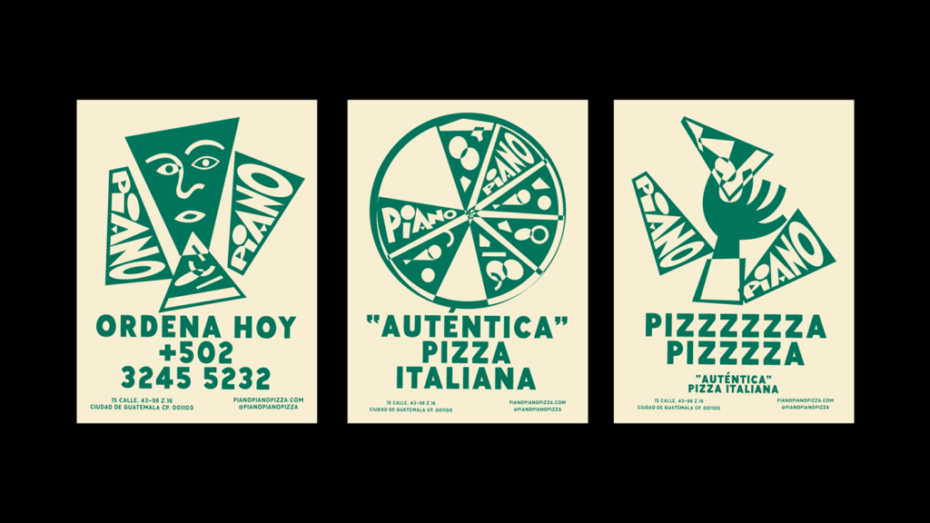
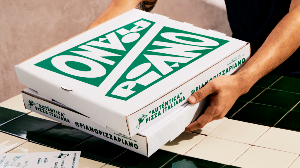
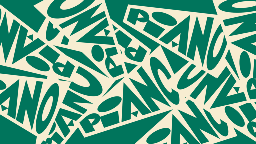
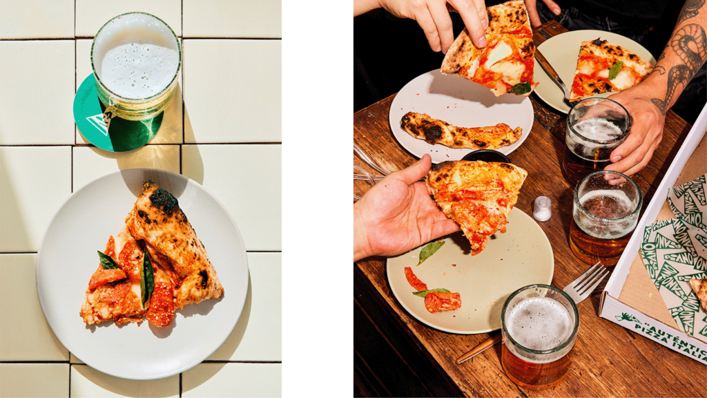
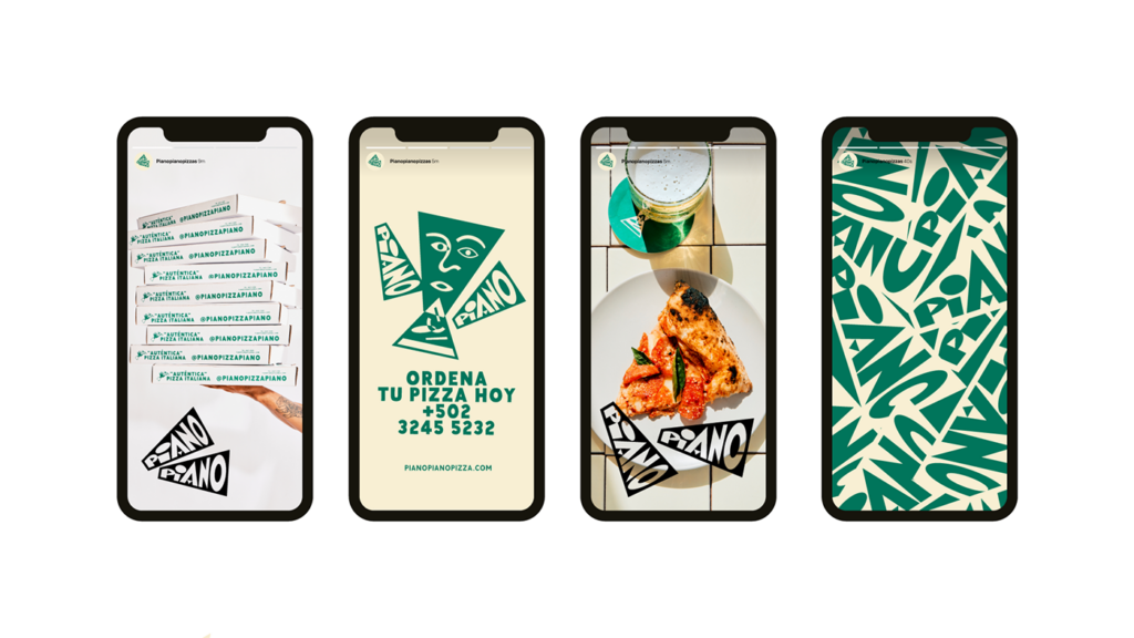
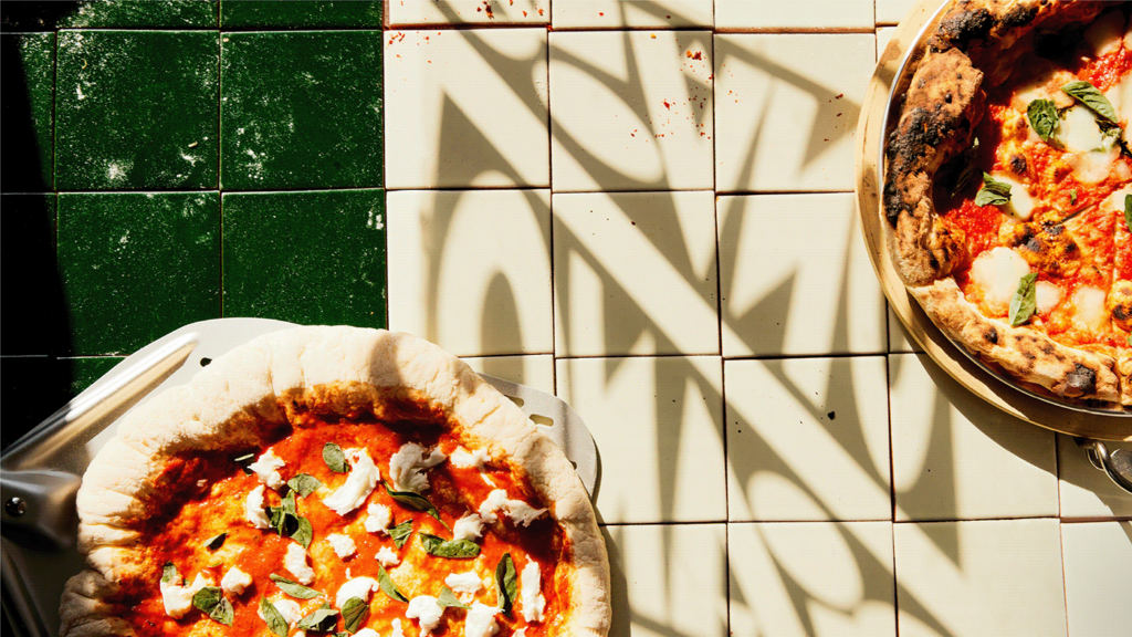
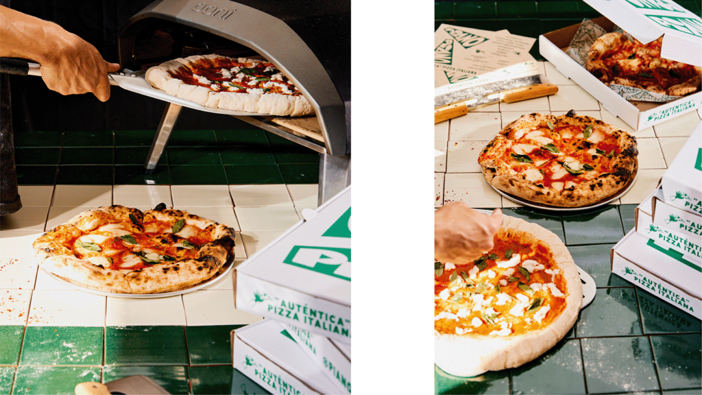
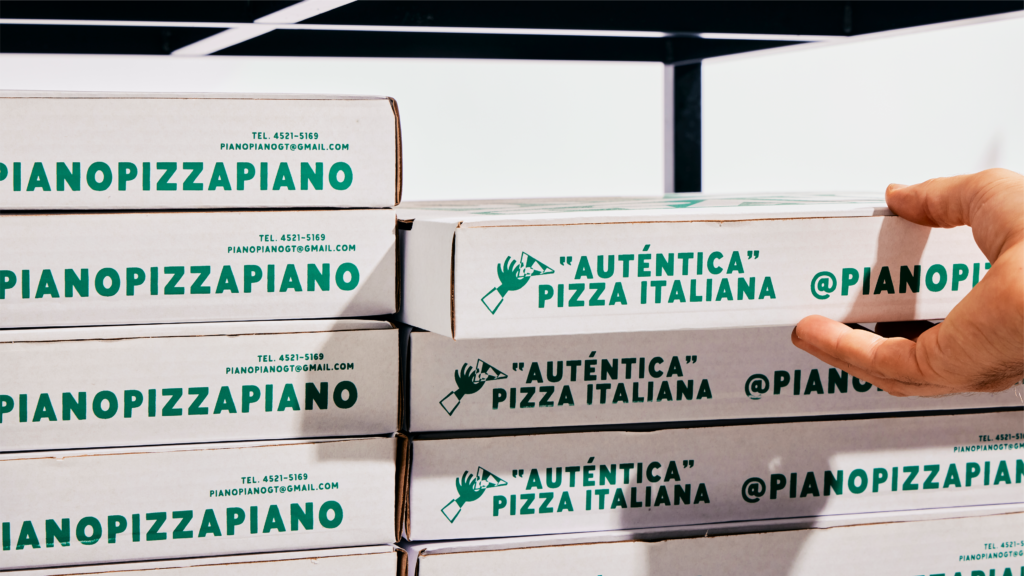
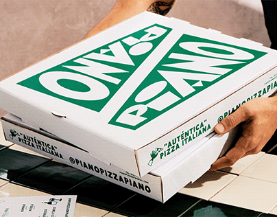
While many in America were celebrating Art Deco as a movement, in other parts of the world, they celebrated similar movements. Although some didn’t have a positive goal as a movement, the art and style remain iconic. Such is the case with the Italian Futurist Reconstructivist art movement. The brand identity for Piano Piano is the design aesthetic of this movement in full glory with this beautifully typography and off kilter geometry.
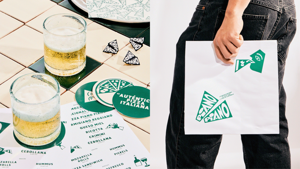
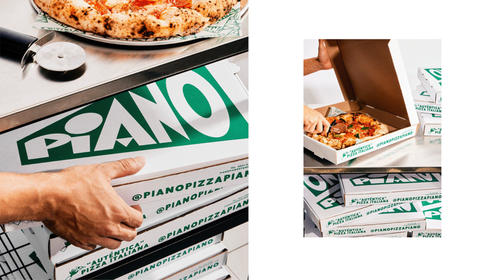
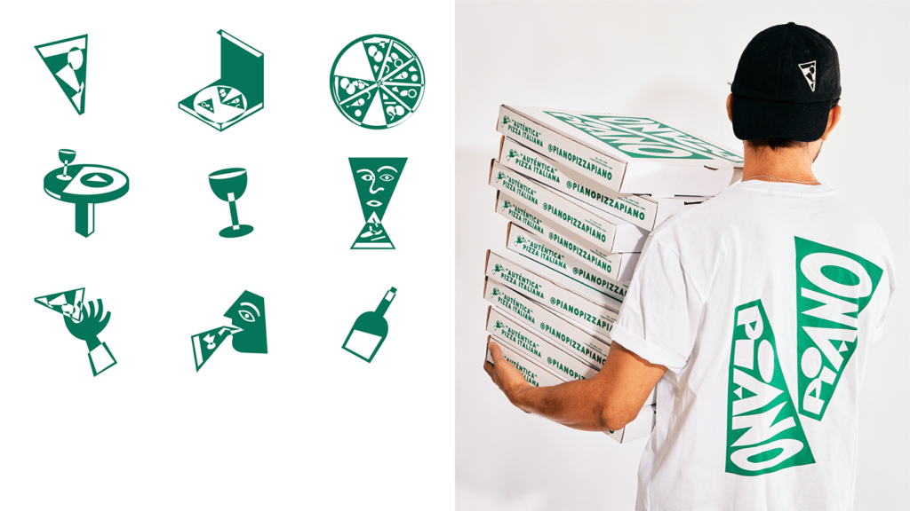
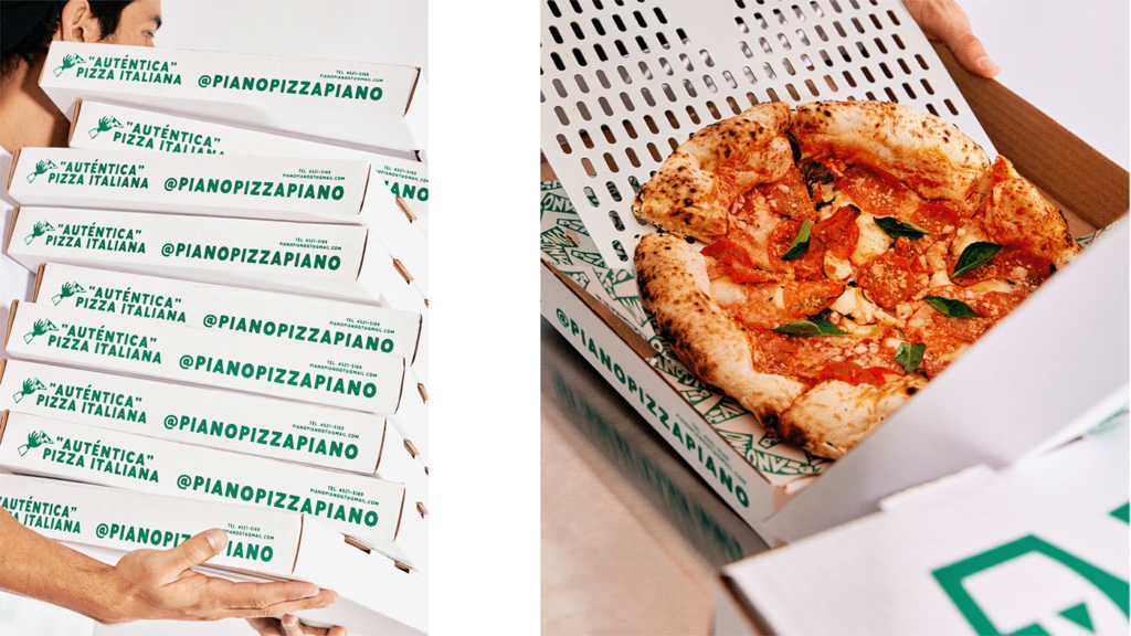
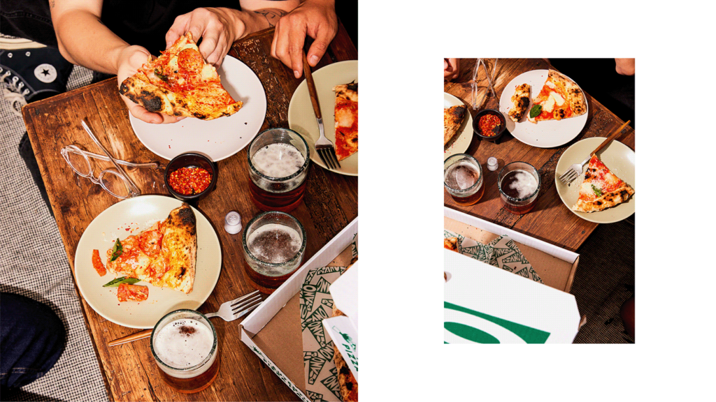
Piano Piano started as most restaurants: a family with a passion and a desire to do it with better ingredients. For the identity, it was about showcasing a style that’s inarguably Italian that subtlely references the food (slices of pizza). Designed with limited color palette allows the compositions to sing and production costs to be well-managed.
Andres Higueras leverages strong geometry for illustrations and typographic compositions that create structure without losing a sense of conviviality. Each touchpoint strengthens the brand’s aesthetic with fresh layouts and new perspectives on using this design style
Despite the art movements fascistic roots, the design is a triumph. After all, we cannot change the past, only the future. Maybe this reclamation of a tarnished design style is one step closer to shedding it’s negative roots.
