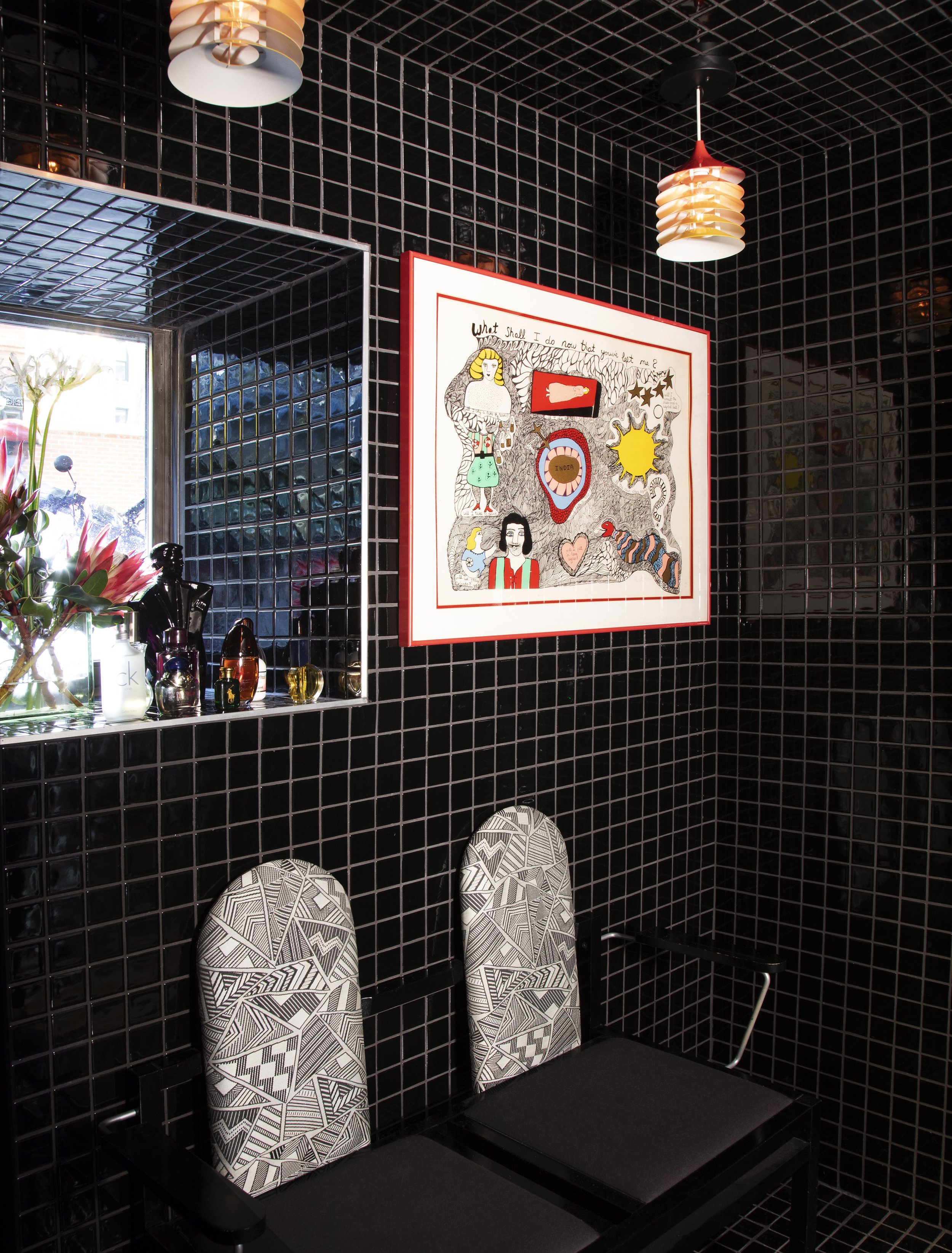
It’s sometimes difficult to get past the photography of a project, good or bad, to dig into the mechanics of the actual design. Agencies and studios have gotten so good at staging their work in fantastic compositions to tell a deeper story about the project, or unify it within their book of work. However, this sometimes impedes on design critique because the pictures may be beautiful but the work may be lacking. If found myself in this conundrum with this project and its suite of photos.
The work for Holiday Bar by Savvy Studio isn’t bad, but it’s also not the agency’s best work by any stretch. What got in the way a bit was the photography which employs a harsh flash style that feels a bit paparazzi. It’s guerilla and gritty and it definitely got in the way of analyzing the design.
When I was able to get past the photography style, it became clear that Holiday Bar has some great aspects worth sharing. It also has some not so great areas. Let’s start with the bad so we can end on a good note.
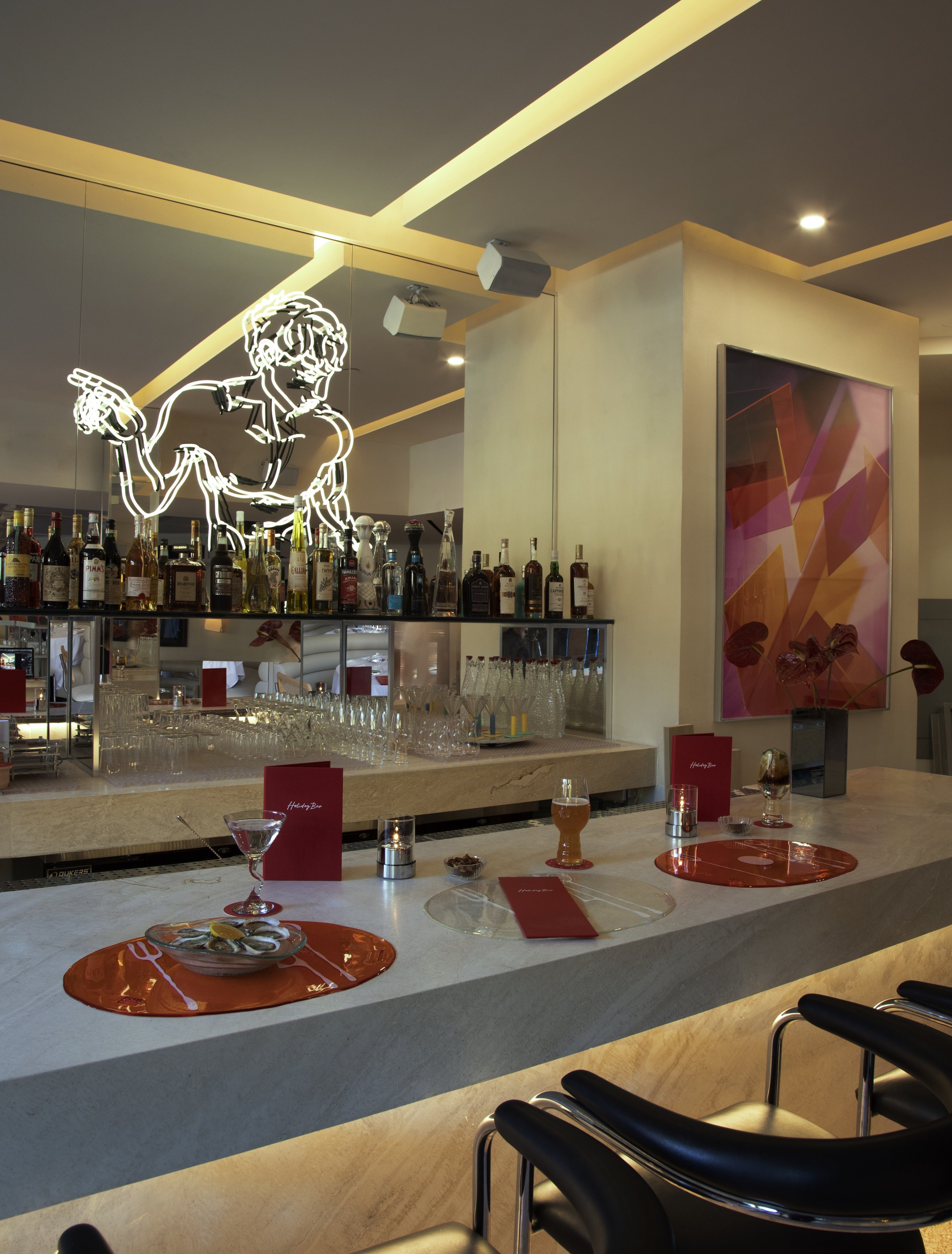
The brand is shallow when looking at the suite of touchpoints meaning it doesn’t expand past the logo script and the one illustration. Despite the great suite of photos, what one starts to realize is the photos contain essentially the same subject matter: the menu, a coaster, and the illustration. However the logo’s script and the illustration style match quite well making it a great path to explore further. One has to assume there simply wasn’t budget to do so.
Now, onto the good. The brand finds inspiration in classic 80’s cinema like Scarface where scenes of bar and clubs dominate the narrative during the storylines. Known as a decade of excessiveness and indulgence, the era had interesting hallmarks of design like the neon lighting feature at the bar.
The typography is intriguing. It’s a replica of a type specimen found by the design team. I think it’s executed quite well.
Overall, the project is okay. It’s certainly not the studio’s best work, however.


