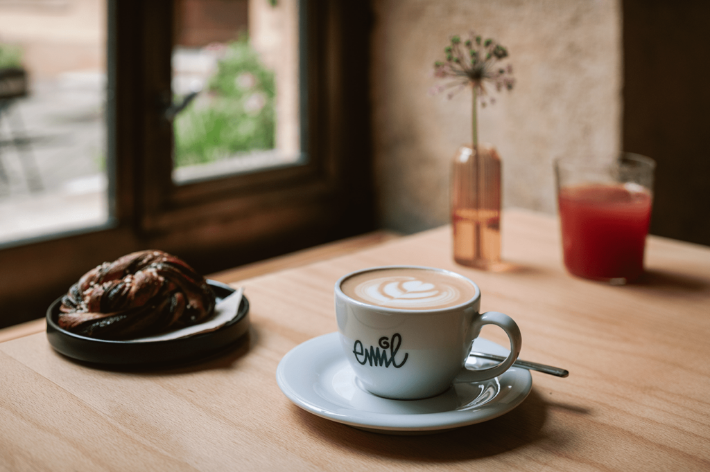
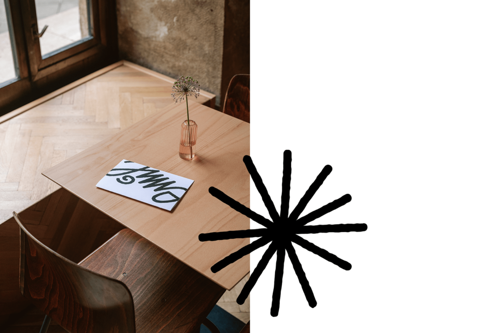
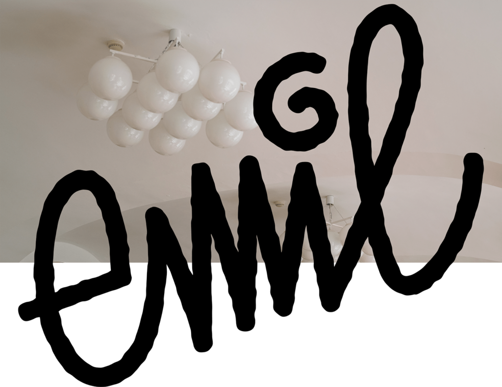
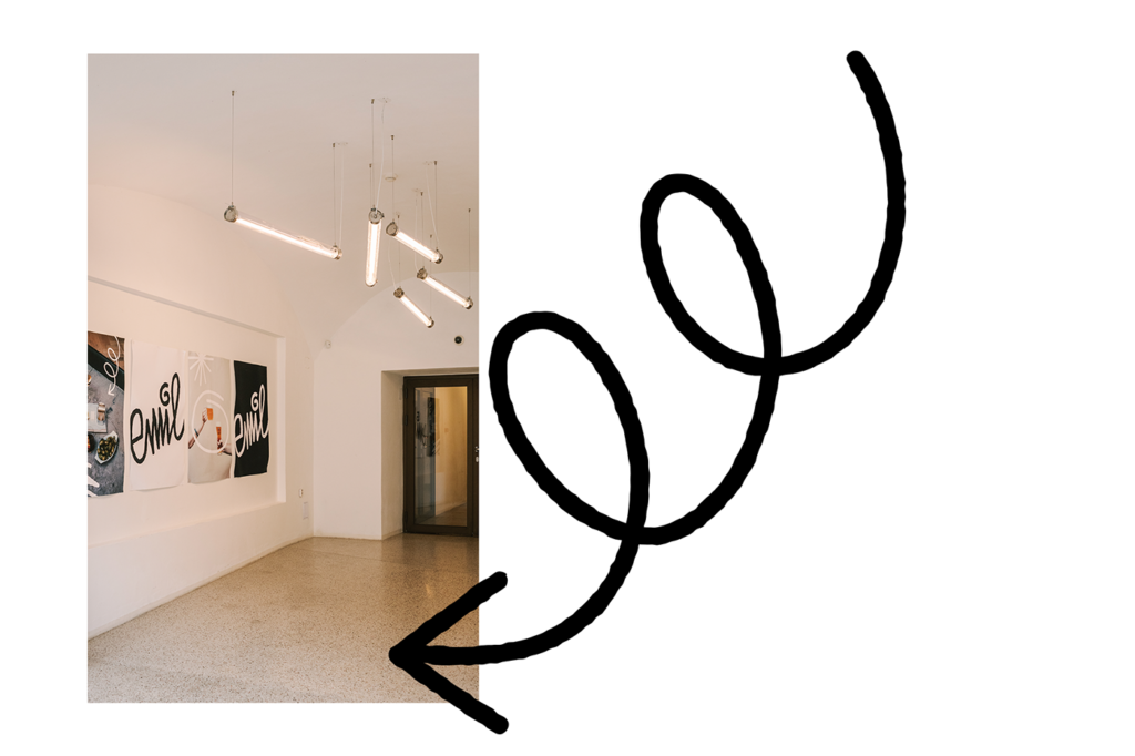
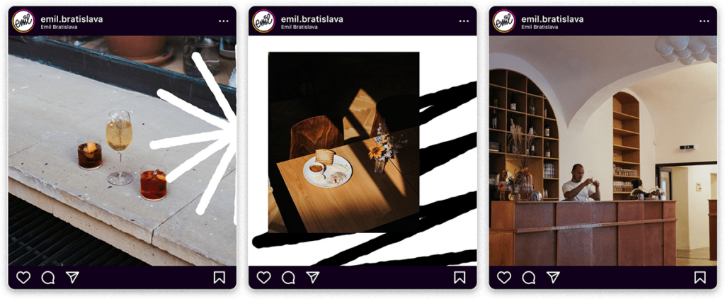
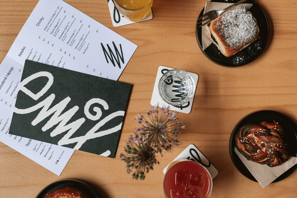
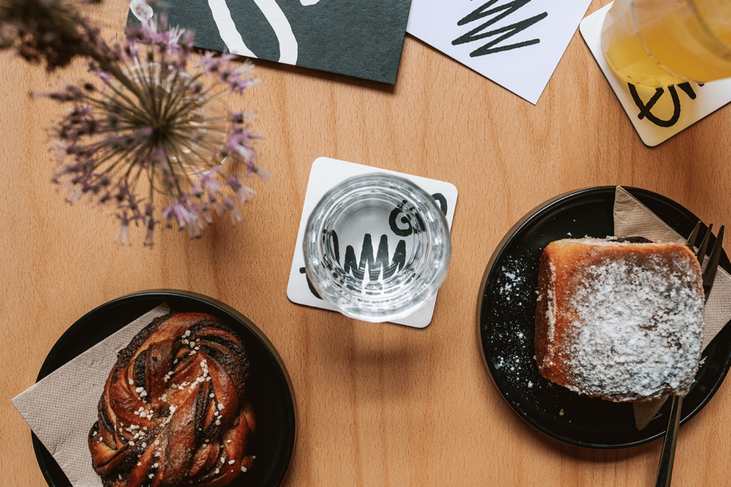
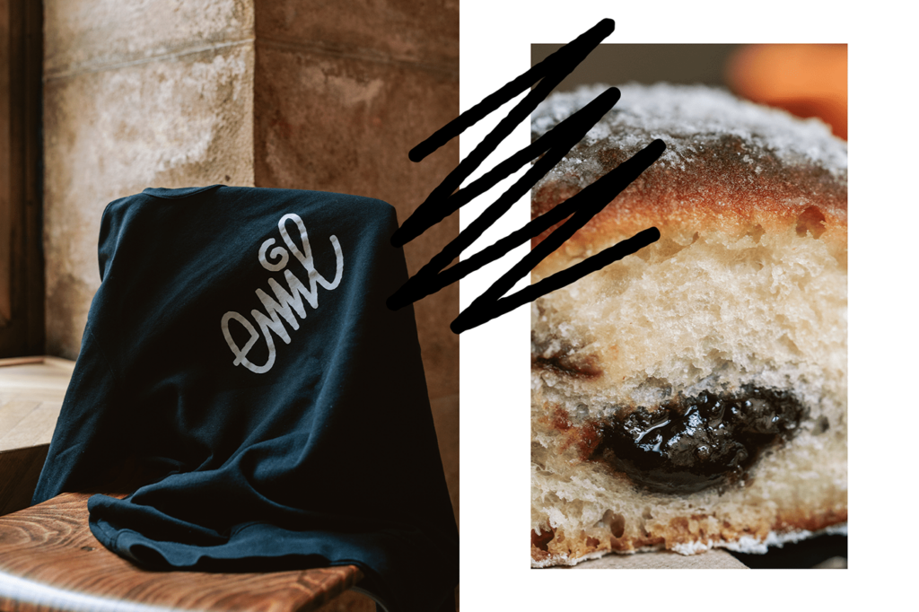
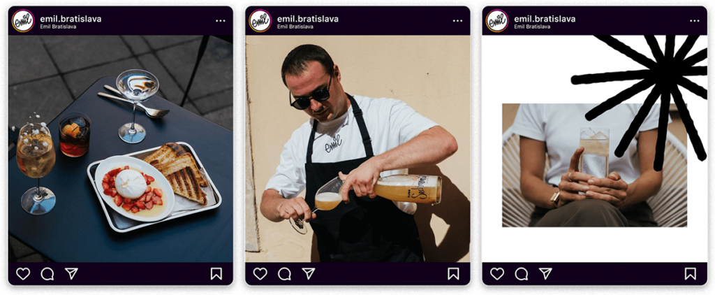
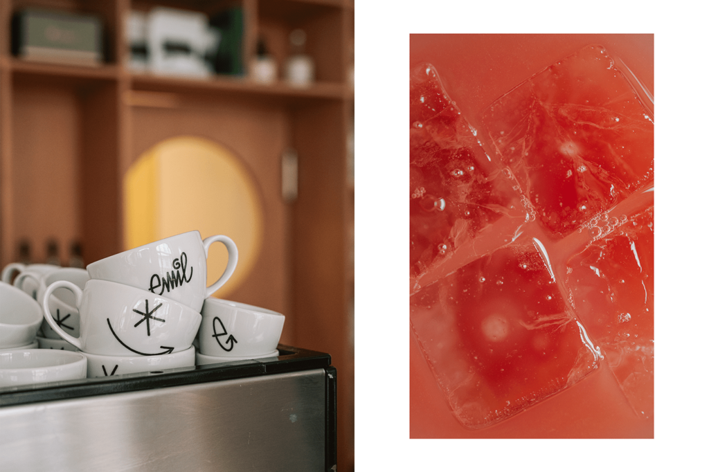
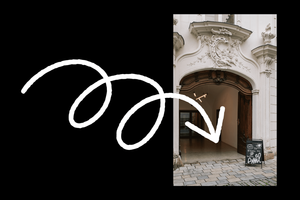
Handscrawl doodles make this café brand standout in a world of design that’s usually marked by a mix of minimalism and kitsch. Starting with the core logo which is the handy work of the cafe’s founder, the brand takes on a semi-whimsical vibe in a high contrast black and white color palette.
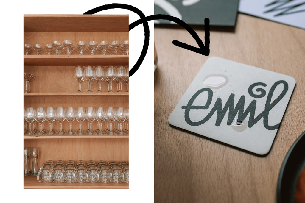
The contrast between refinement found in the color palette and the interiors with rebellious whimsy found in the scribbles and interruptive elements, creates an energy that’s fun and enjoyable. I especially love the smiling arrow with the spark/asterisk which feels like a winking face.
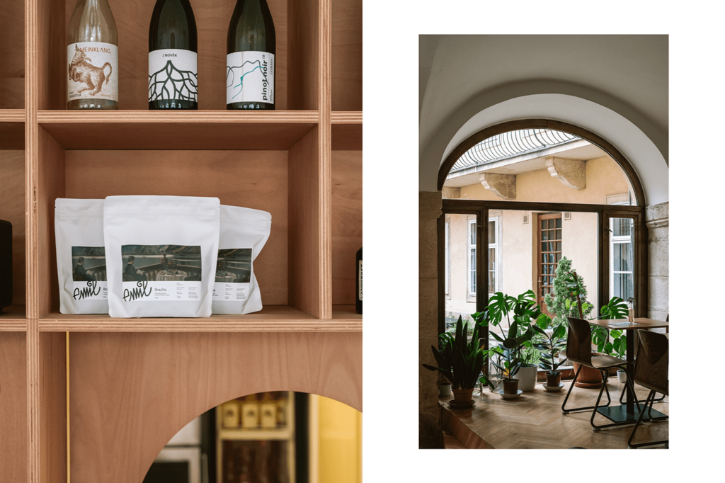
Overall, the brand is very intriguing while not trying too hard. The sketches are fun and simple, and not forced so they feel natural. Combined with the other elements the result is a quaint, memorable brand.
