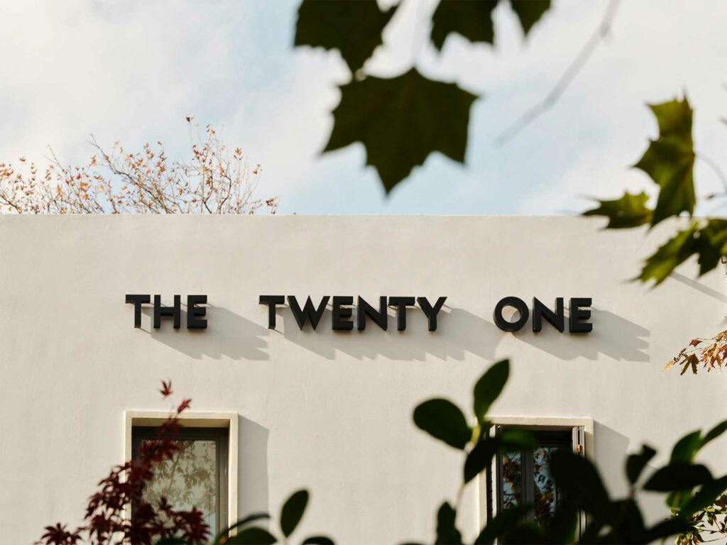
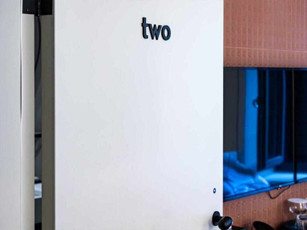
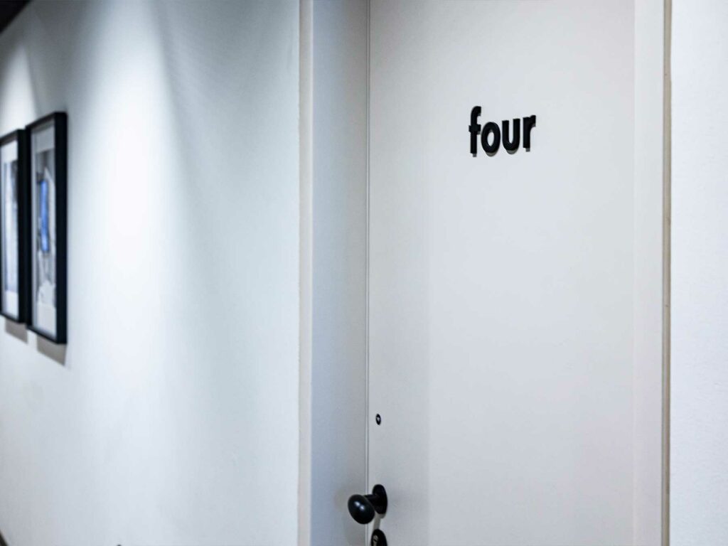
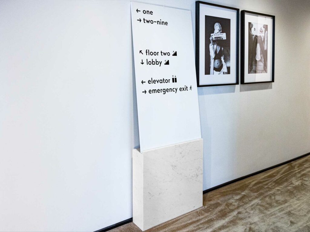
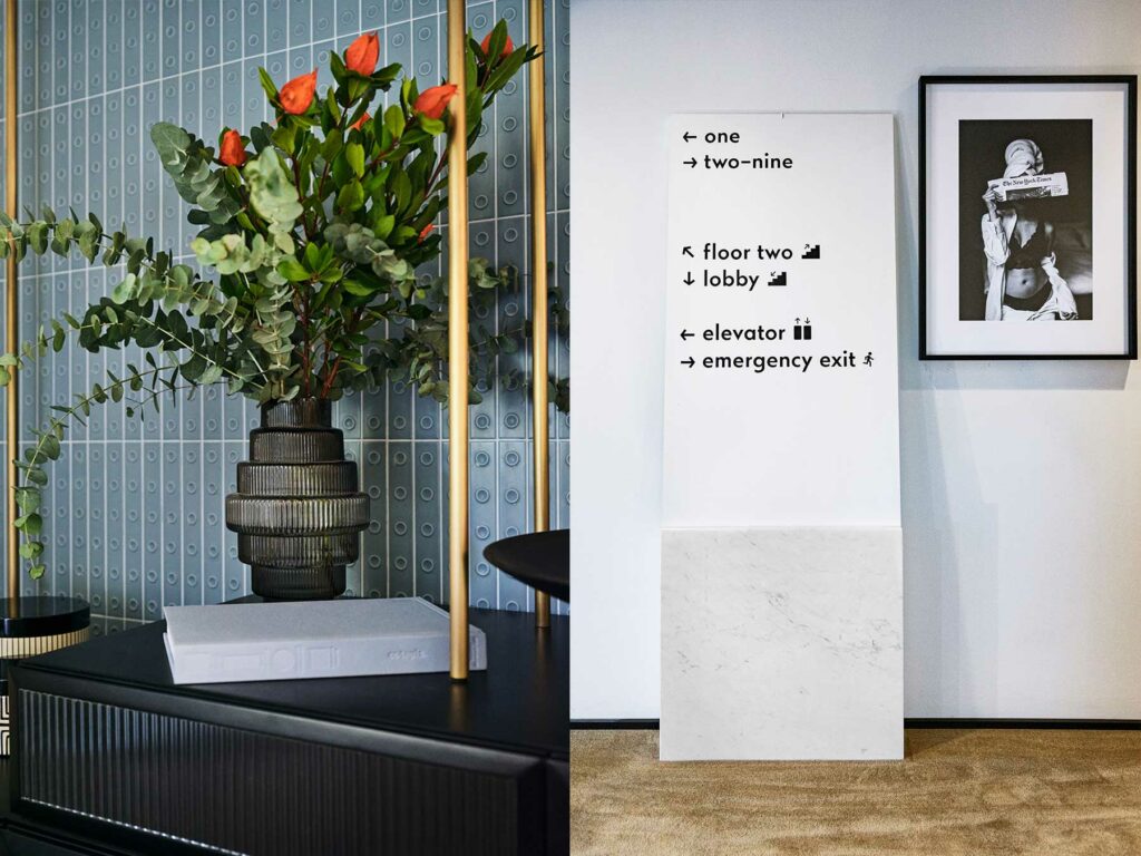
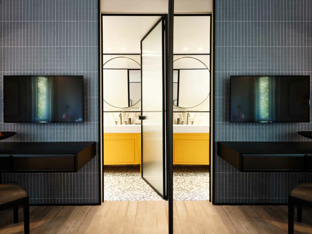
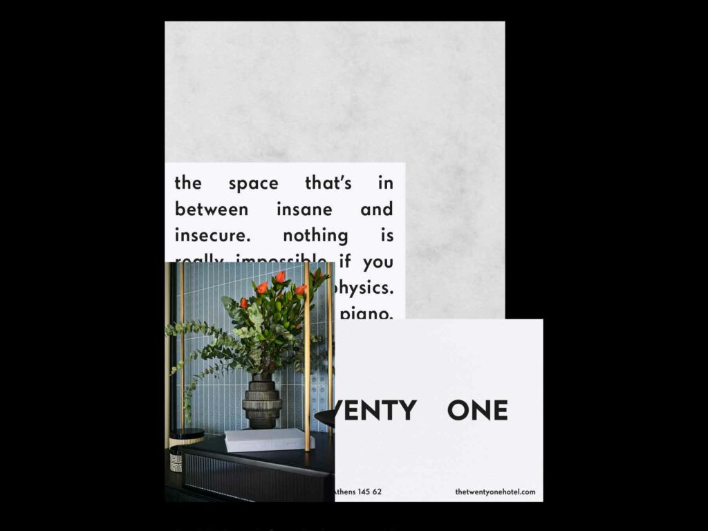
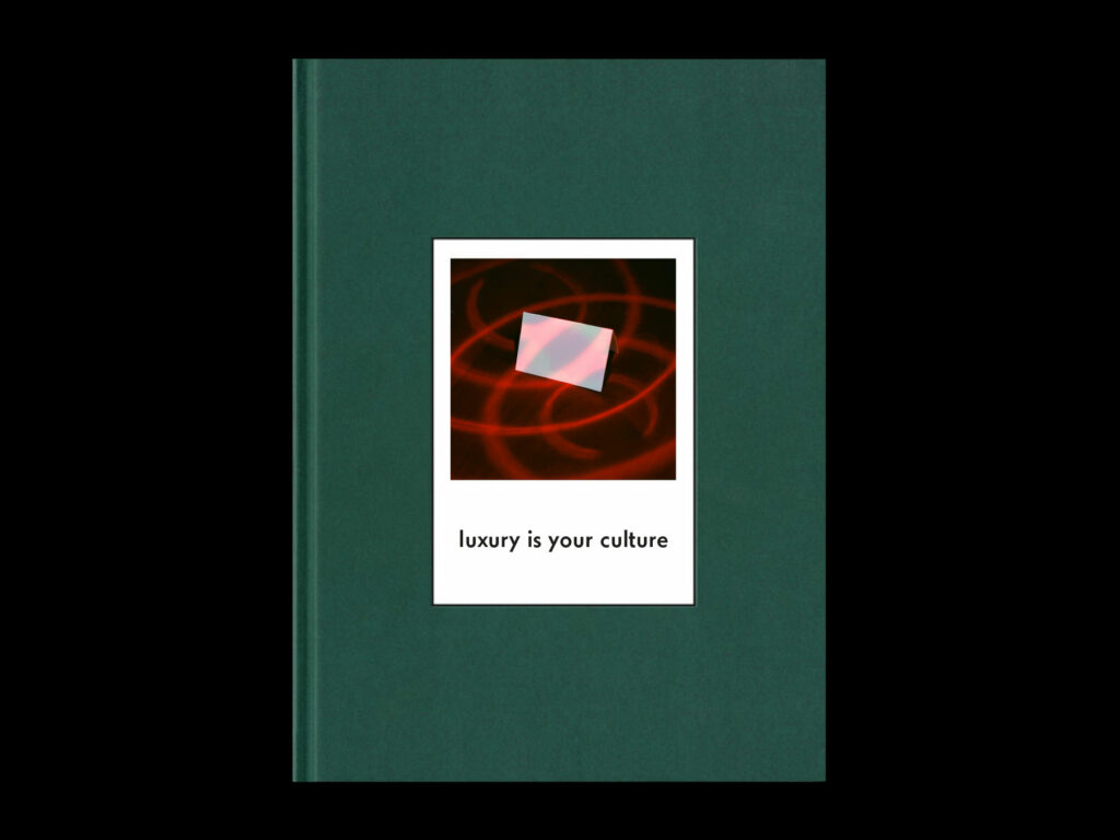
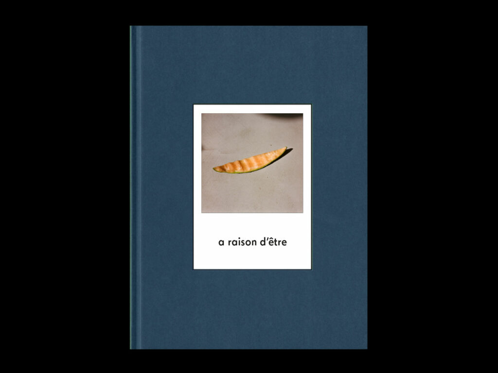
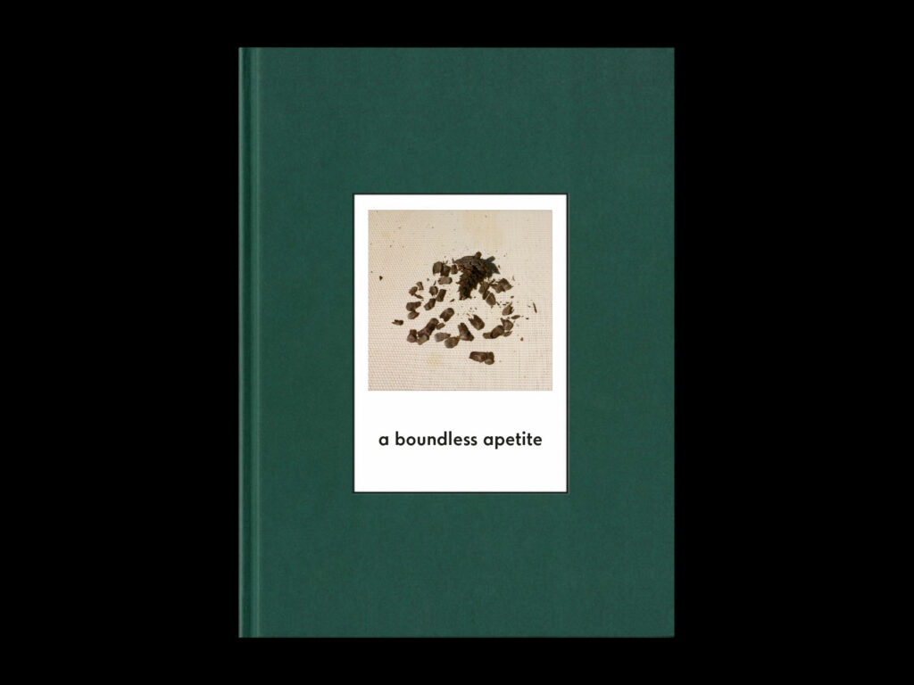
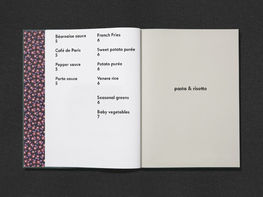
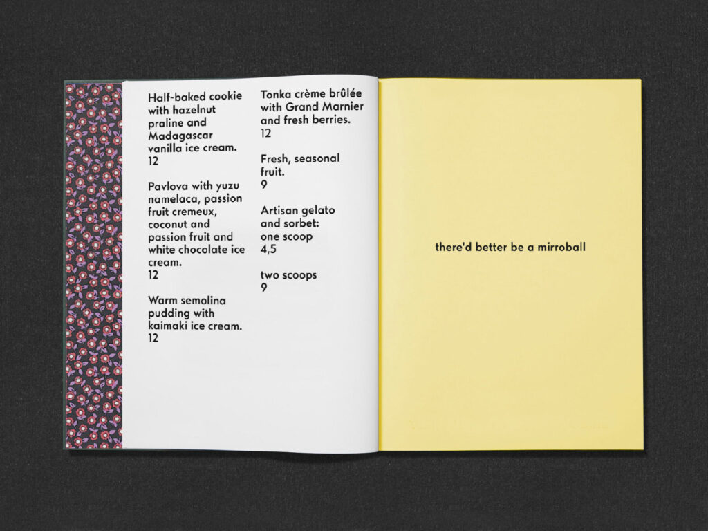
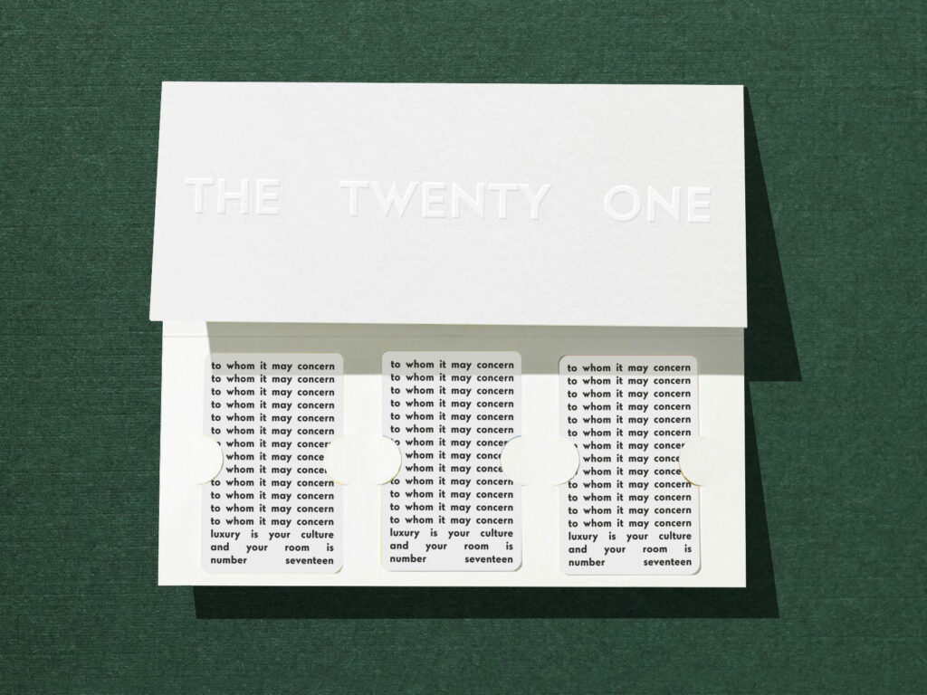
From wayfinding through all the little details, Marlon Tate’s work for The Twenty One hotel in Athens, Greece is spectacular. It’s a profound expression of modern design at its finest and never does it stray away from a cumulative brand language.
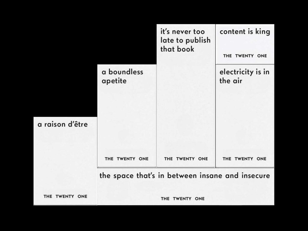
An Art Deco, modern typeface serves as the defining characteristic of the brand. Set in black over top of white backgrounds, the typography is empowered to stand stoic and wonderful. This gallery-like basis creates a foundation for rebellious artwork and copywriting, never taking away from their impact.
With phrases like “The space that’s in between insane and insecure” and “it’s never too late to publish that book” serve more like battlecries than witty one-liners. And because the typography is kept simple, their impact hits harder than it probably would otherwise.
