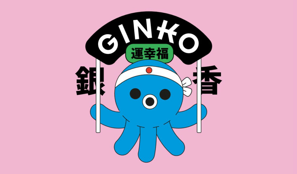
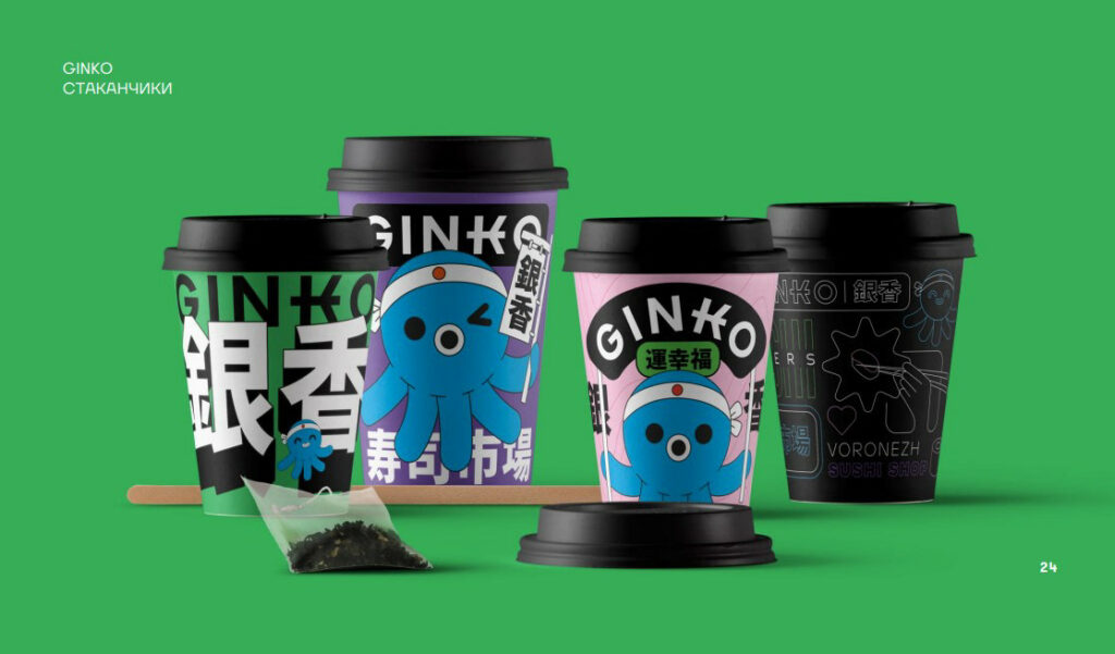
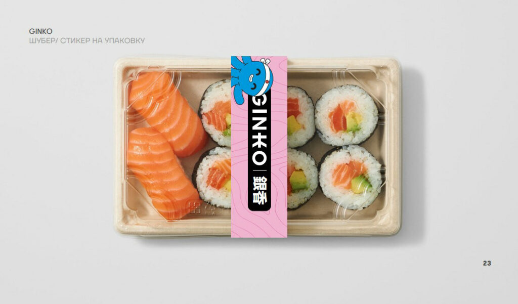
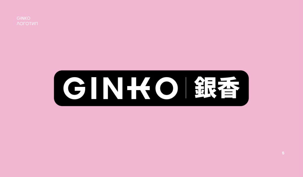
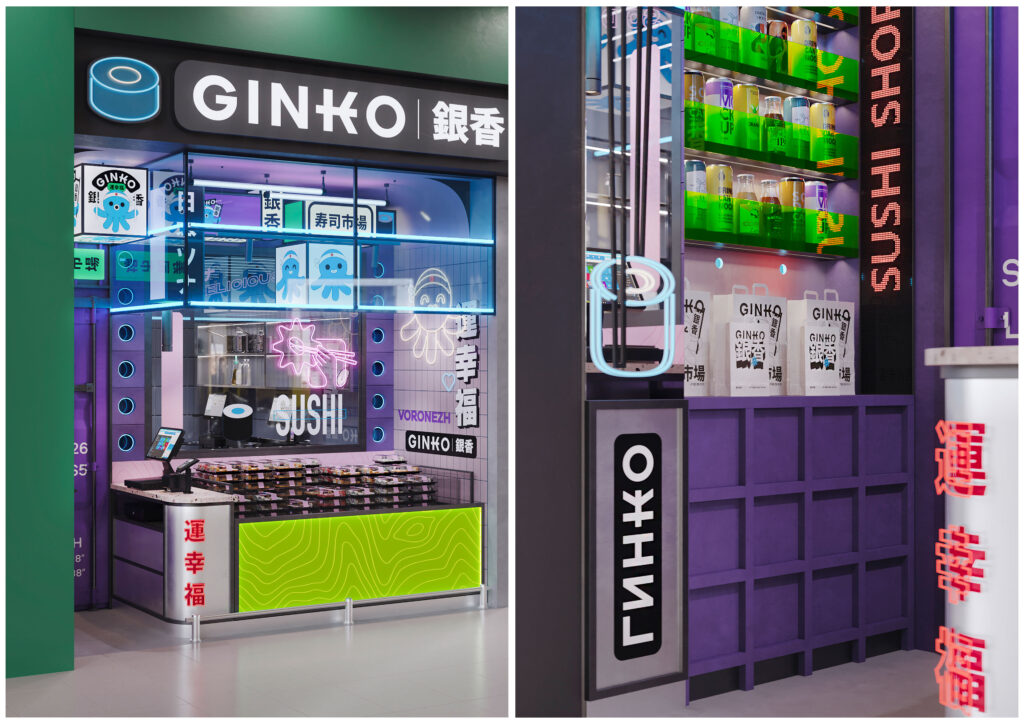
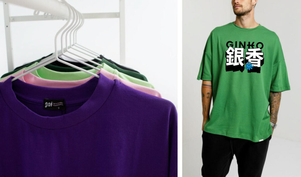
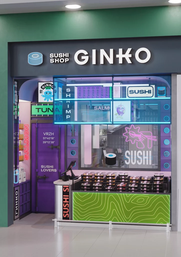
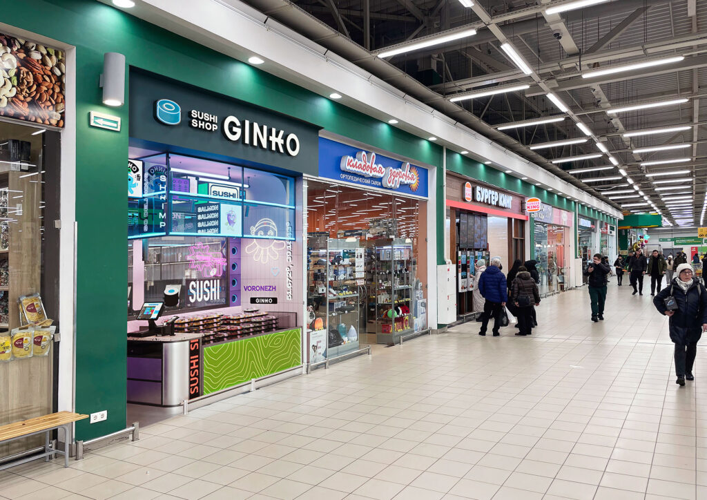
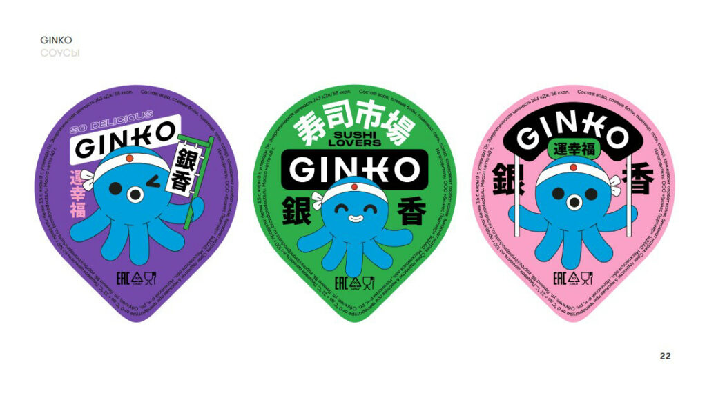
One part kawaii style and one part throwback 90’s, the brand identity and interior design experience for Ginko Sushi is fun, pastel-y and excessively cute.
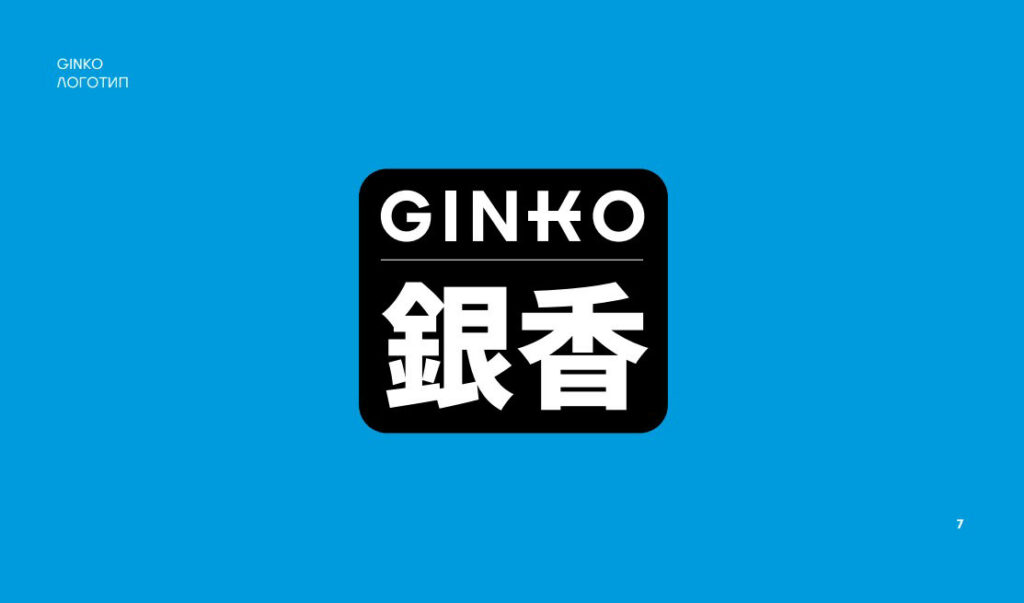
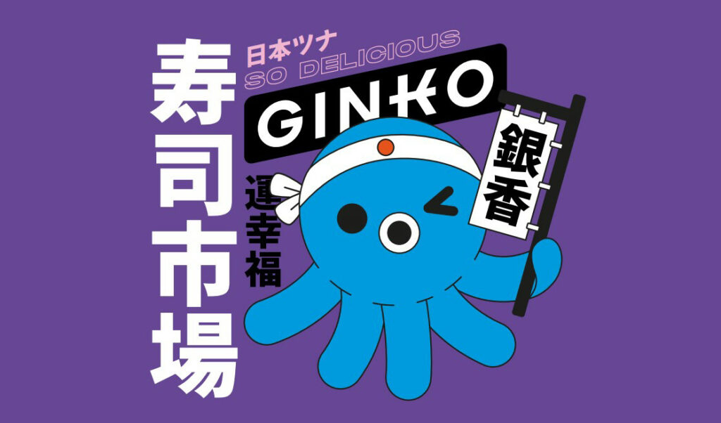
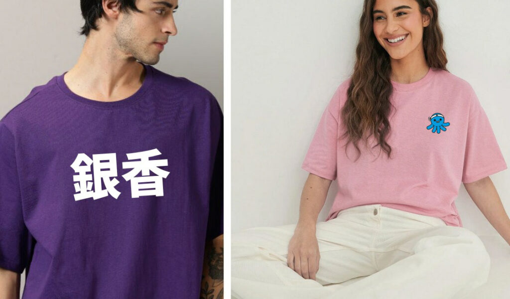
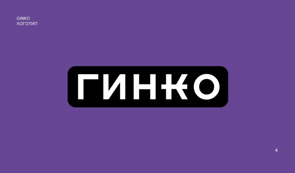
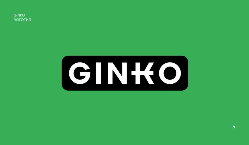
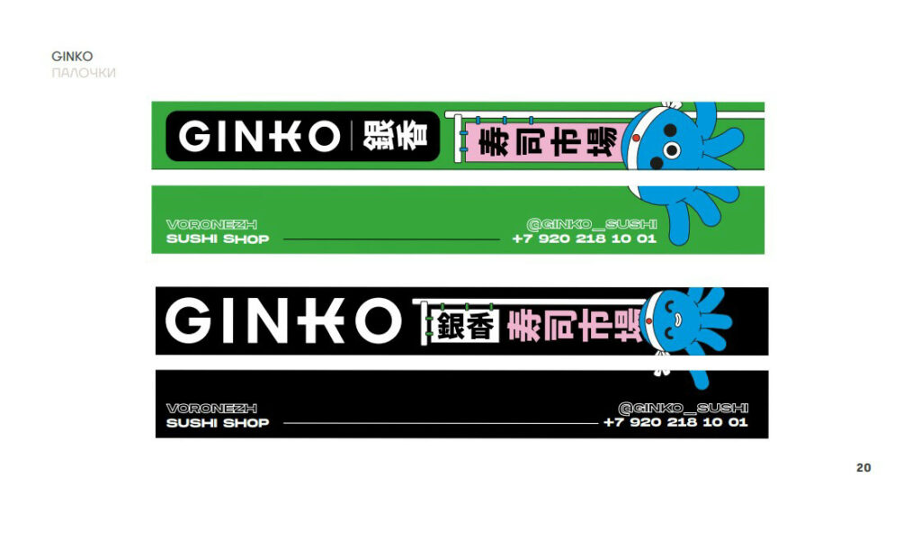
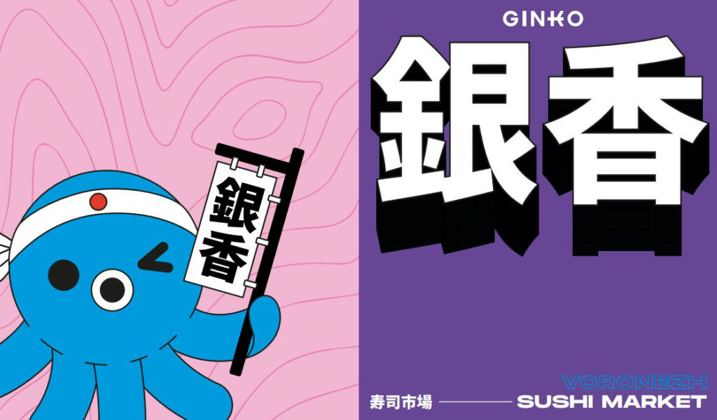
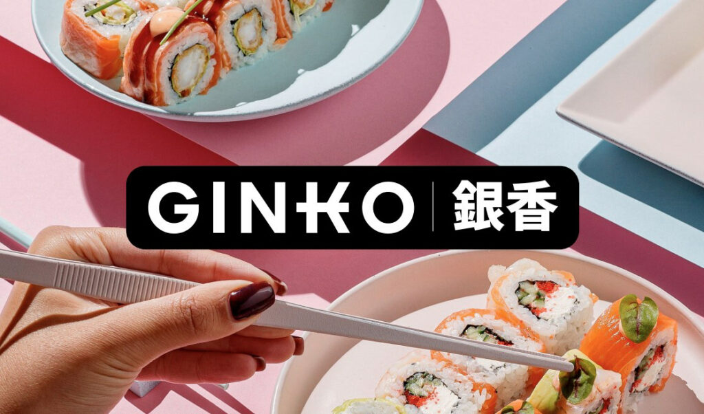
The typography is clean with some a unique character form for the letter K. Outside of that, it’s a standard grotesk which marries nicely with the kanji symbols that flank it. However, it could be even better if the letterforms for the Latin-based alphabet had slight curvature as found with the symbols.
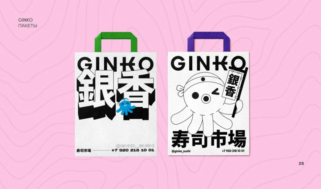
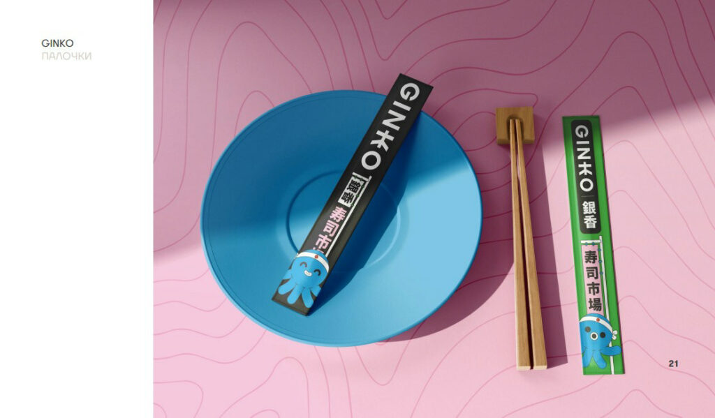
The brand comes to life with the addition of the octopus character donning a bandana with a simple red dot derived from the Japanese flag.
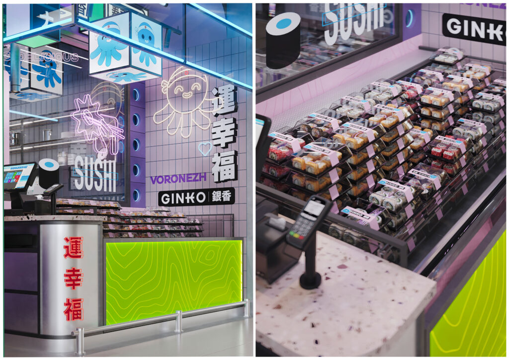
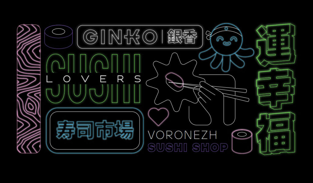
The interior space is where this brand really comes to life. With pastels, neons, and metal textures, it looks like what the year 2020 looked like from the perspective of 1985. It’s rad!