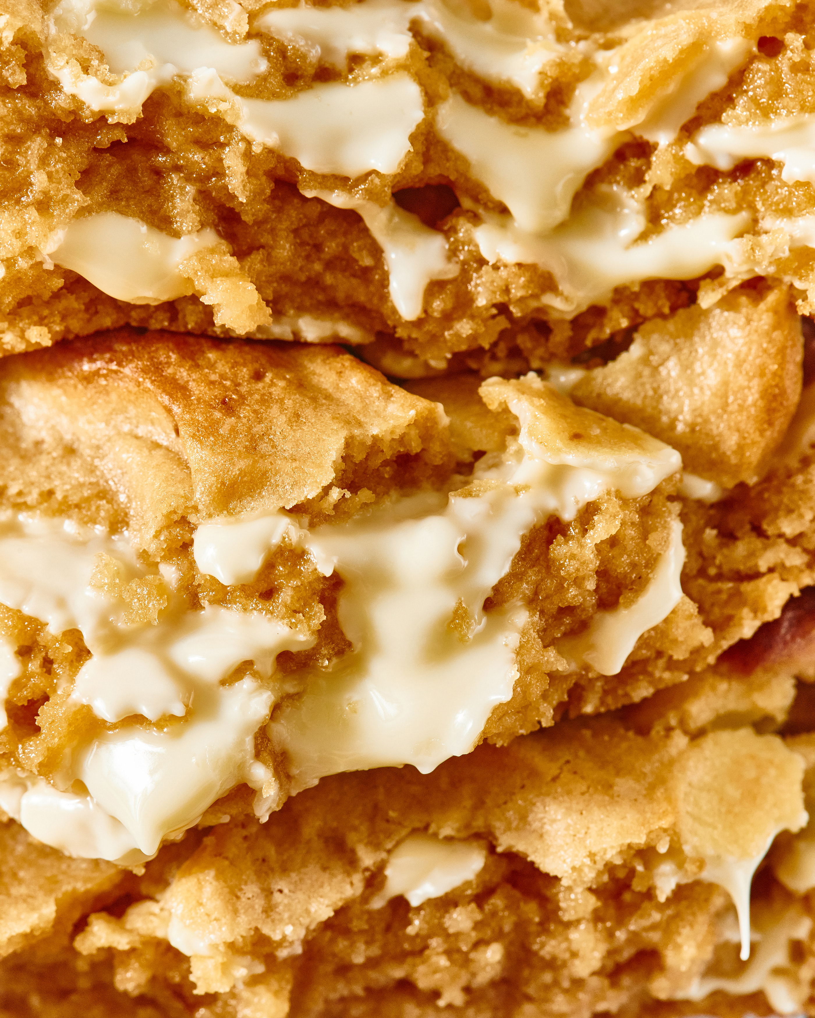
Who doesn’t love cookies? What’s even better is designing a brand for a cookie company. That’s exactly what the team at Arcal Studio had the opportunity to do with the new restaurant brand Blend.
The brand identity for Blend features a thin sans-serif typography treatment that feels contemporary. While not too stark, its slight curvature creates an approachability that’s sheds the coldness of minimalism associated with serif typography.
Pastels and shades of pastels comprise the color palette reinforcing the soft approachable feeling of the brand overall. Combined with doughy shapes, the brand brings an upscale feel that’s rooted in the craft and art of cookiemaking.


