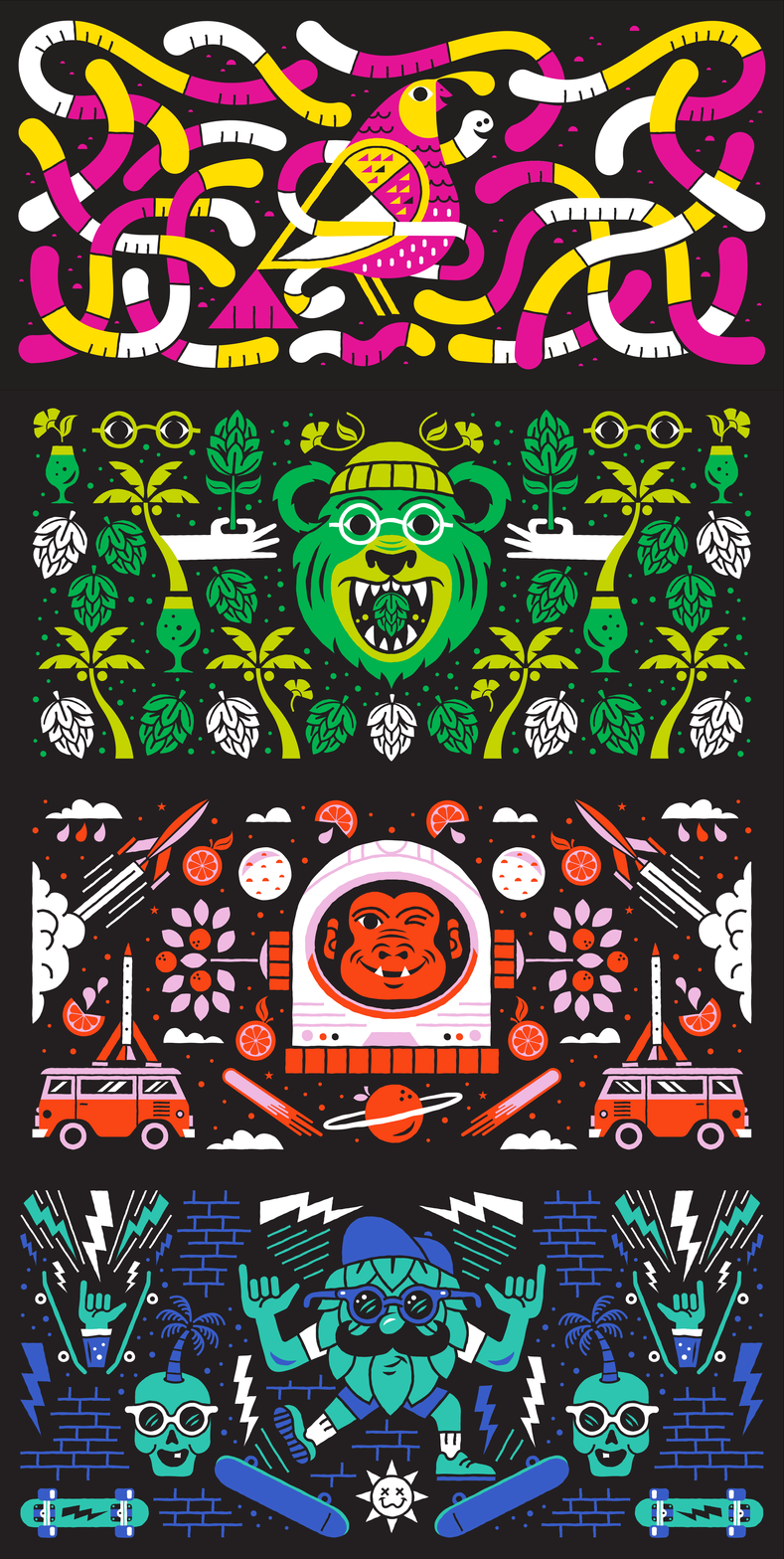
The world of craft beer is well explored territory. While a lot of brands are striking and interesting, they tend to fall into a typical design approach. (Don’t me started on the naming conventions!) So it’s extra special when a craft beer brand identity and packaging project really grabs my attention. Such is the case with Carpenter Collective’s work for New Glory Craft Brewery.
Carpenter Collective is known for a style of design that melds campy illustrations with a semi-nostalgic vibe. They’ve applied this to New Glory’s rejuvenated brand while paying homage to the original look which is dominated by patterns. CC’s new patterns tell a story of the beer style, flavor and name while establishing a truly eccentric, yet approachable experience.
From the variable design of the logo’s typography through the pattern illustrations of each of their four core beers, New Glory has a fresh identity that ups the ante in the beer industry vertical.


