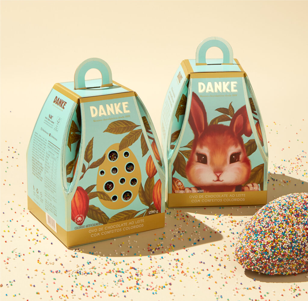
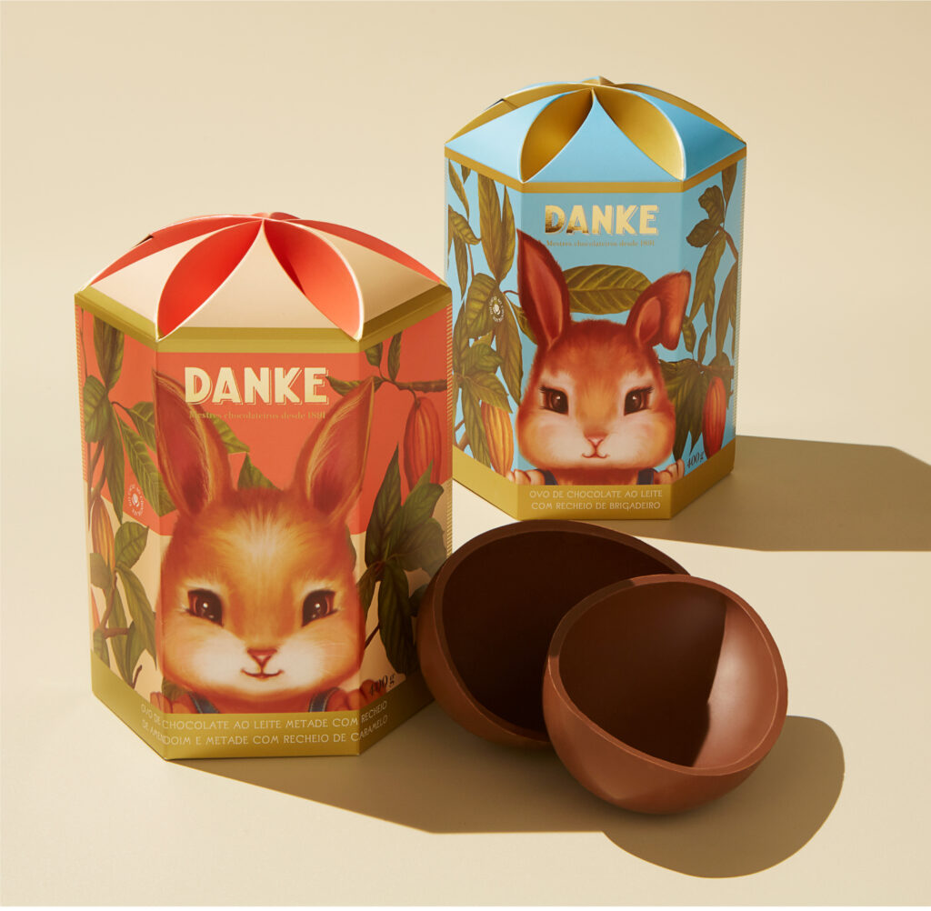
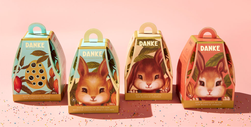
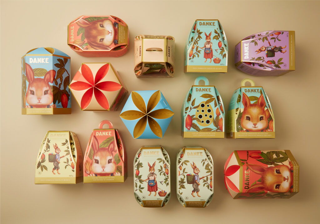
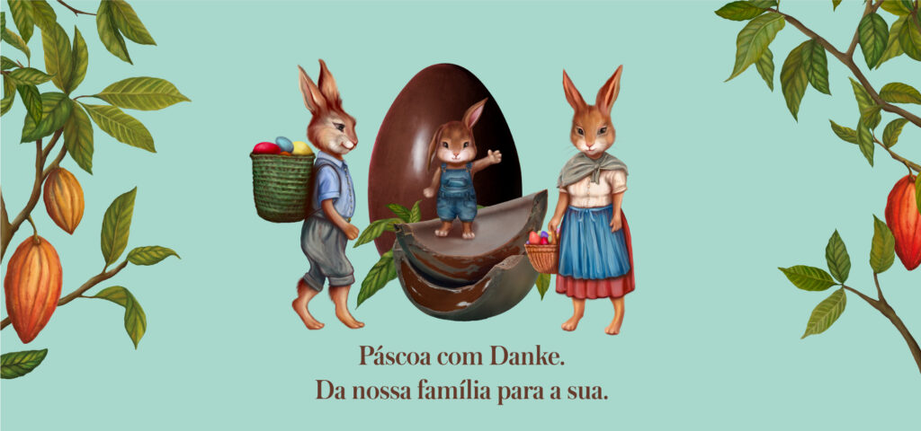
As designers we’re constantly enamored with modern and trendy design aesthetics that often we forget the wonderful beauty found in more classic design styles. Nata Design’s work for Danke Cacao, a chocolate brand in Brasil, is proof positive that classic design still has staying power.
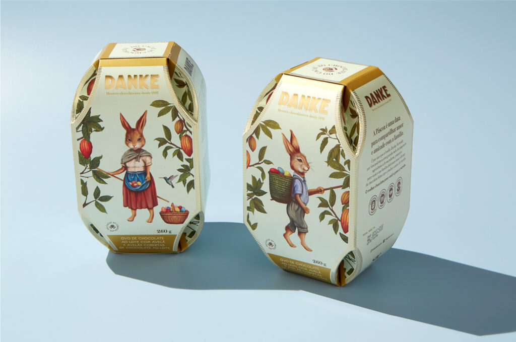
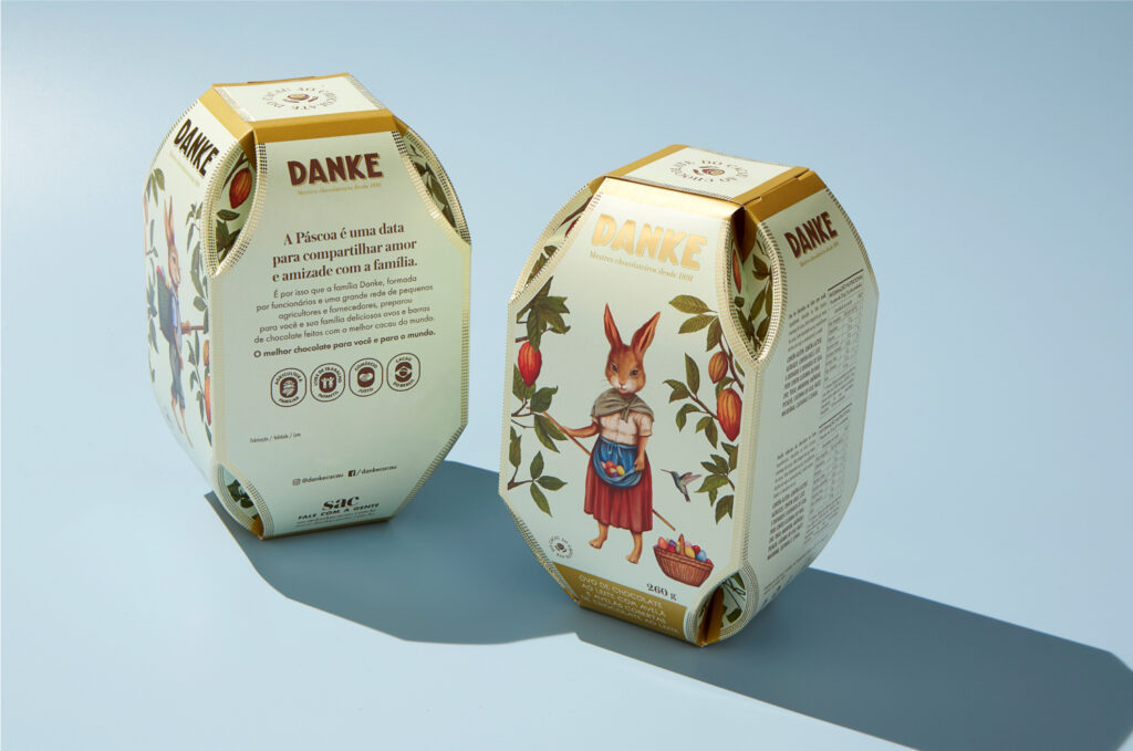
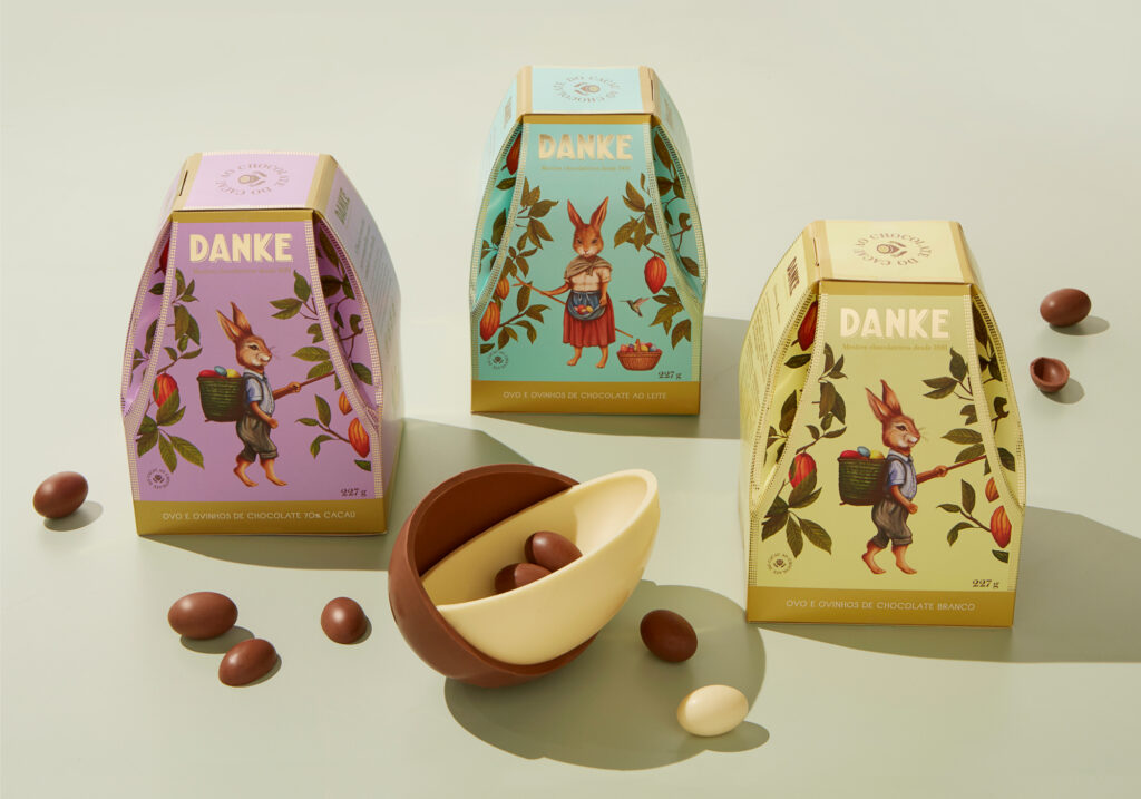
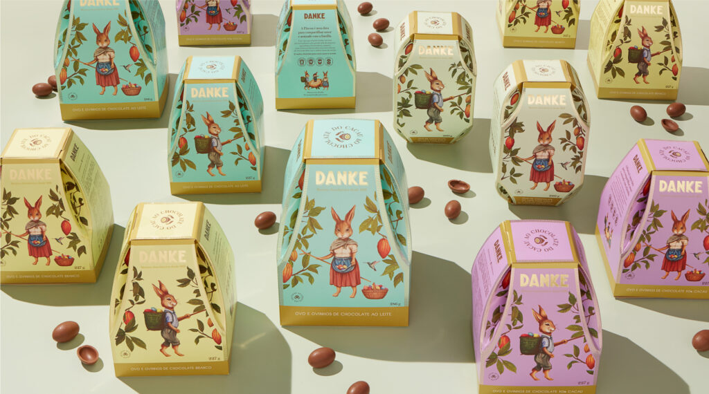
Nata Design had the opportunity to create the limited edition look for the Easter lineup. They took one of Easter’s more iconic secular image, the Easter Bunny, and ran. In their classicly styled illustrations, the Easter bunny is strolling through cacao groves, picking fresh bean pods.
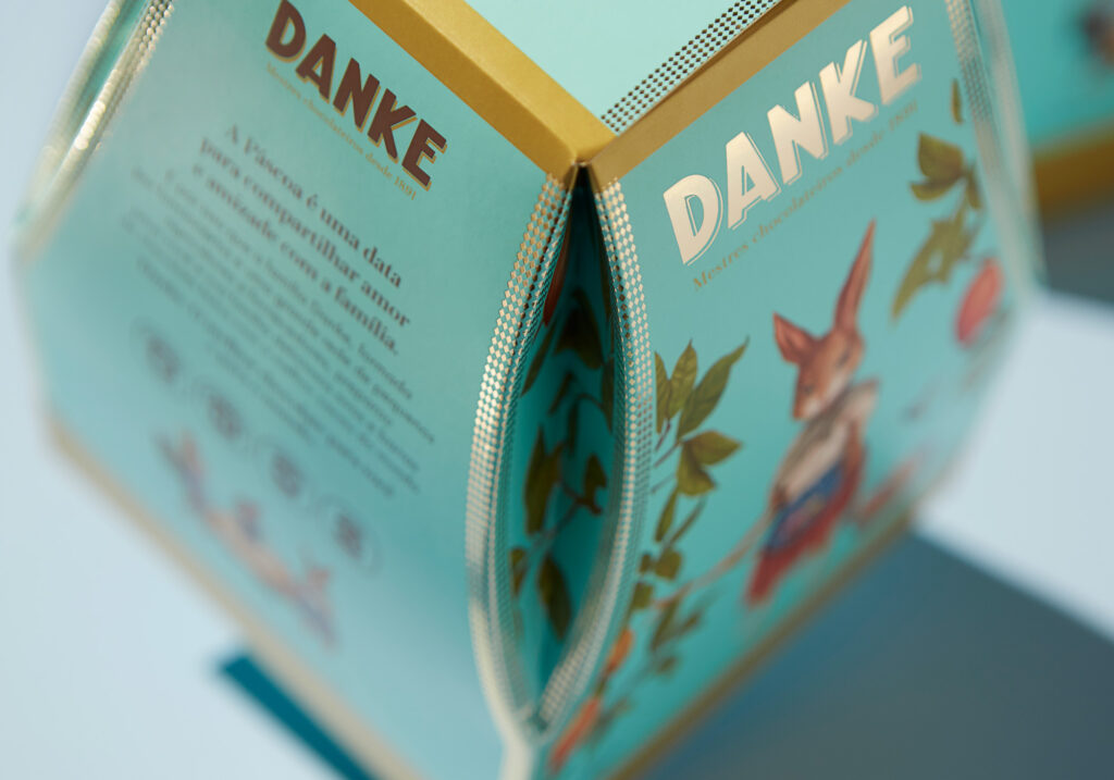
The layout of the packging uses gold elements and clean layouts to allow the illustrations to take the focus. It melds perfectly with the unique packaging structure which has an egg-like finished construction.
