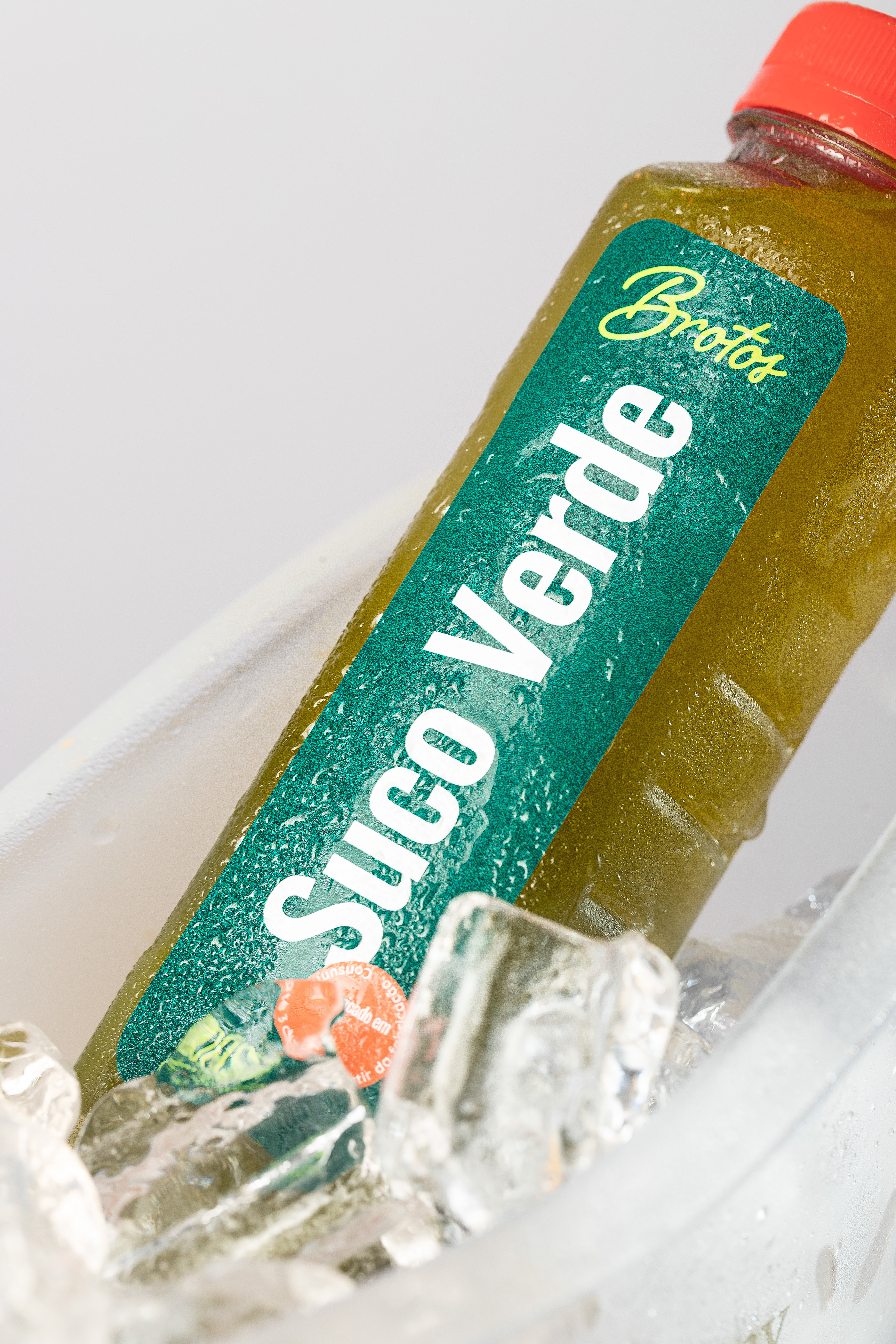
Unlike many other natural or organic food brands, the identity and packaging for Brotos takes inspiration from the vibrant colors, not drab, washed out ones. A beautiful pen-style script serves as the brands typographic direction which is supported an eye-catching color palette and bold, large typography.
Each packaging opportunity extends the brands identity with different color combinations that explore contrasts between colors and the shapes of the letters. The containers for each food item and meal are wrapped with custom labels that offer the team the ability to customize with handwritten details.
Beyond the packaging is how the team extended the identity into advertising touchpoints. The advertising creative builds upon the strength of the packaging with its bold, vibrant typography that delivers the message effectively every time.


