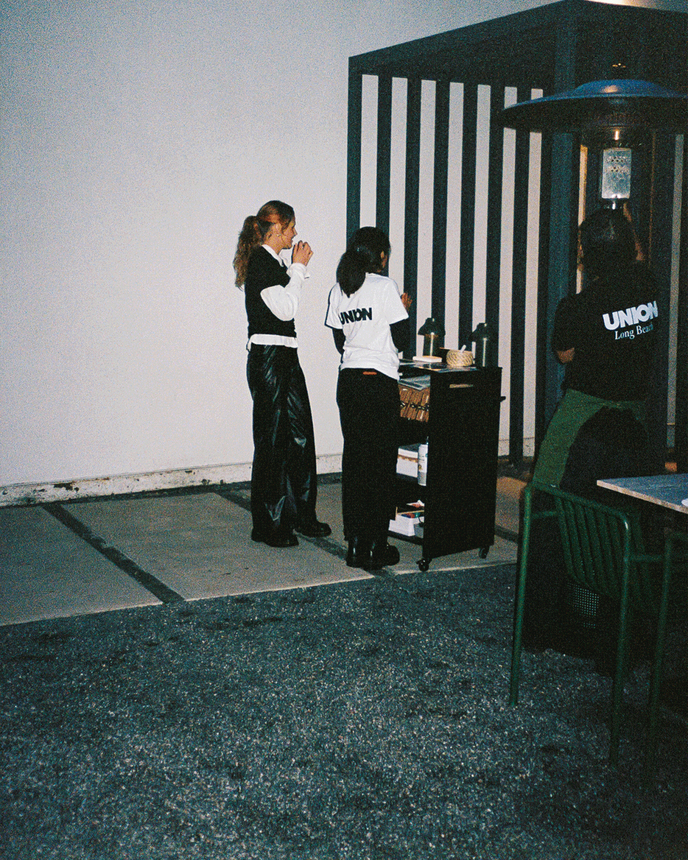
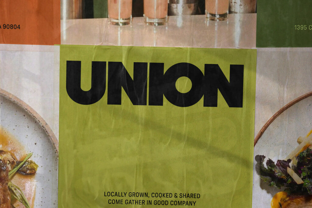
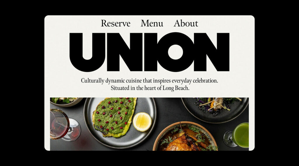
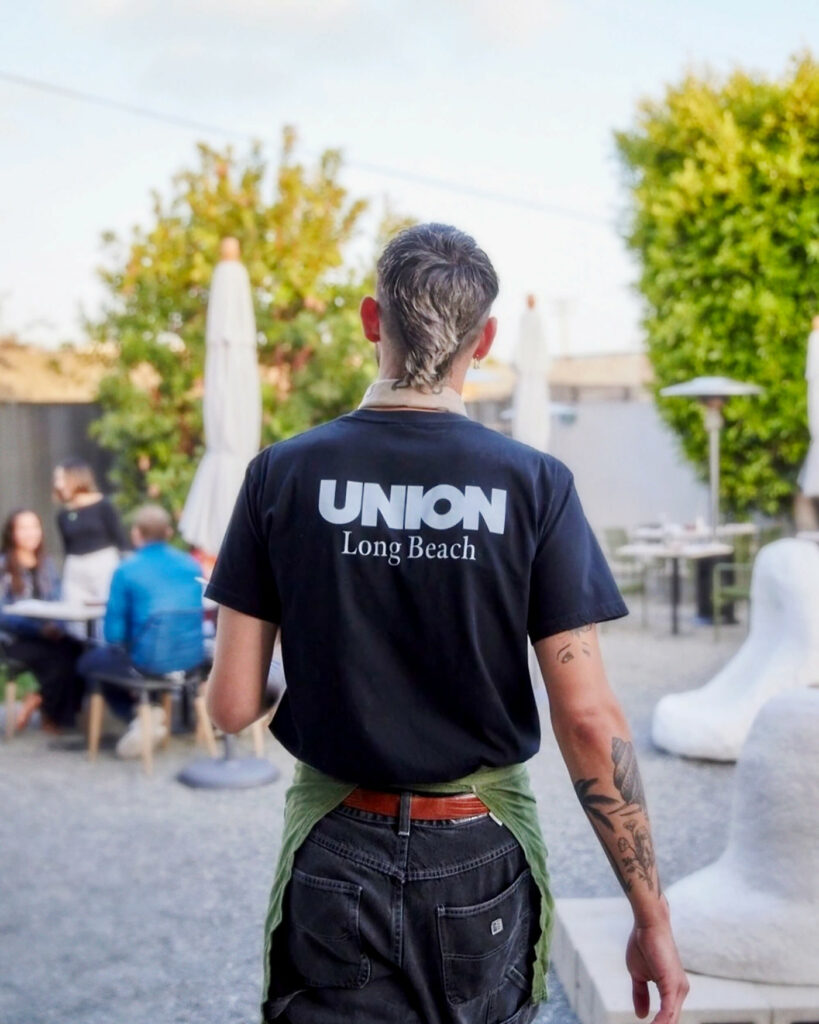
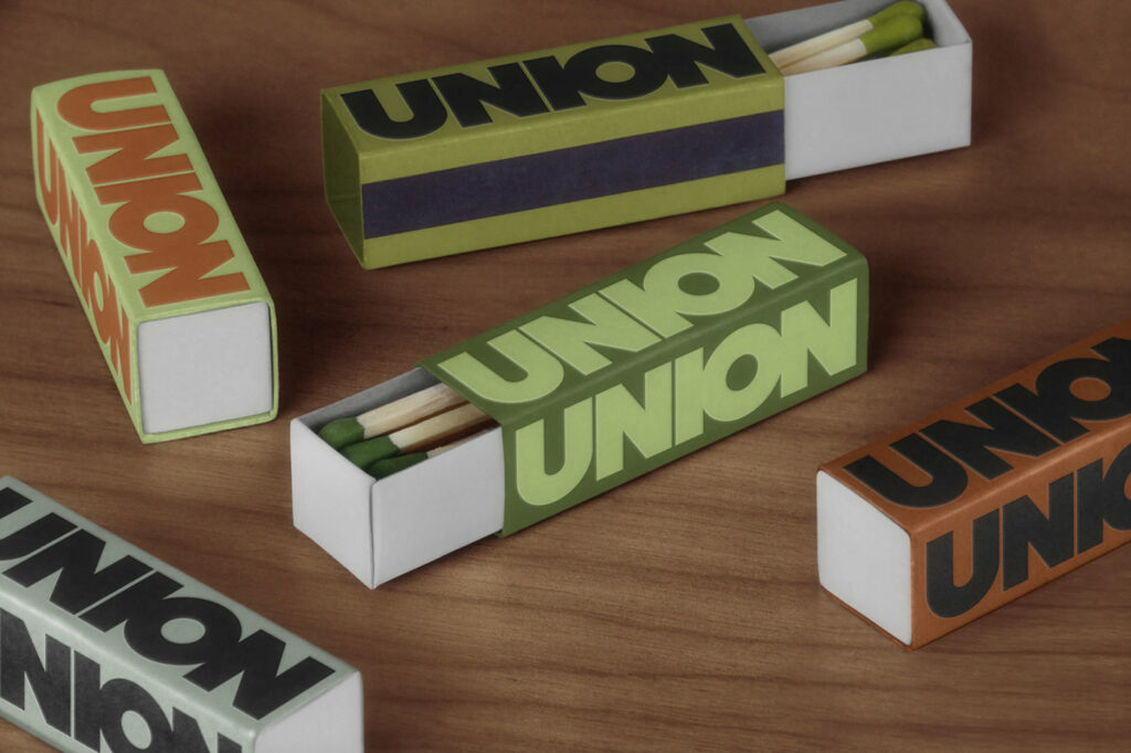
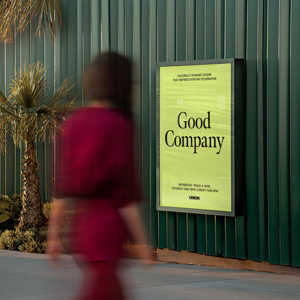
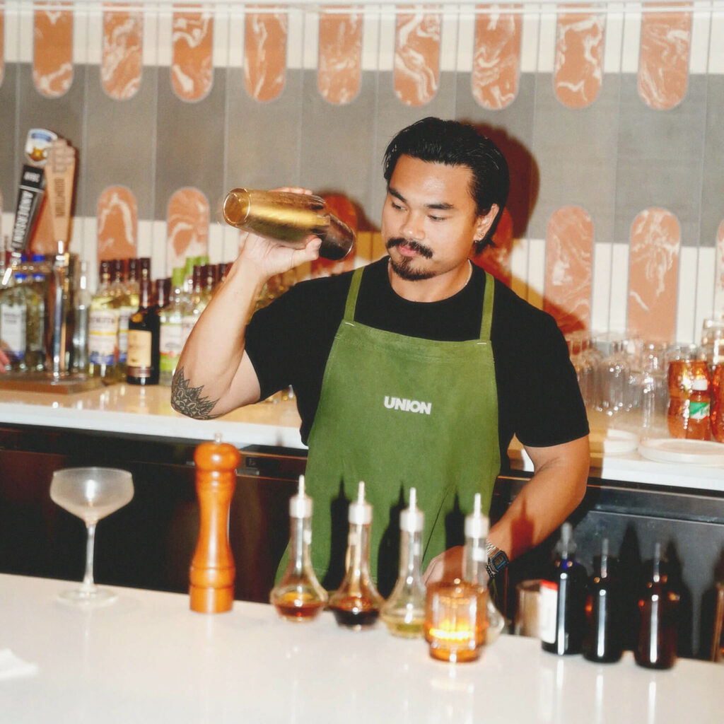
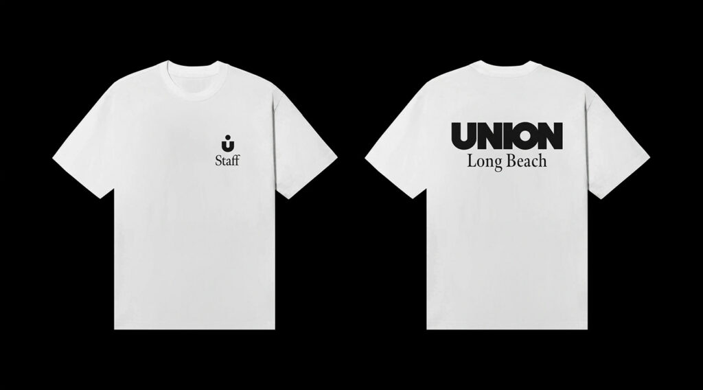
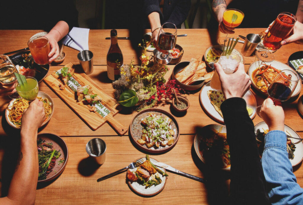
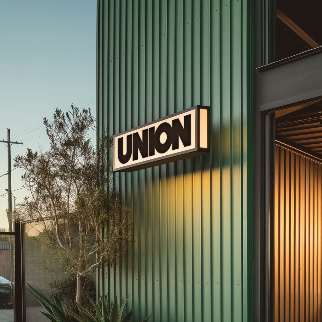
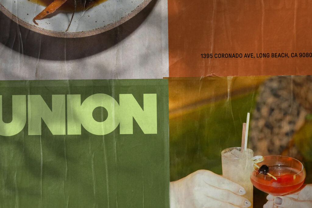
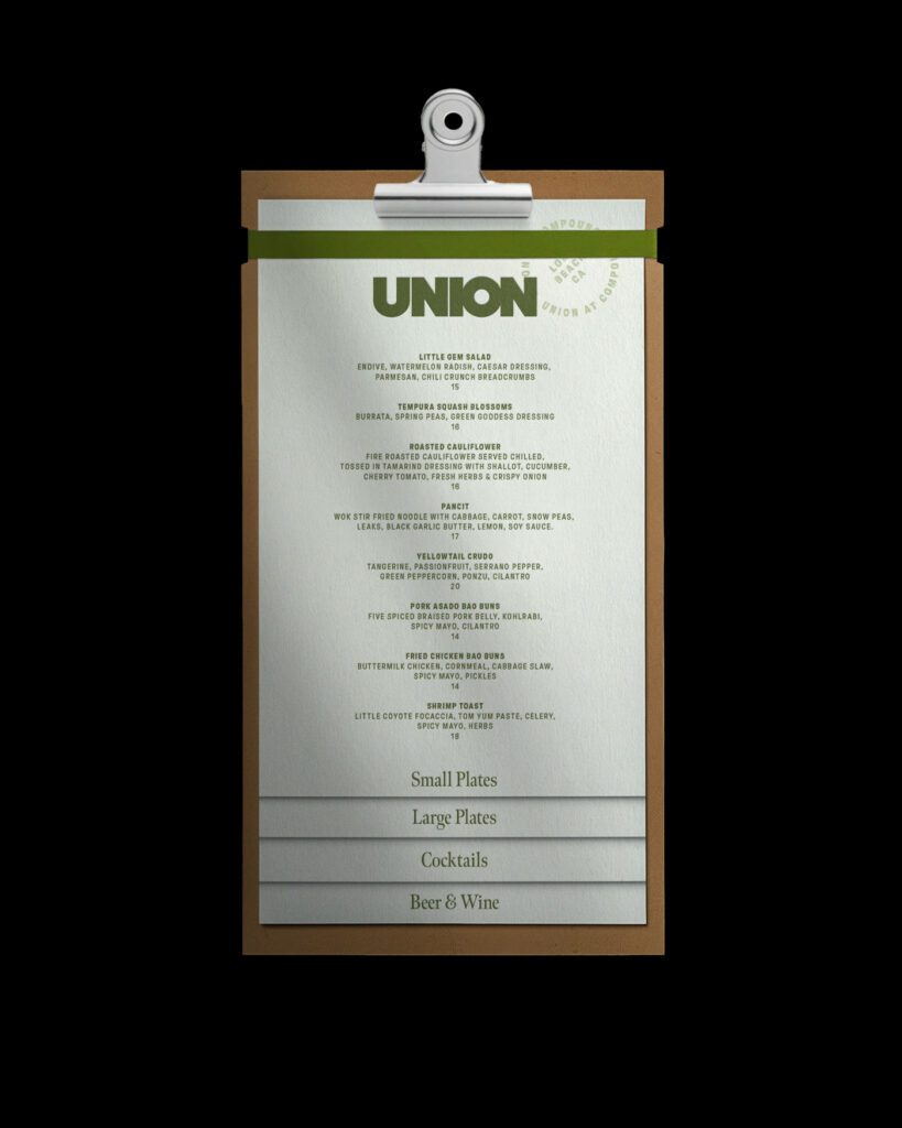
Confident boldness and a Polaroid photography style mark this restaurant brand as chic and stylish. From the core, Union exudes a bold frankness that’s unafraid to merge retro vibes with a modern irony. The restaurant’s brand identity features a thick, bold typeface that puts the emphasis on the “O” in Union in a way that feels like a plate or a vinyl record. That correlation starts the merging of two eras.
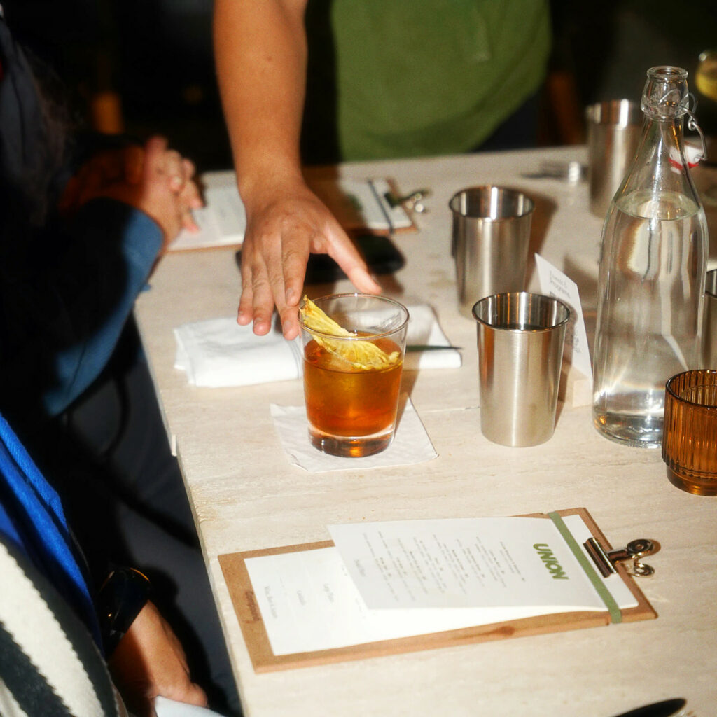
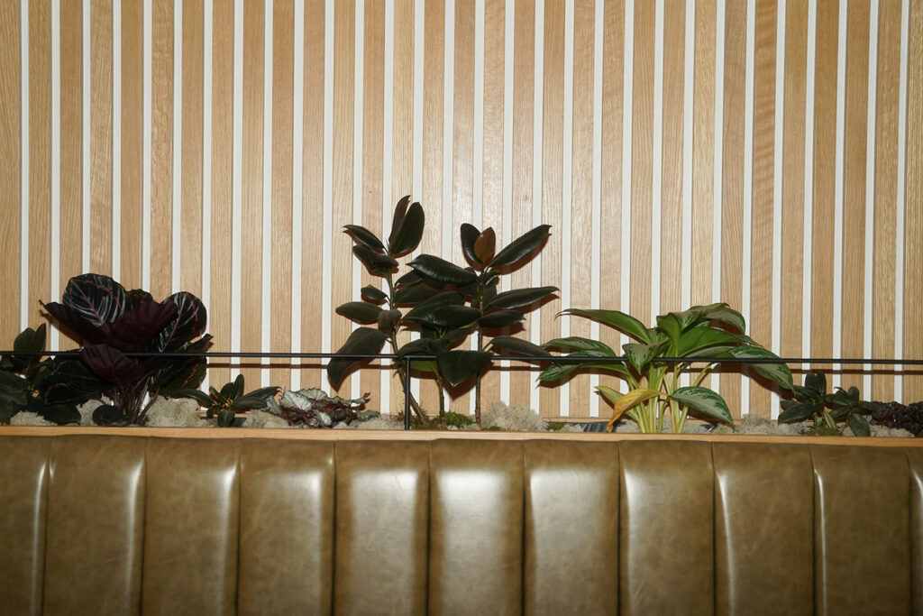
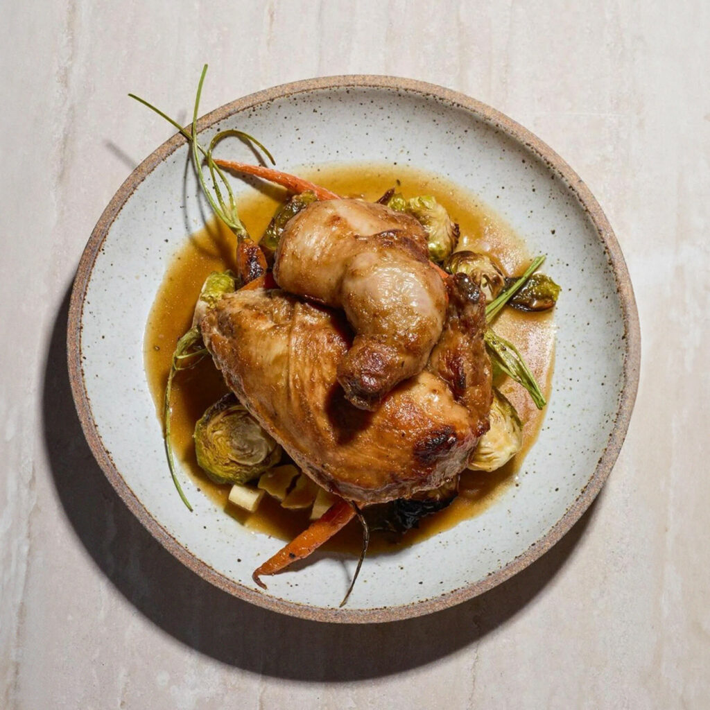
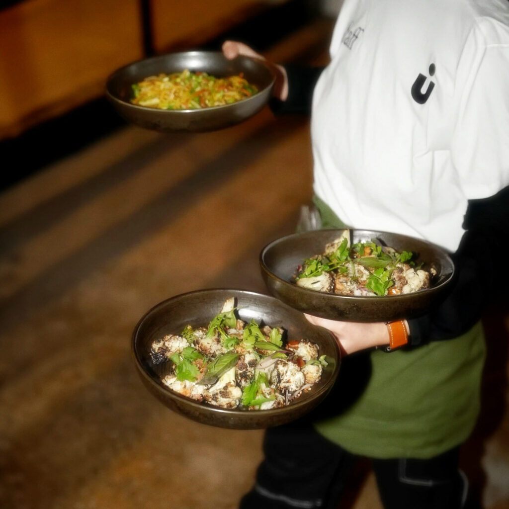
Muted colors serve as a basis in both print and interior design elements. Typography is throwback and the photography’s high flash seals the narrative perfectly. Overall, the design is well concerted in its style of which is has plenty.