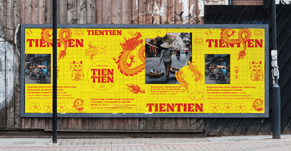
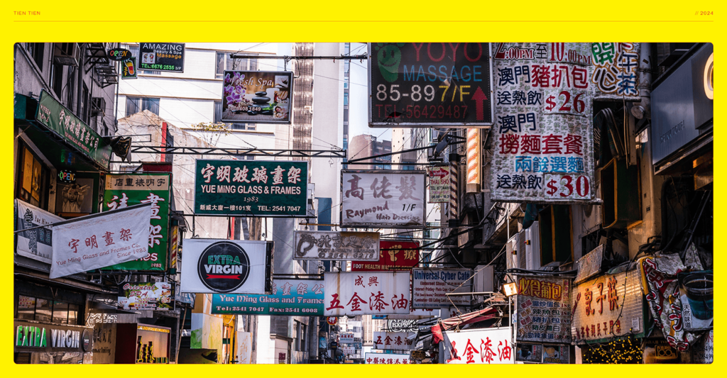
Designing for other cultures can be a tightrope walk. You have to evoke a sense of place without stepping into cliches that can be considered culturally insensitive, tone deaf, or downright racist. Mateusz Machalski walks that tightrope with excellence in the work for Tien Tien.
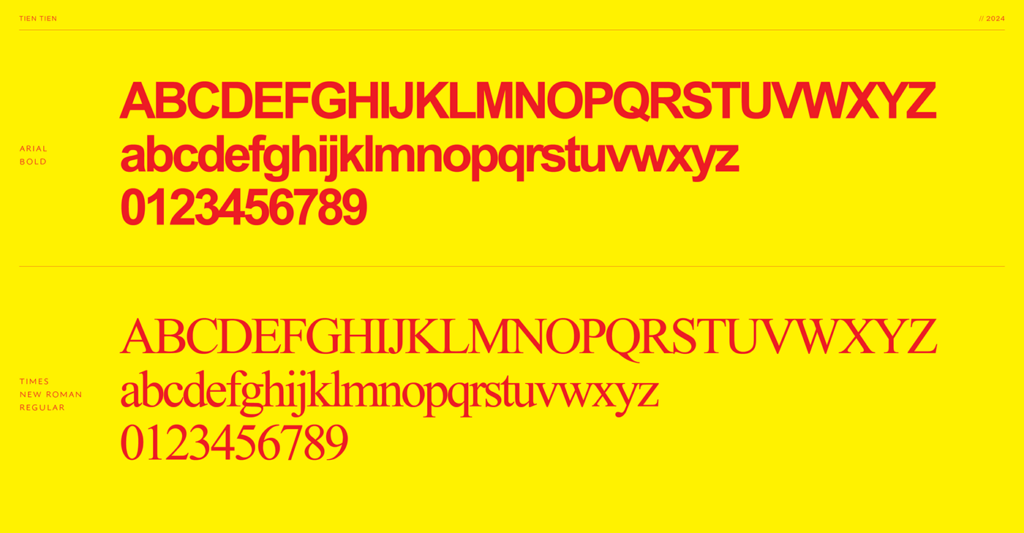
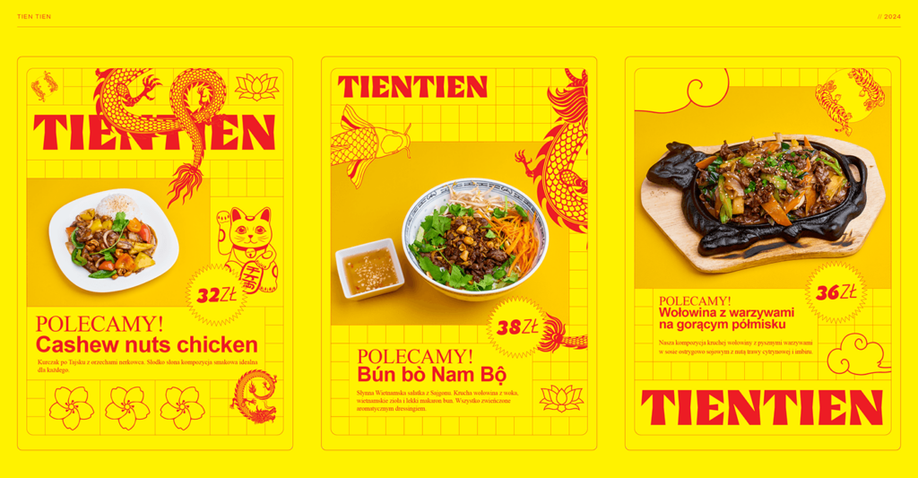
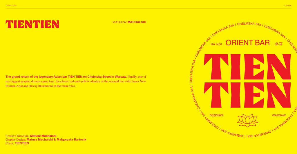
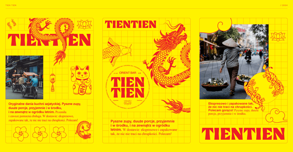
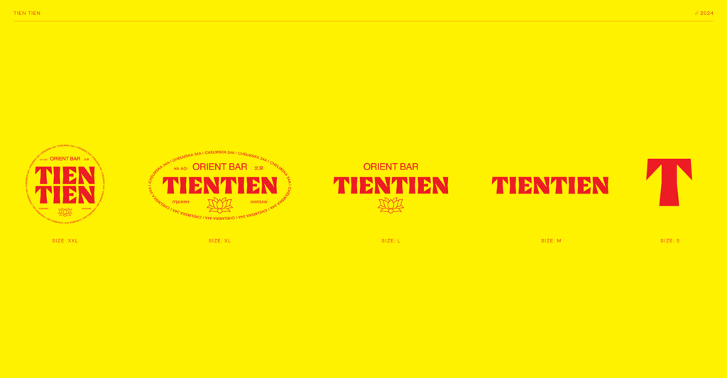
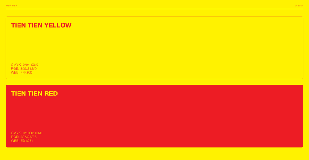
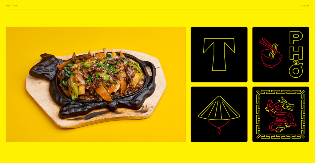
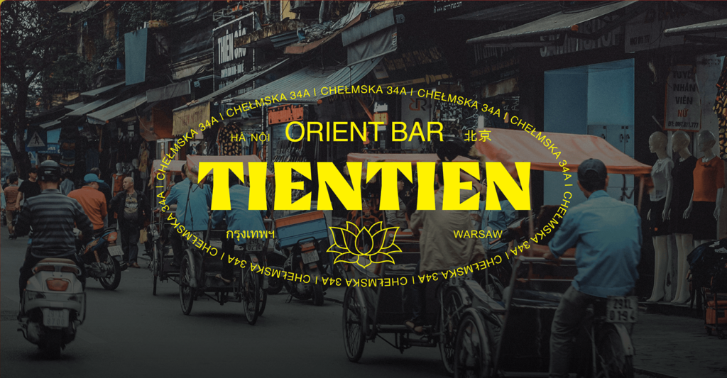
Adopting a bright yellow and red palette, Machalski immediately draws correlation to the colors often associated with the nation. From that basis the designer balances thin linework and grids with thick and chunky typography. The stark contrast creates balance in the relationship of the extremes.
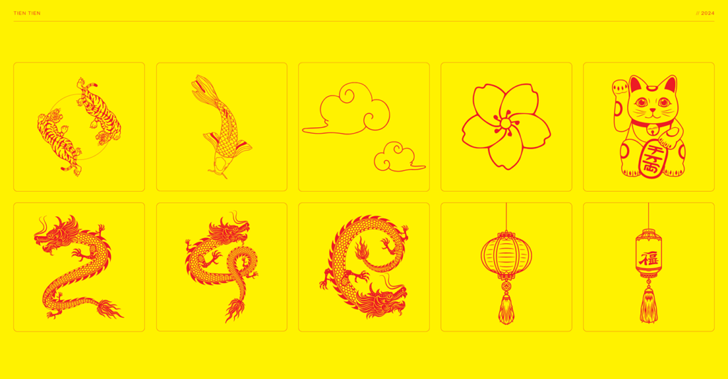
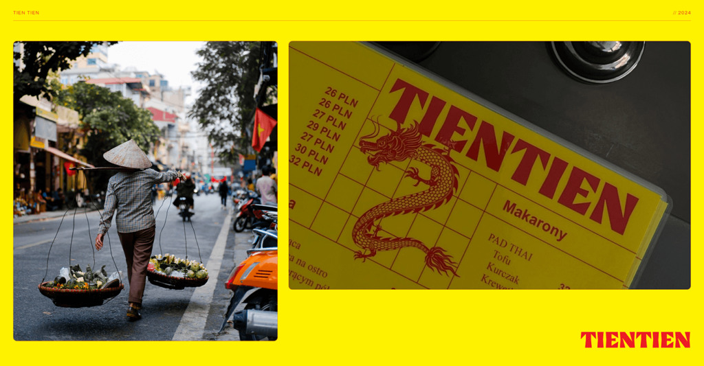
Compositions are kept under control with dedication to the grid. The grid is interrupted with illustrations that represent cultural icons. Some of the icons do draw too much influence from Chinese culture which, while accurate, doesn’t represent the true root of Vietnamese culture. However, they are fun and add a layer of cultural intrigue.
One criticism i’d have it in the execution of the dragon illustration. The style and line weights look different from the others. Finding more alignment there would strengthen the collective identity.