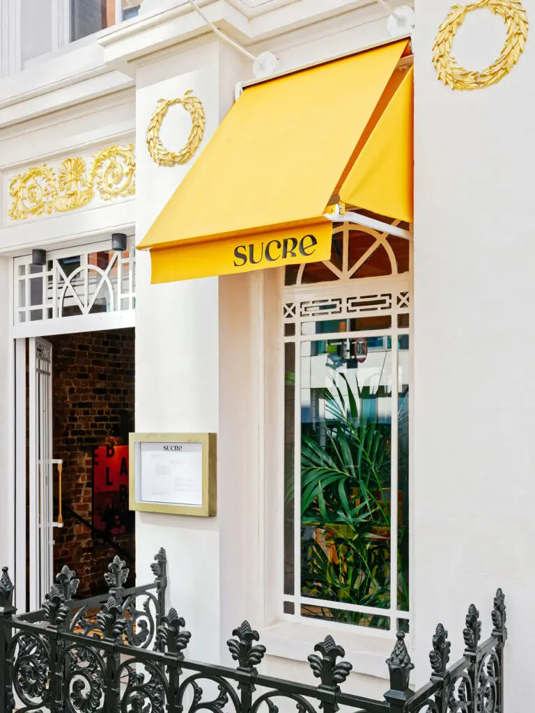
Many restaurants across the world, especially in the United States and United Kingdom, are representations of immigration. Immigrants come to new places and food tends to be the easiest path to establishing oneself in that new place. I find it to be one of the most endearing and attractive parts of the restaurant industry. But I digress.
Despite immigration being a common storyline, rare has a restaurant brand truly represented the influences beyond cultural icons and cliche visual styles. Not to say that’s a bad path ahead, but definitely well trodden territory from a visual sense.
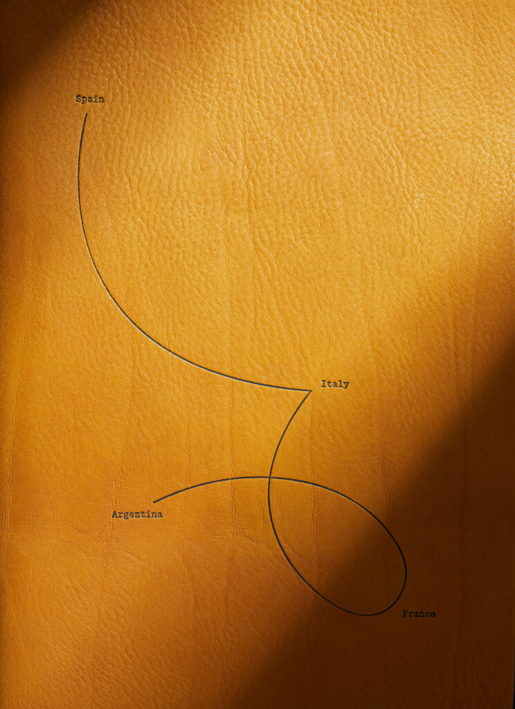
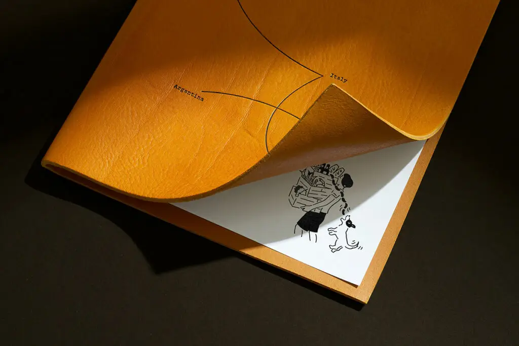
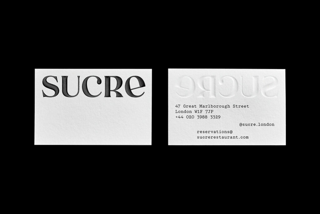
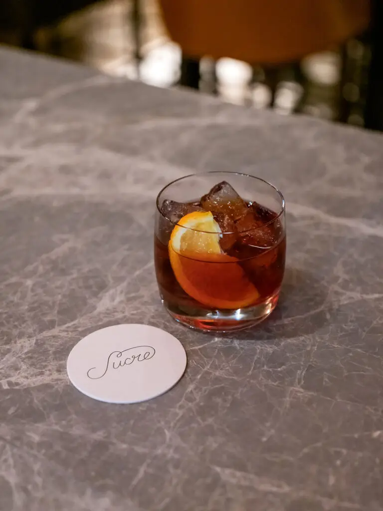
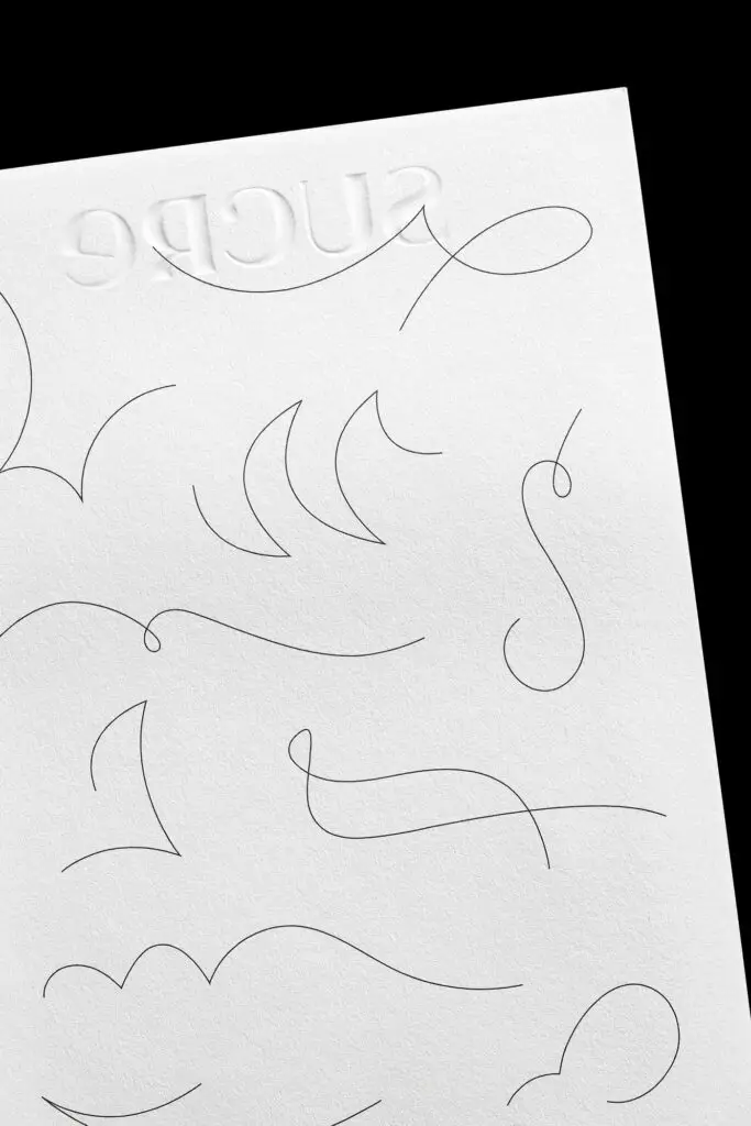
For Sucre, the story is played out visually in a way that pays homage to the roots of the chef’s cultural history via a depiction of a journey. Plots, or pins, on an invisible map gives the guest the sense of a journey and points of influence. Connected by a thin line, the identity starts to take shape using this line elsewhere to anchor it back to this journey story.
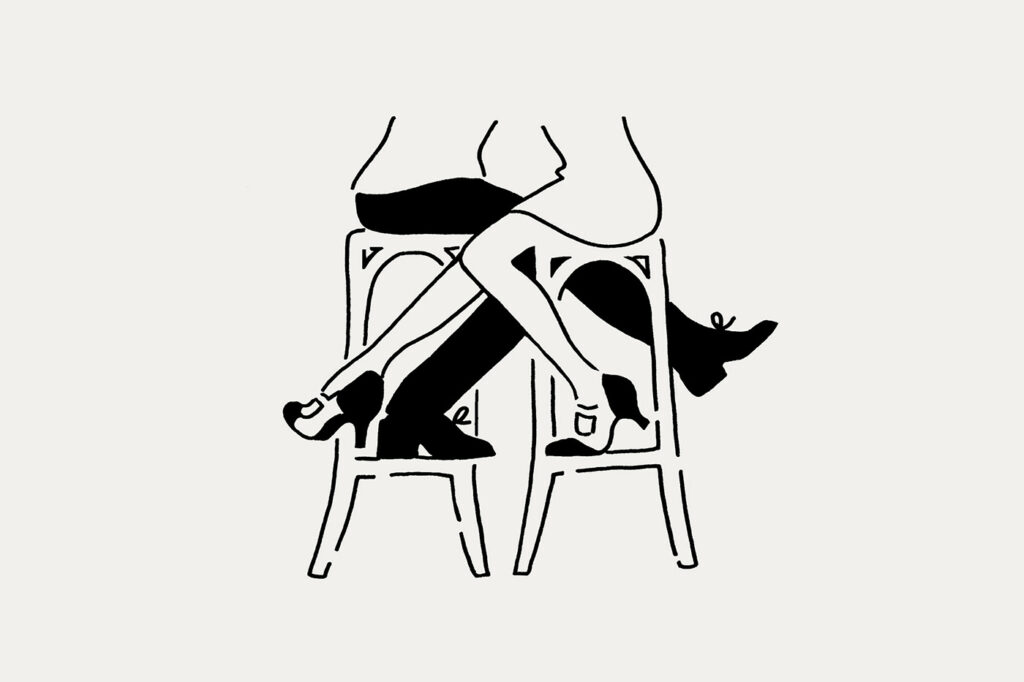
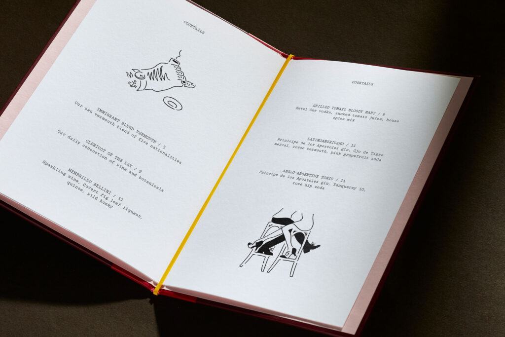
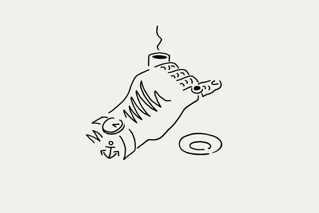
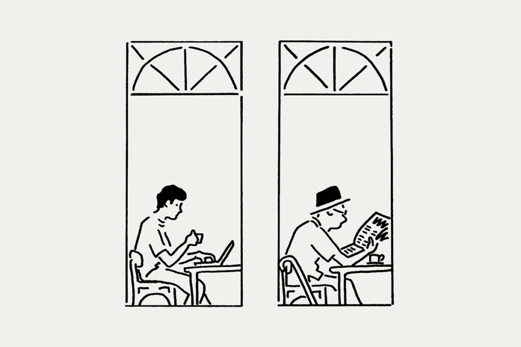
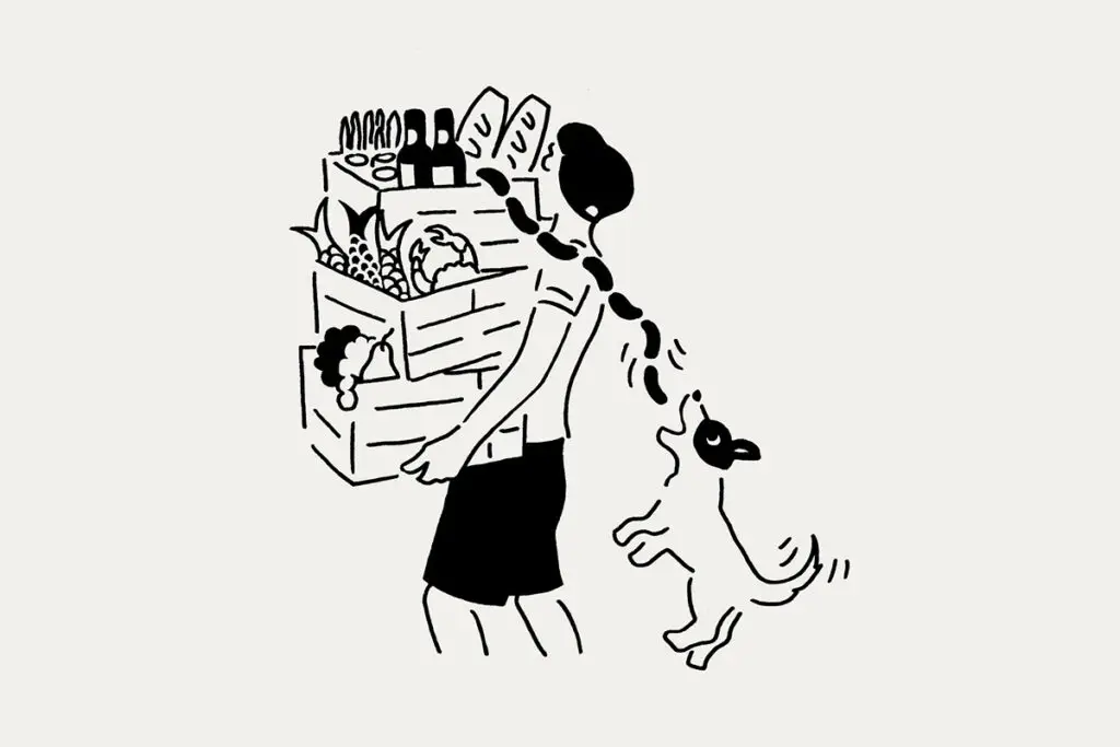
That line work manifests in doodle-like illustrations that depict moments like a couple intimately seated, and a proper holding of an espresso cup.
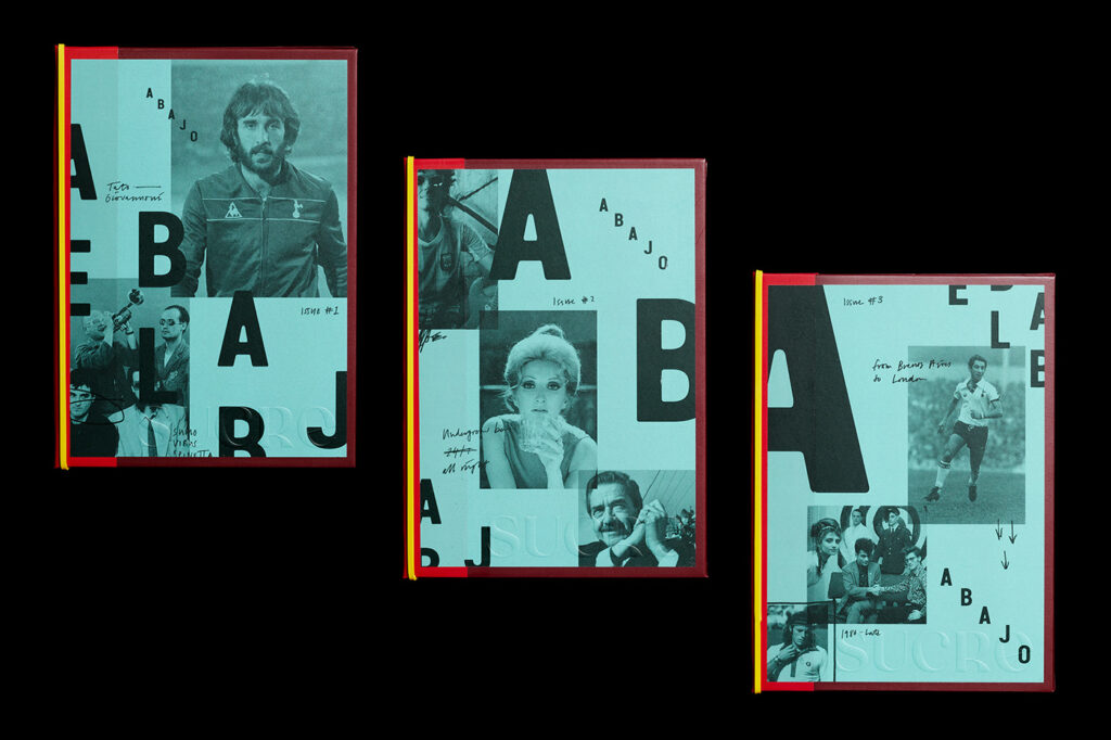
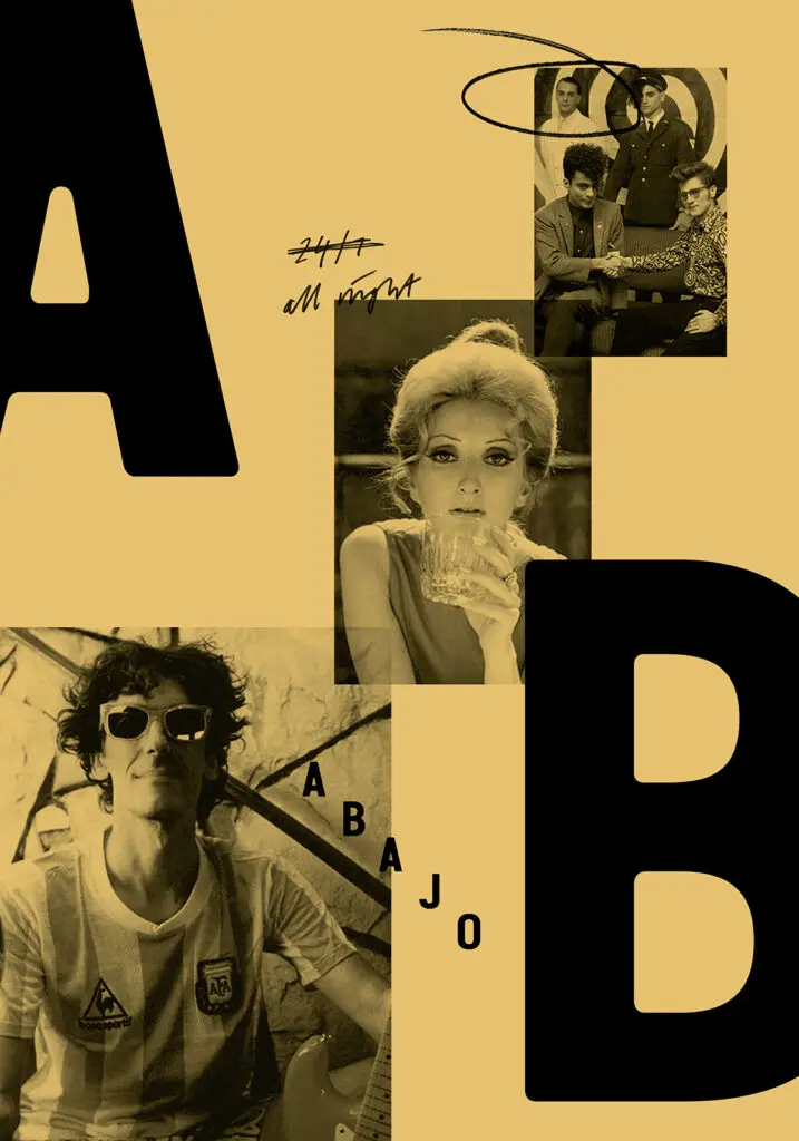
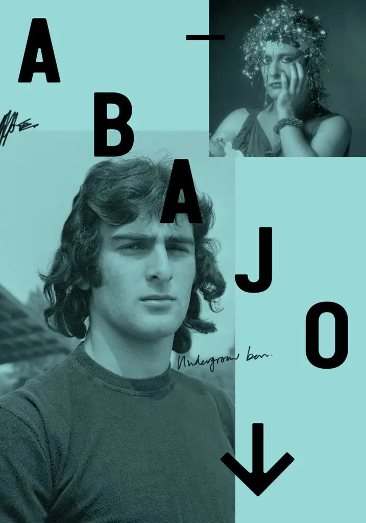
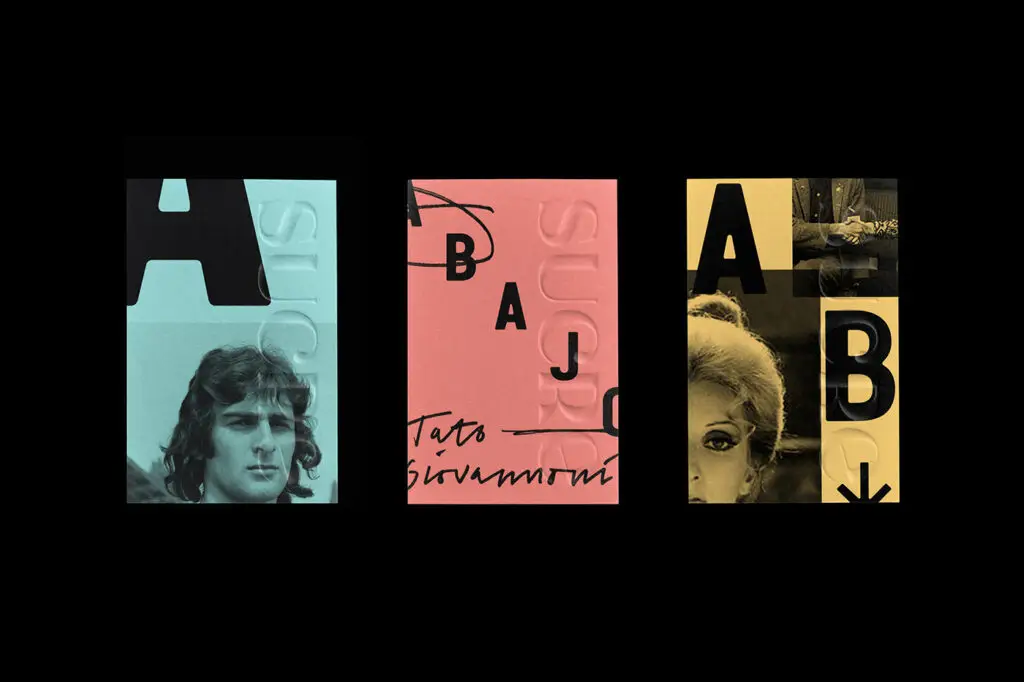
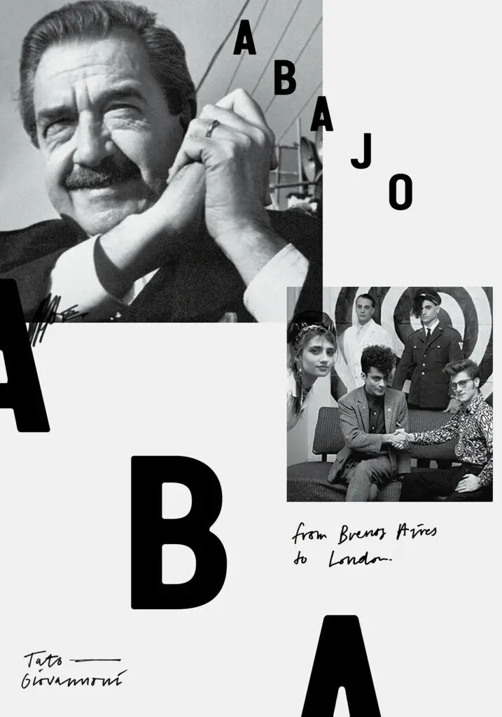
Building on the story is the bar downstairs, Abajo. The bar’s identity complements the main restuarant, but takes on a bolder, more street-like vibe with black and white photography and grid-breaking layouts. More colors are introduced, as well, giving it an appeal that draws you in.