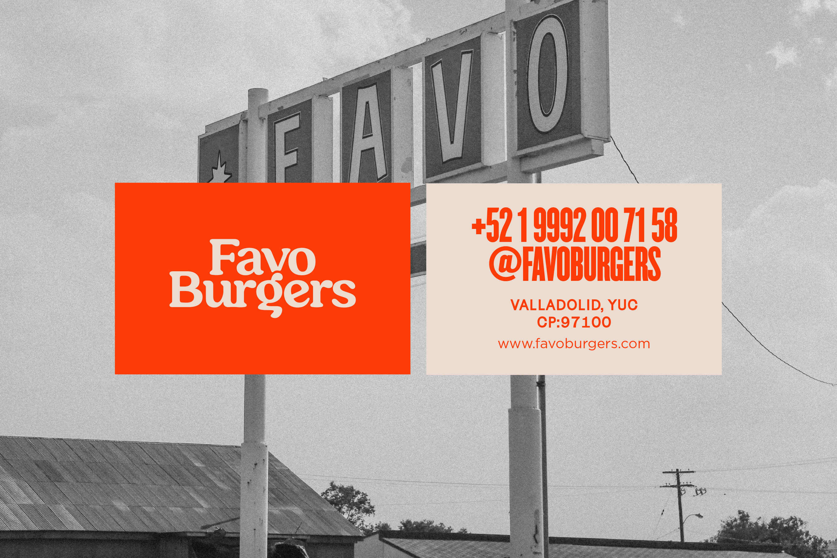
Limited color palettes do anything but limit the design potential, but only the highly skilled can truly unlock their power. Such is the case for Puro Diseño’s design solution for the Favo Burgers brand.
The brand leverages a refreshing and warm orange color with a slightly off-white counter. Together they push forward the brand from the core identity to every corner and touchpoint.
Unlike many brands out there, Favo doesn’t commit to a singular logo solution. Instead, many logos have been established as a collective primary. This allows the brand to have multiple personalities by design. All of them are uniquely retro and throwback.
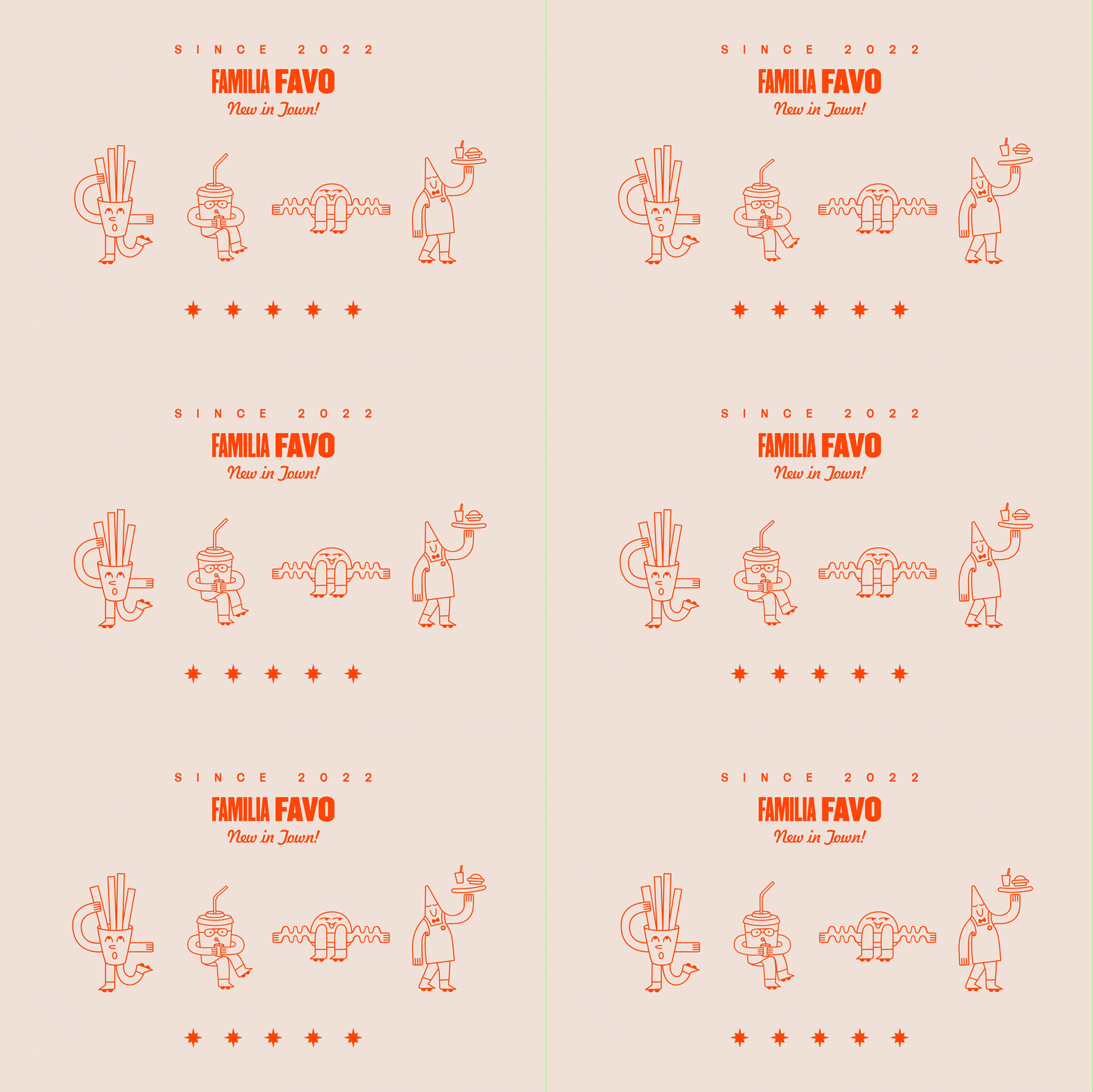
From this basis, the brand expands its semi-retro vibe across the packaging and marketing touchpoints. Together, it congeals nicely. Add in some fun, simple illustrations and the identity system is set.


