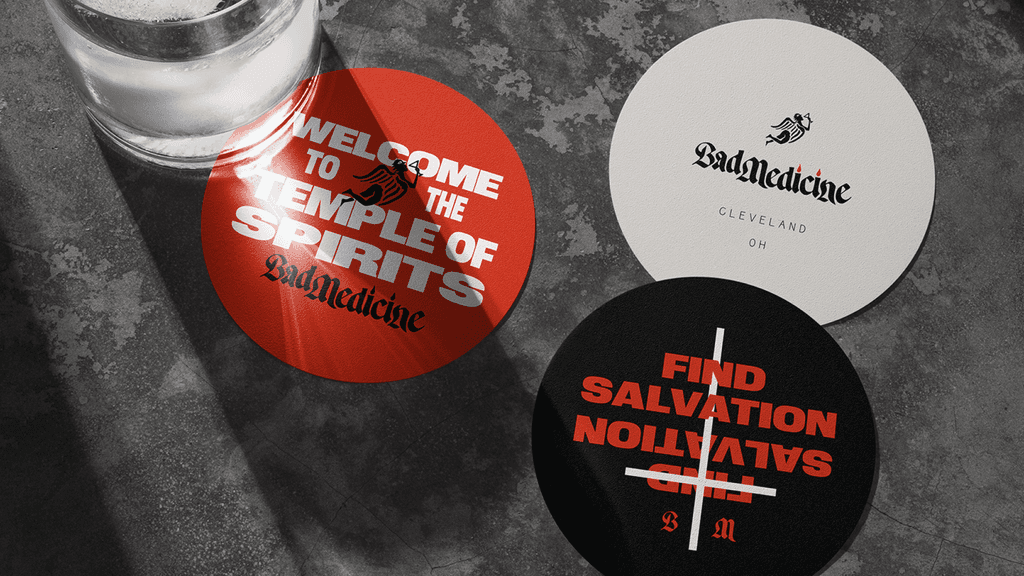
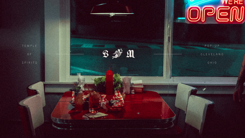
Jon Contino’s brand identity for this Cleveland bar is top notch. Using black letter typography in a way that doesn’t feel Bavarian is a fete within itself, but infusing it with the right amount of grit and attitude is next level.
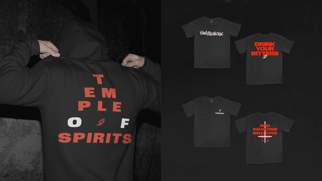
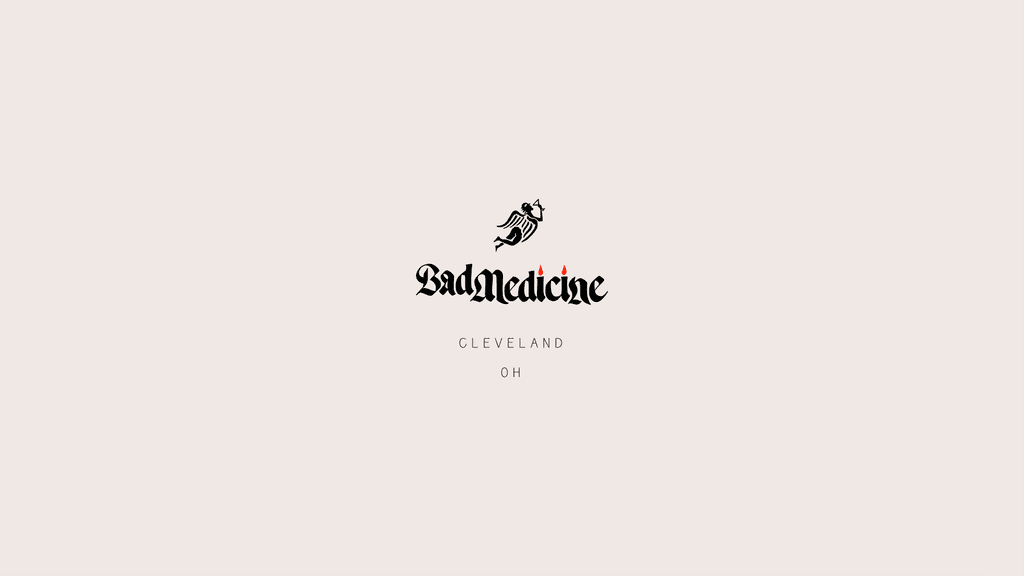
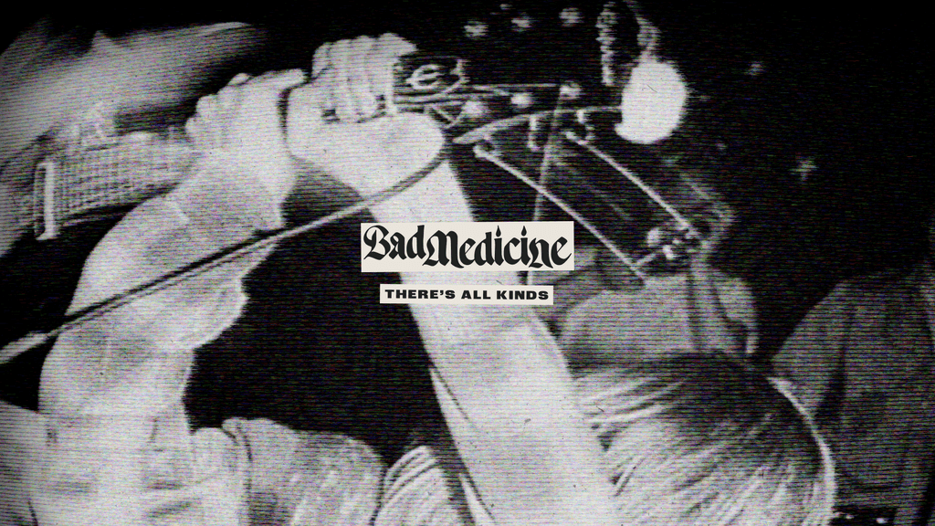
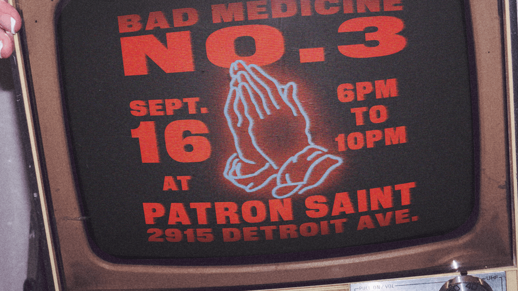
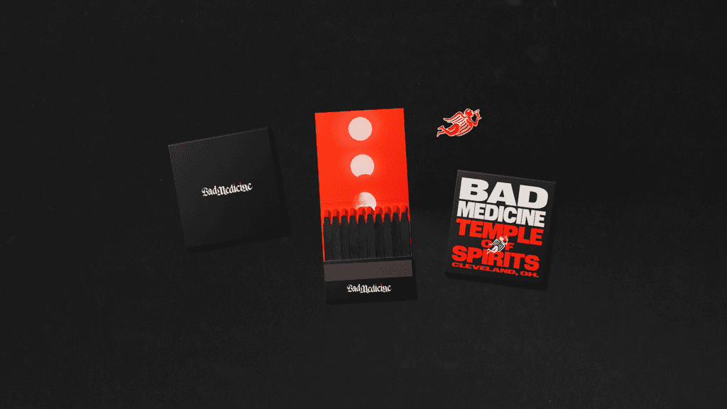
The identity for Mad Medicine it led by a blackletter style typographic treatment. Two candles are worked into the letterforms to create a unique feel that’s gives a moody vibe out of the gate. Upon this base, Contino works in thick, industrial strength typography to solidify a look that feels inherently Cleveland.
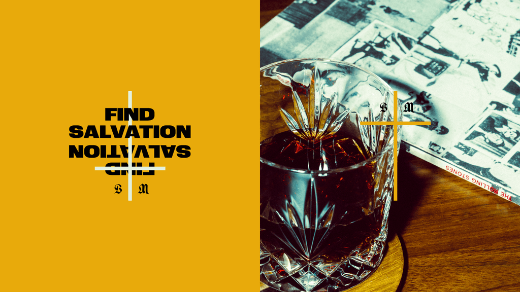
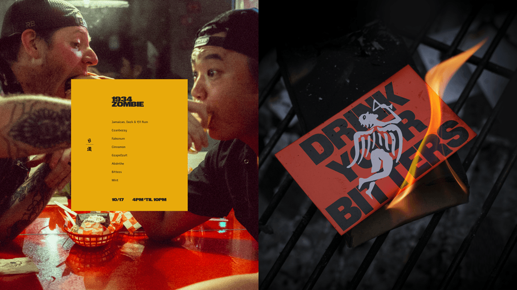
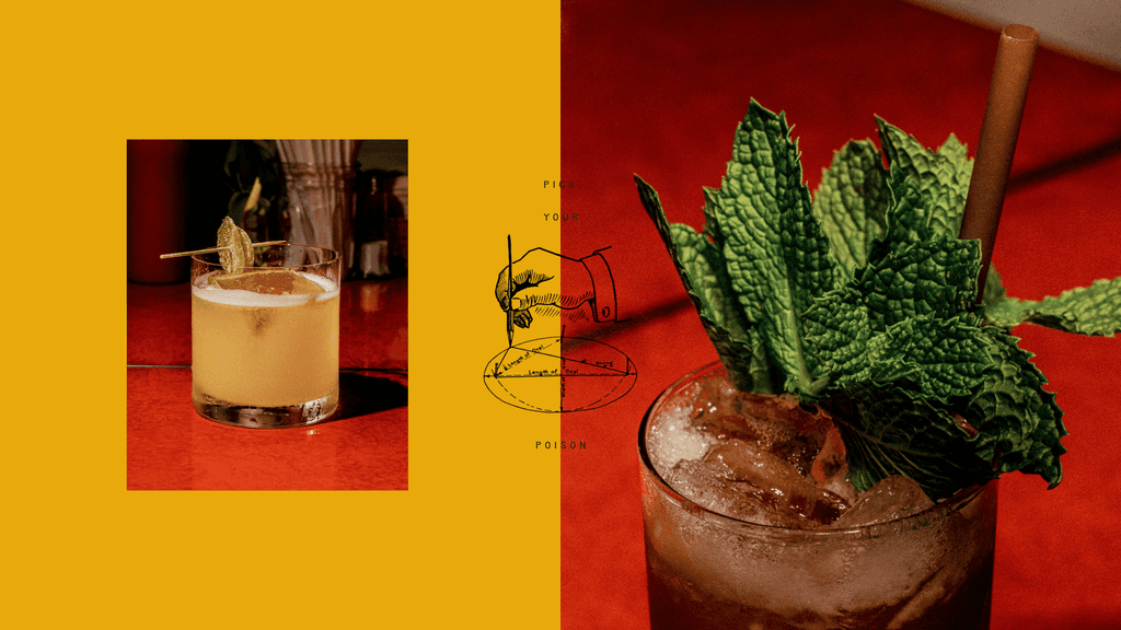
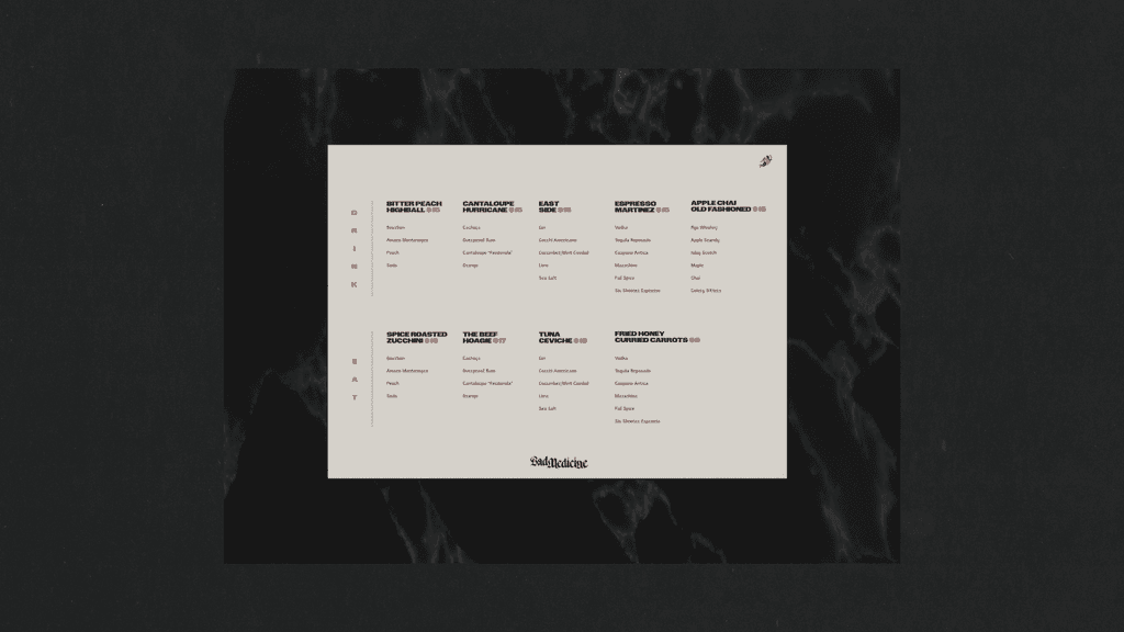
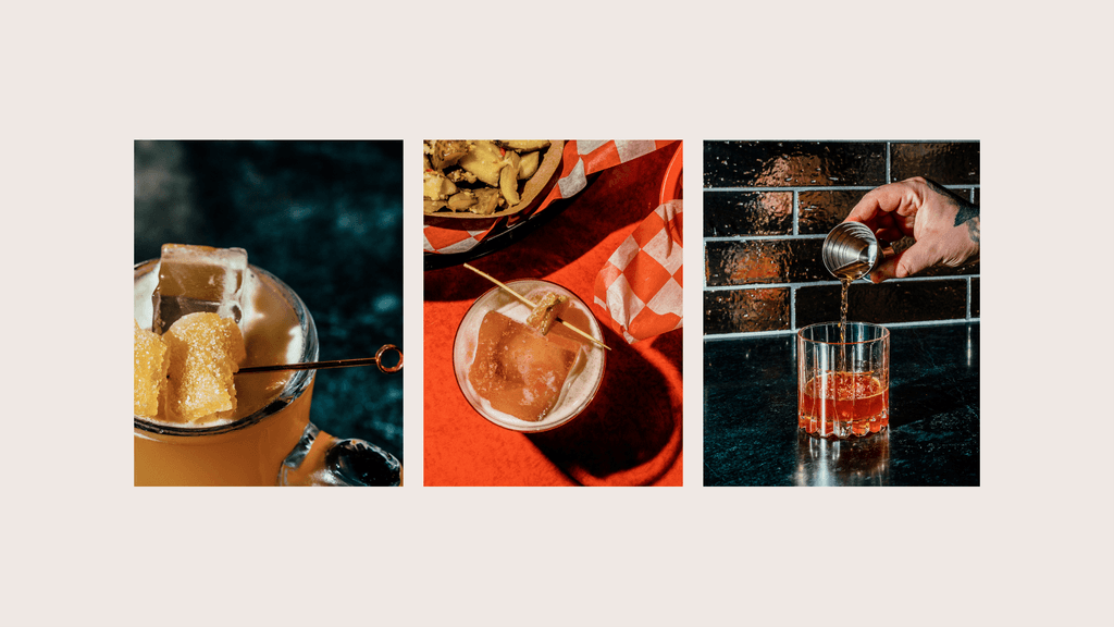
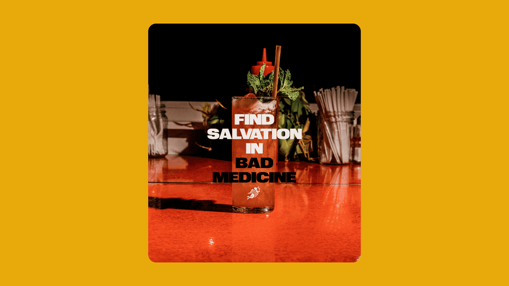
Deep orange red, mustard yellow, and a soft black color comprise the color palette with a slightly off white showing up here and there to add another dimension.
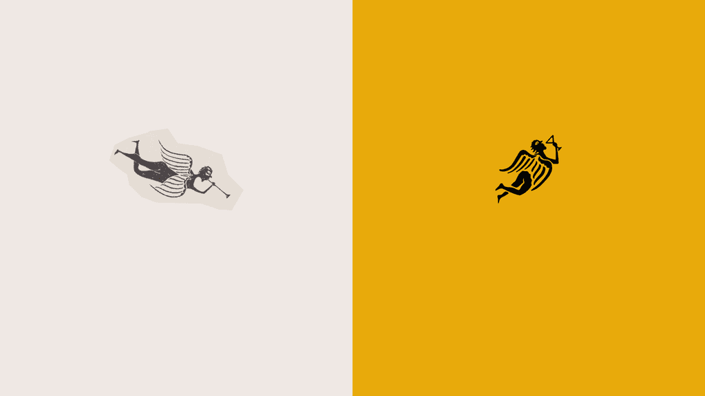
The brand mark comes directly from a tombstone rubbing. It’s an angel holding a Pimm’s cup. It’s striking and adds that slight sacrilegious touch to the overall look.