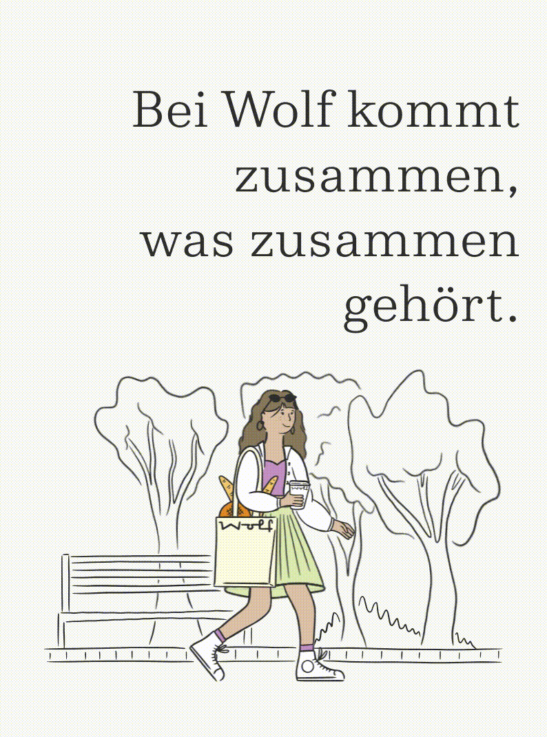
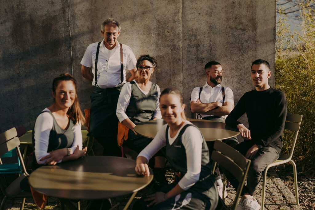
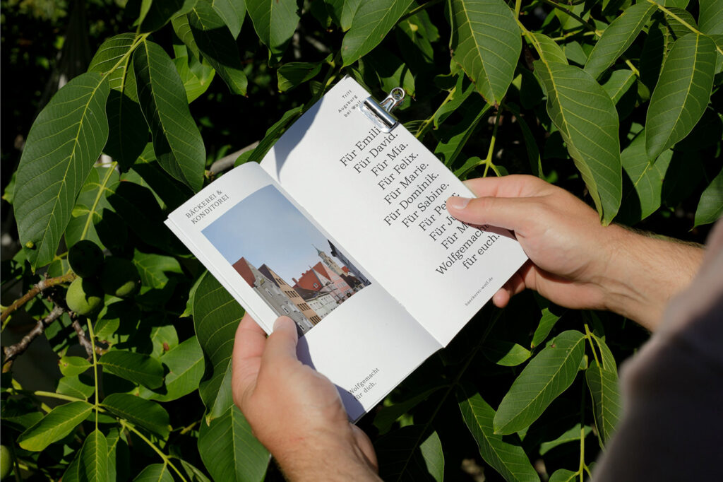
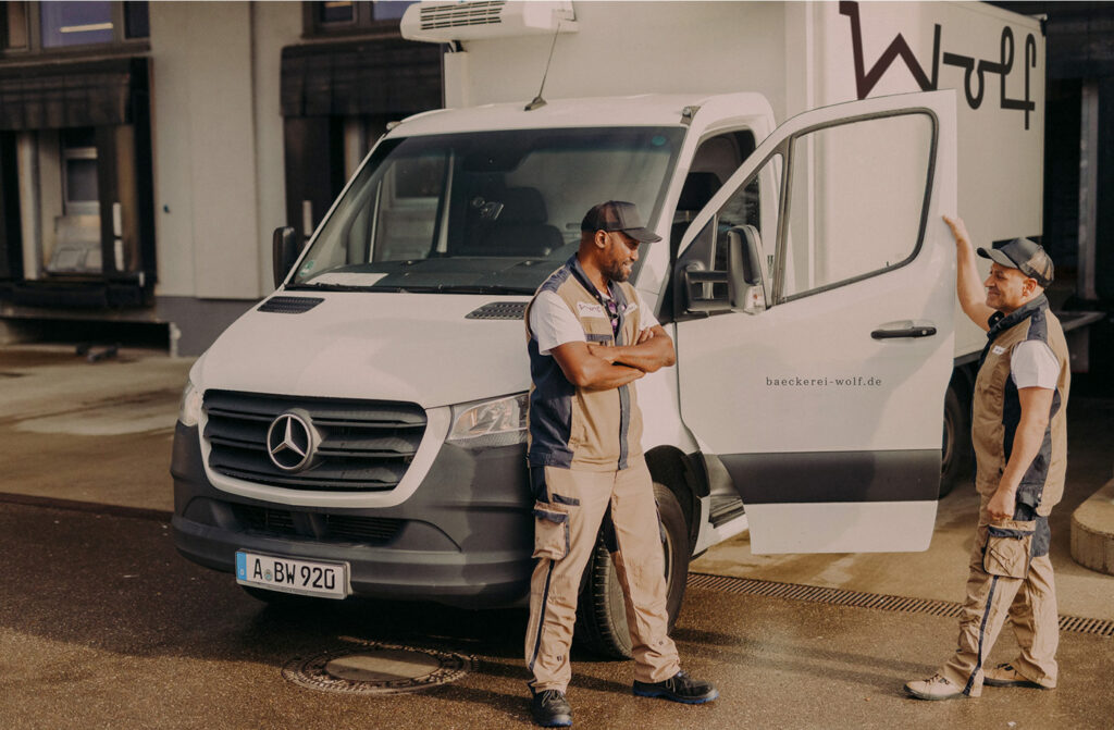
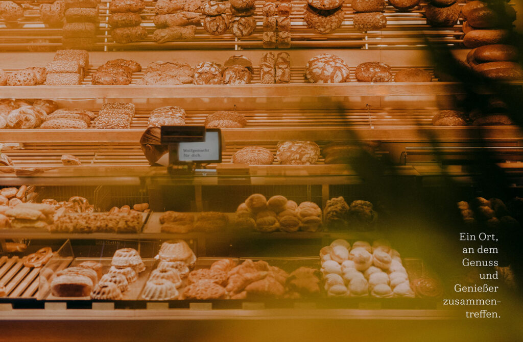
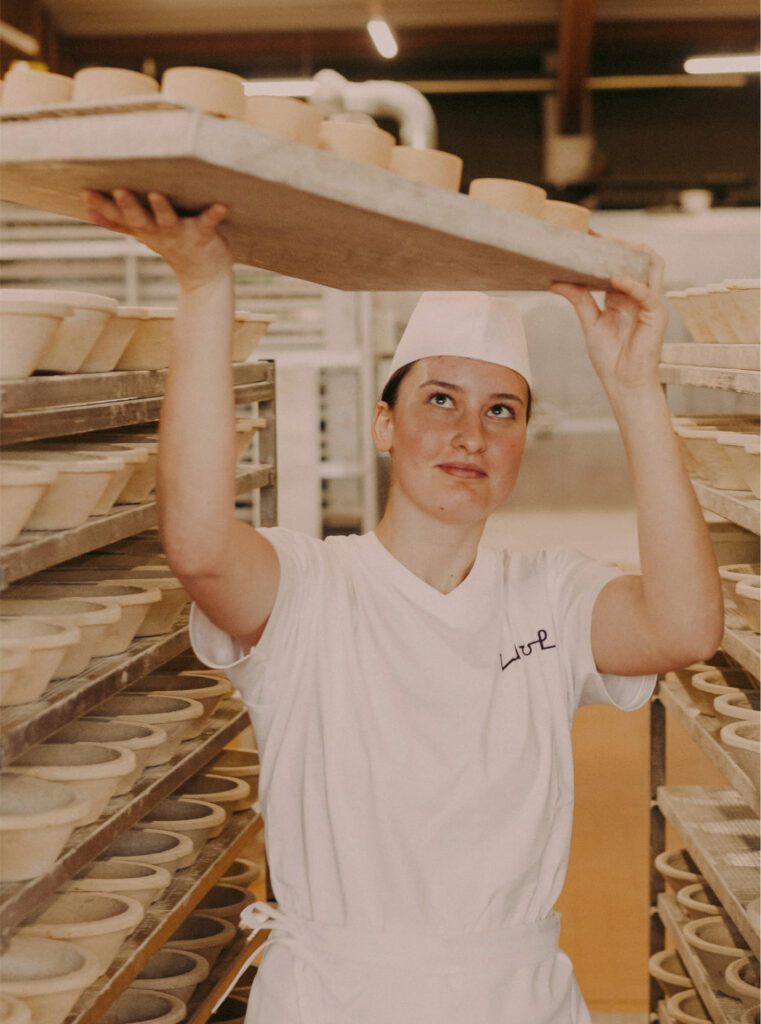
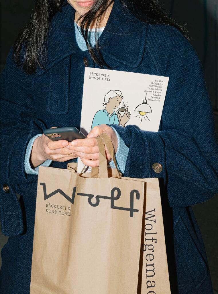
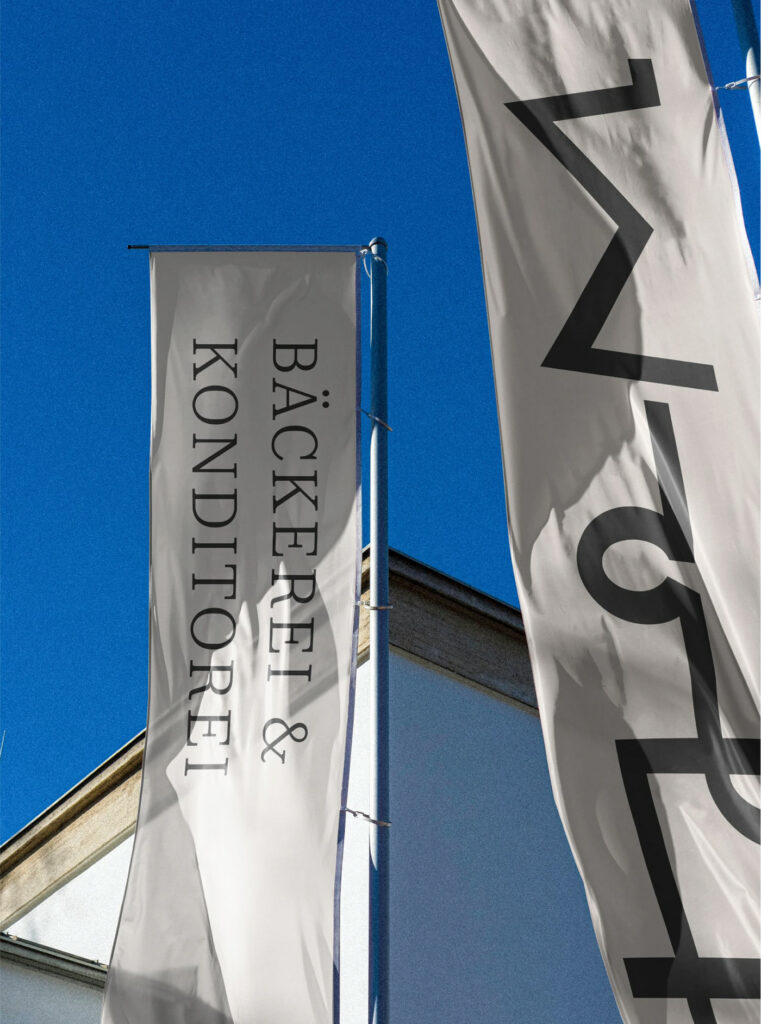
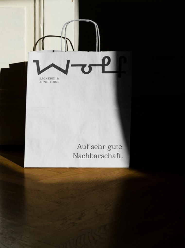
Moodley’s brand identity design for Bäckerei Wolf is an exploration of modernized meets classic design. Supported by a gorgeously strong serif type family, the brand presents as confident, clean, and craft.
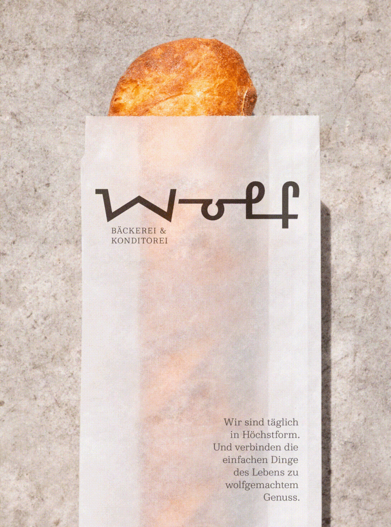
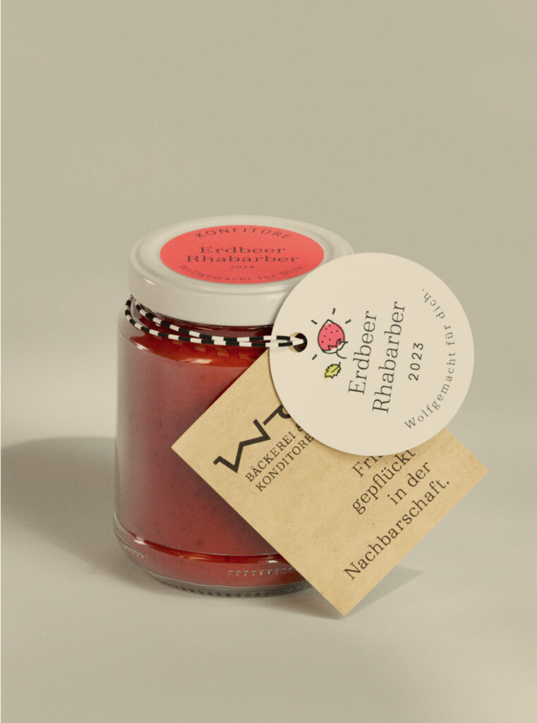
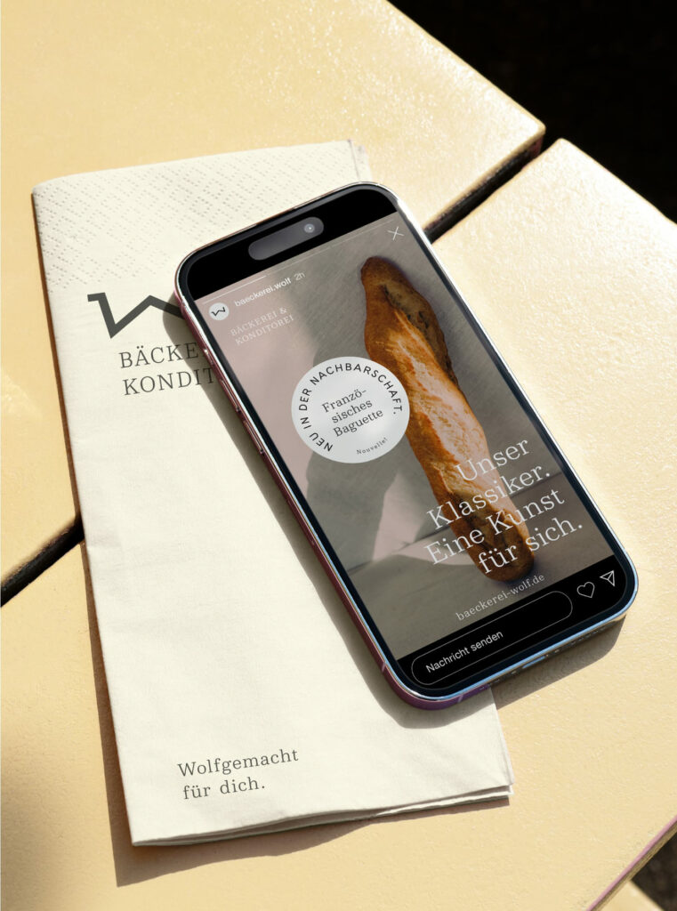
What initially grabbed my attention was the custom typeface created for the word “wolf.” The thicker, harsh angled line work feels Art Deco era in its approach. It evokes the same vibe as the typography found on antique wood boats, or an industrial era coffee machine. It’s wildly beautiful and unique and serves as a great offset to the perfectionist serif core.
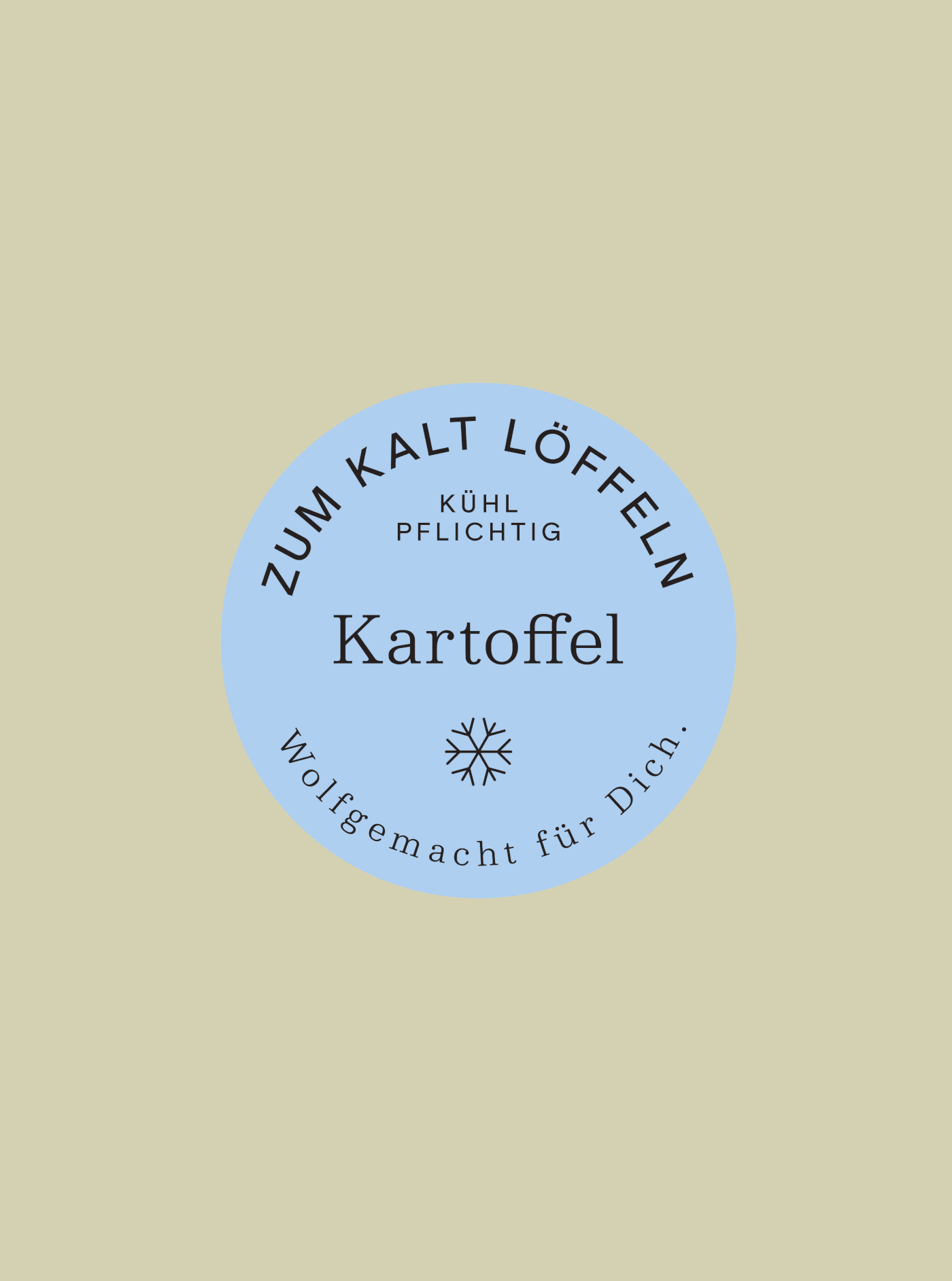
The typography selection doesn’t stop there. No, the Moodley team introduces a thin sans-serif on packaging to create another dimension to the brand’s identity. This addition gives the brand a full visual language without shifting the cumulative feel and personality.
Principles and grid-adherent design takes stride across multiple touchpoints. While each are unique in their expression, they don’t stray too far from the simplicity of the soft white and soft black color palette, nor do they veer off the strong grid layout path. The result is a refined identity worthy of a high craft concept like Bäckerei Wolf.