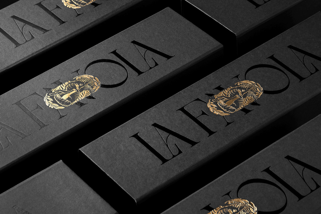
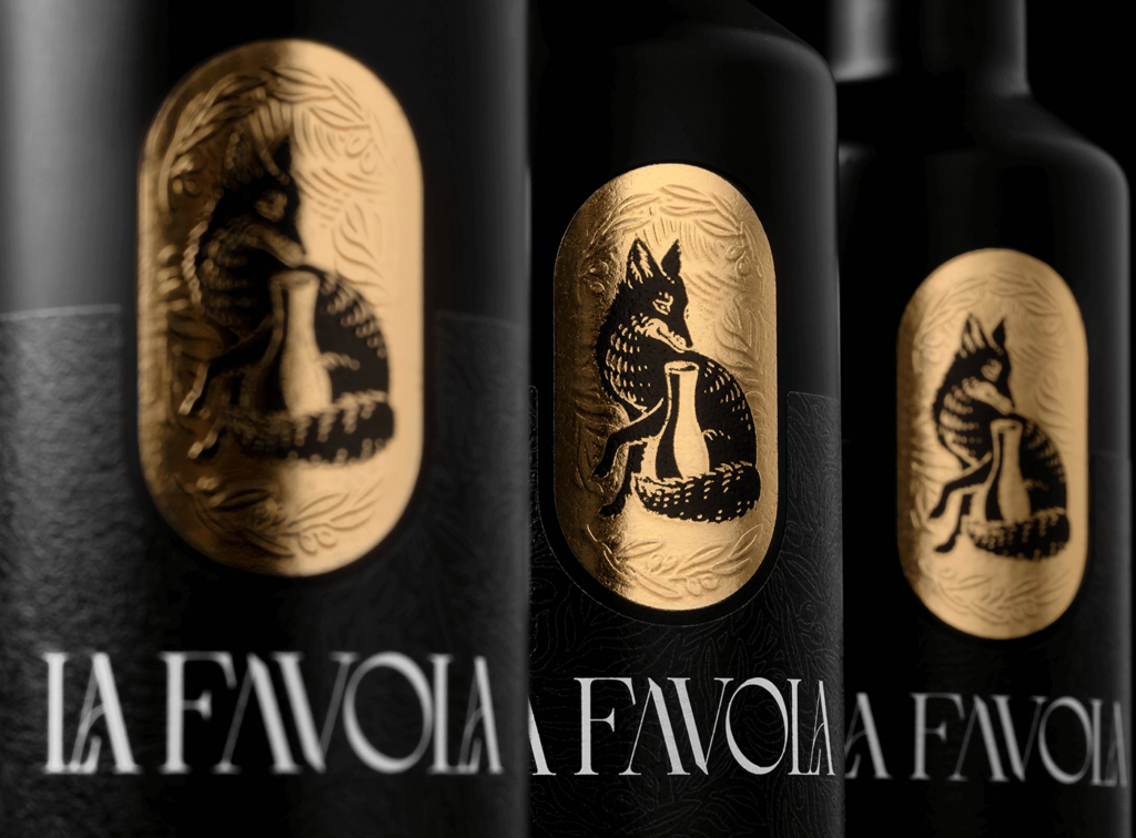
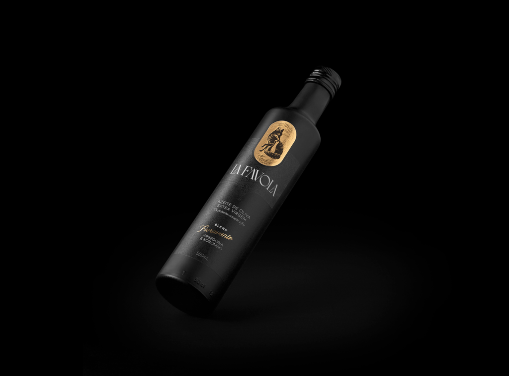
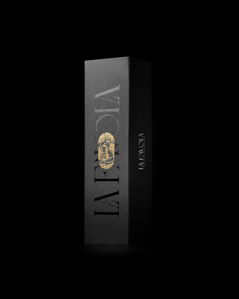
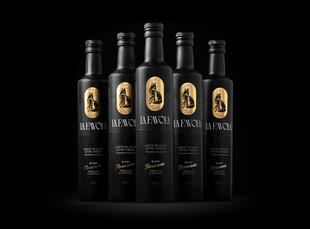
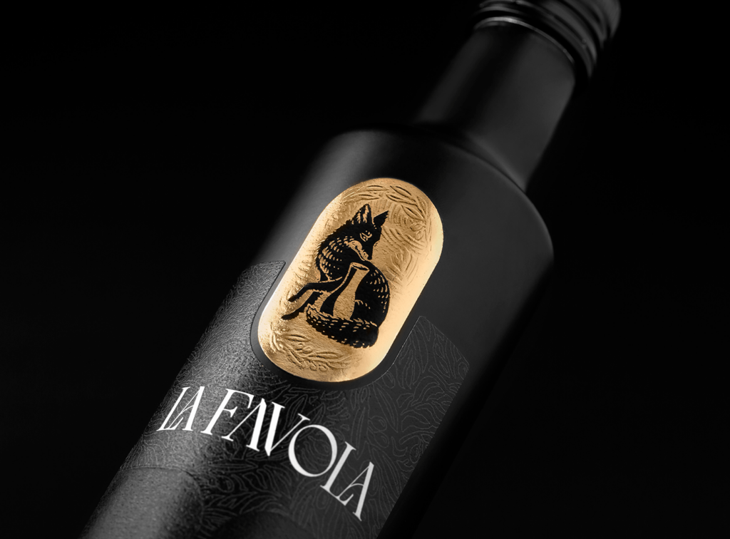
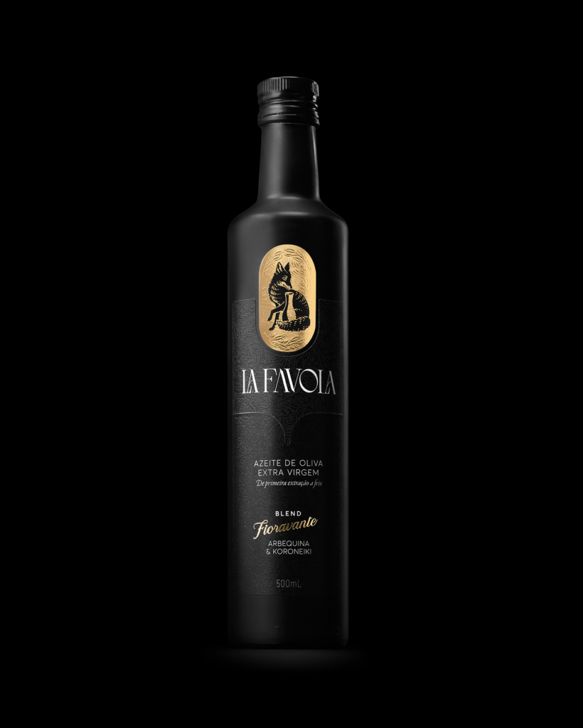
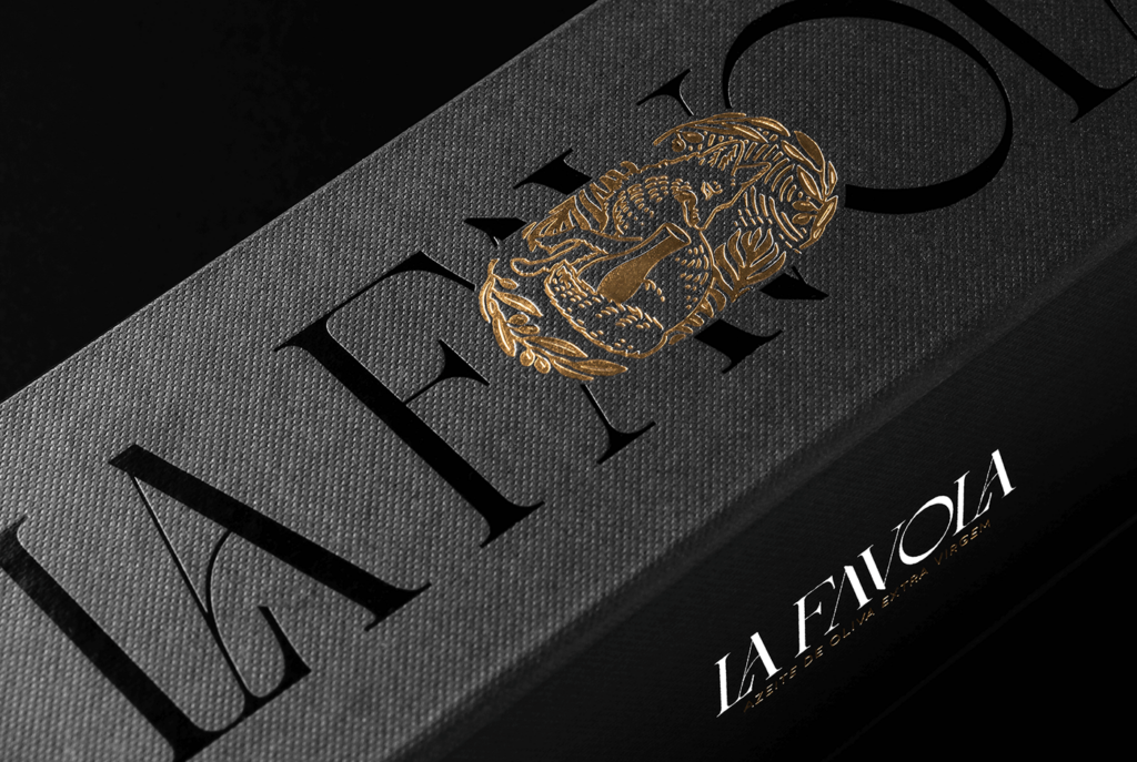
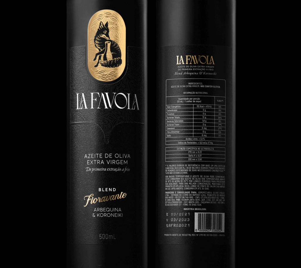
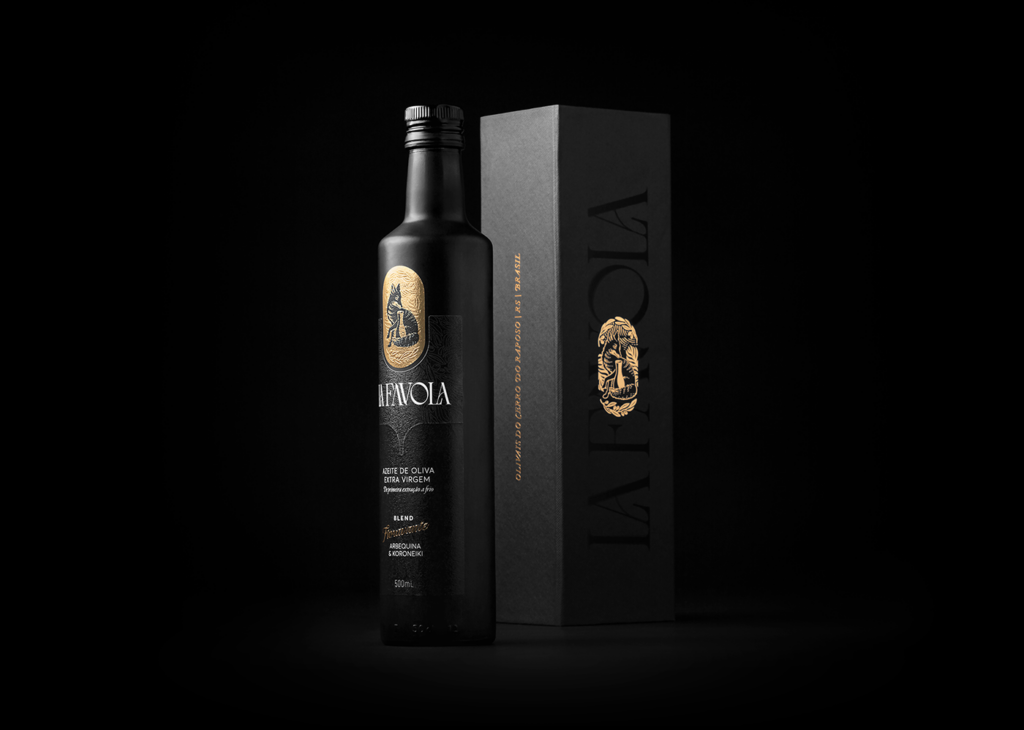
Beautiful high contrast serif typography pulls Art Nouveau elegance while detailed, traditional illustration accentuates the luxurious feel for this olive oil brand.
The main typeface is familial with classics like Bodoni, with hyper thin serifs creating a sense of precision. Curvature provides an organic element to an otherwise structured type family putting a finishing touch to the high couture feeling of the typography.
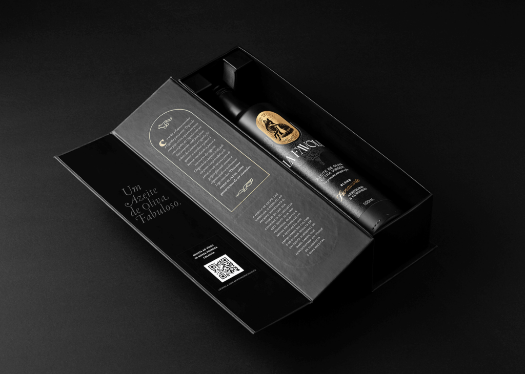
Deep, rich black and use of finishing techniques and textures use light to create a highly detailed and layered package design experience. Gold foil stamping pops off the packaging with that deep background.
The design work for La Favola is an exercise in luxury design at its finest. Every part of the project is worth absorbing and enjoying.