Maximum meaning, minimal means, to me, has always been the hallmark of remarkable design. Despite the rise in popularity of Maximalism design movements, this still reins supreme in my head and heart. Kate Zest’s design work for South House, a vacation rental property in Perth, Australia, is exemplary of this adage in action.
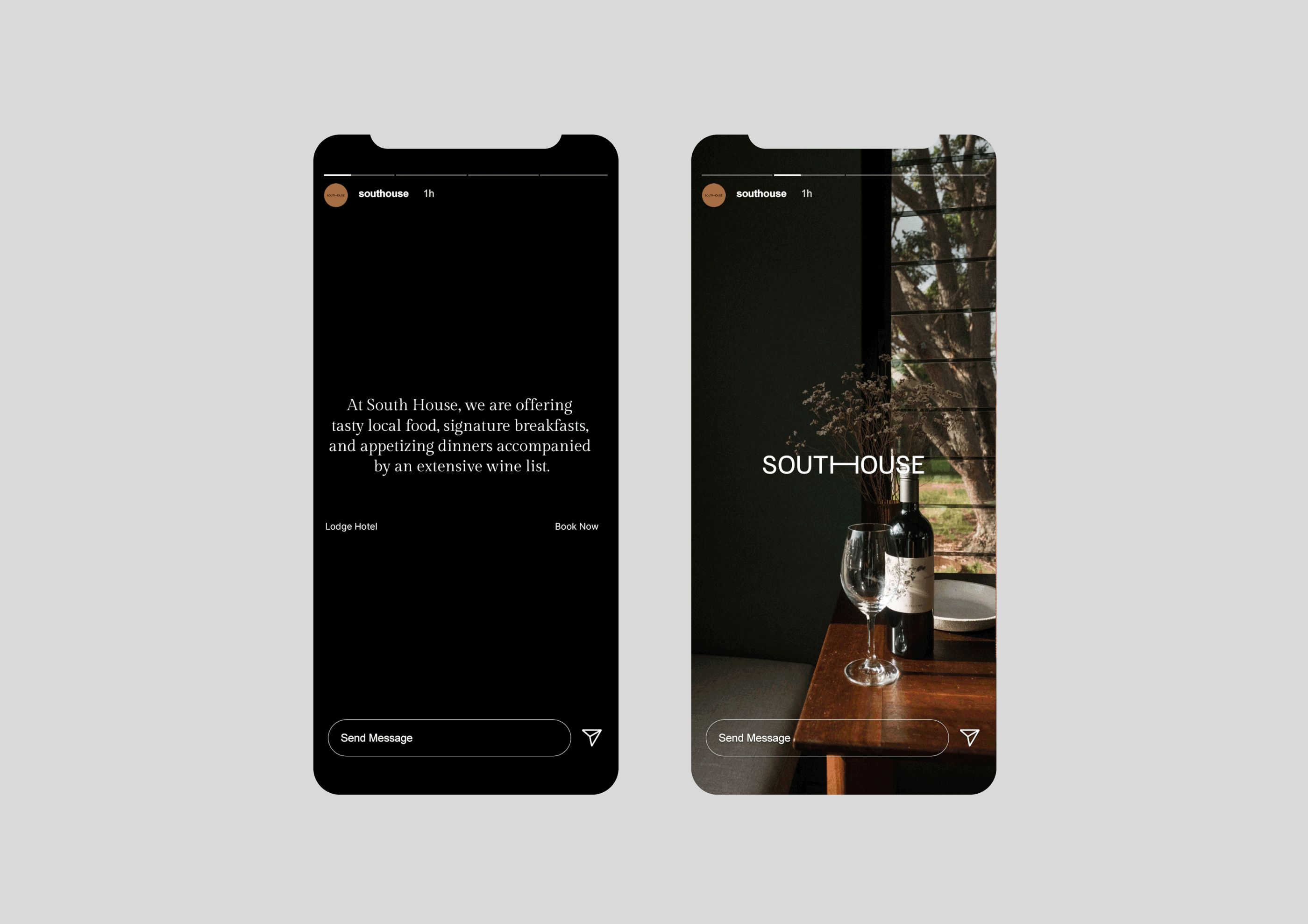
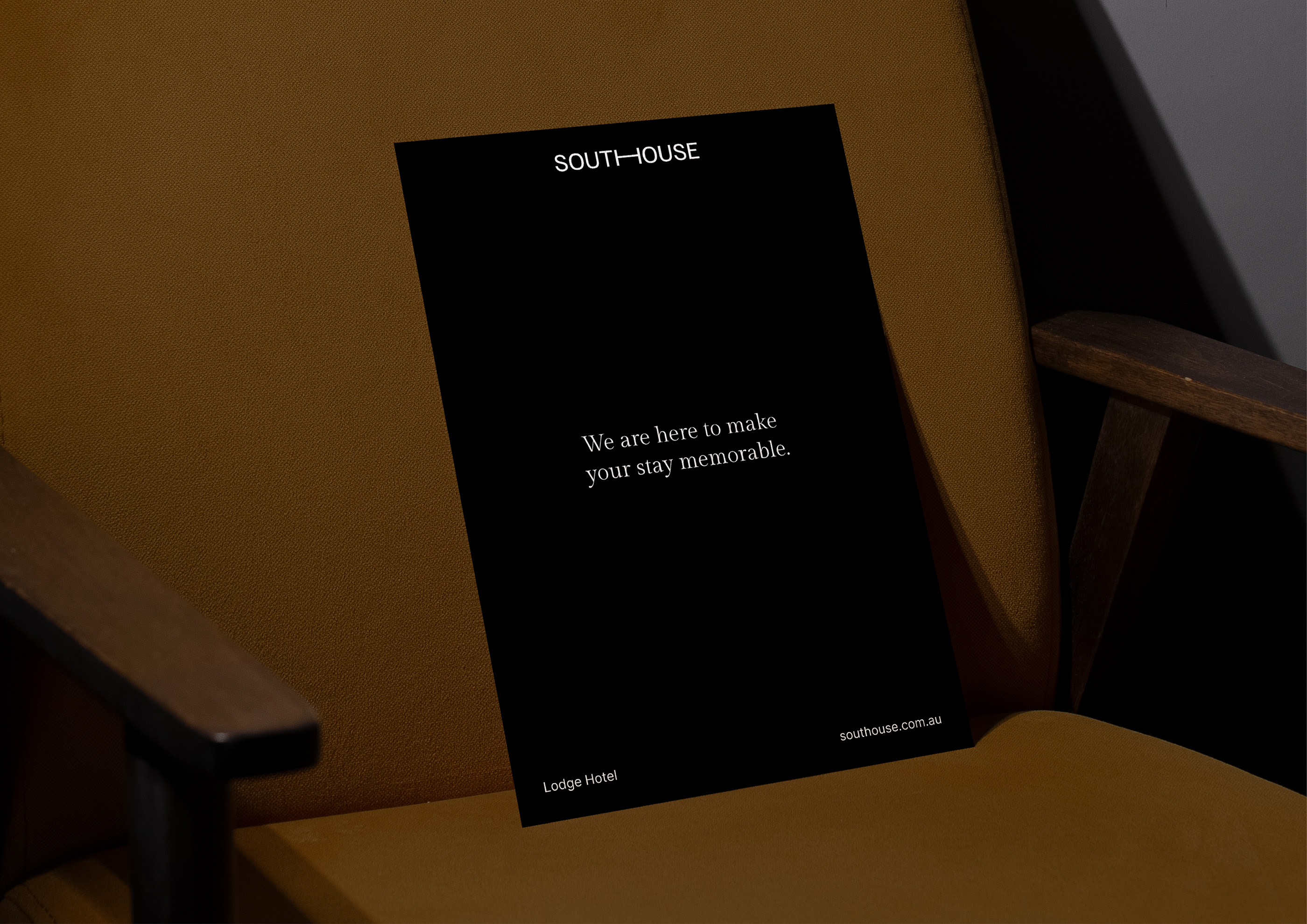
Led by a simple, but profoundly confident type design, South House’s identity sets a calming, sturdy tone from its core. At first, it seems the designer stopped at the logo design, but as one absorbs the other touchpoint that initial perception quickly dissipates.
Using the power of color, minimalist design techniques, and a dash of confidence, Zest crafts a natural expression that’s in line with the visual and visceral aspects of the vacation property and its surroundings.
Earthtones serve as backgrounds for simple layouts while the introduction of a more organic typeface ensures the starkness of the sans-serif, modern typography doesn’t create a cold personality.
Cumulatively, the identity is perfectly aligned with this beautiful getaway property: Structurally, visually, and emotionally.