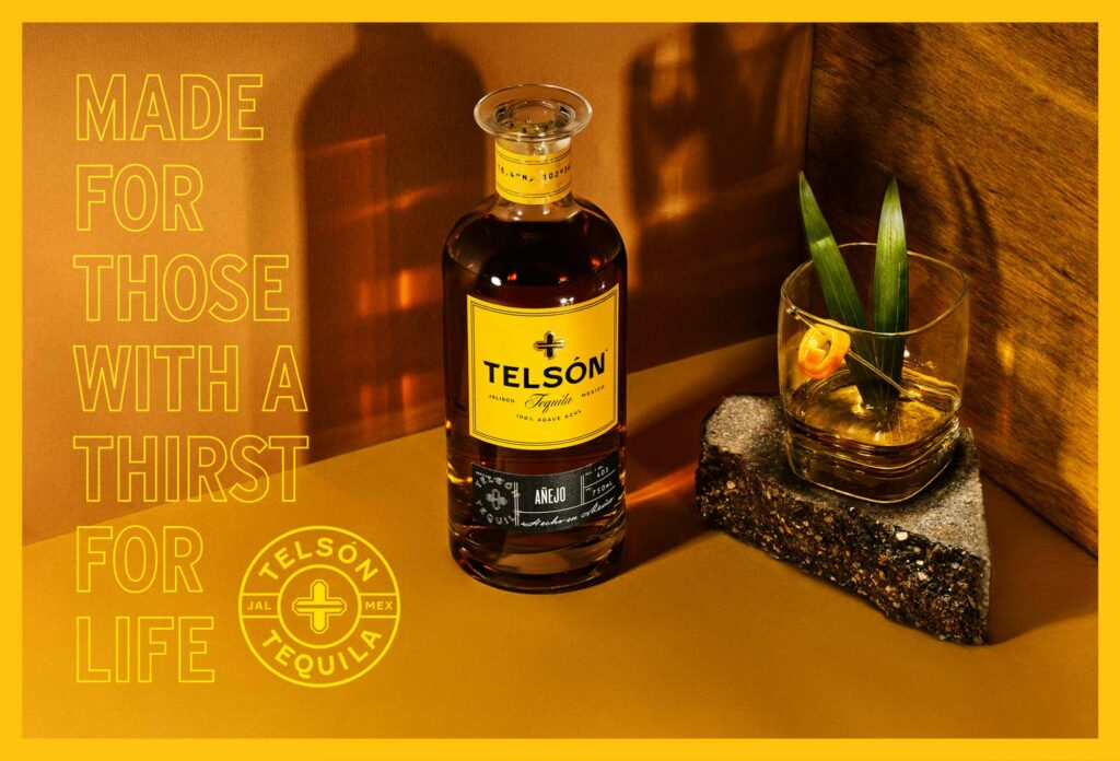
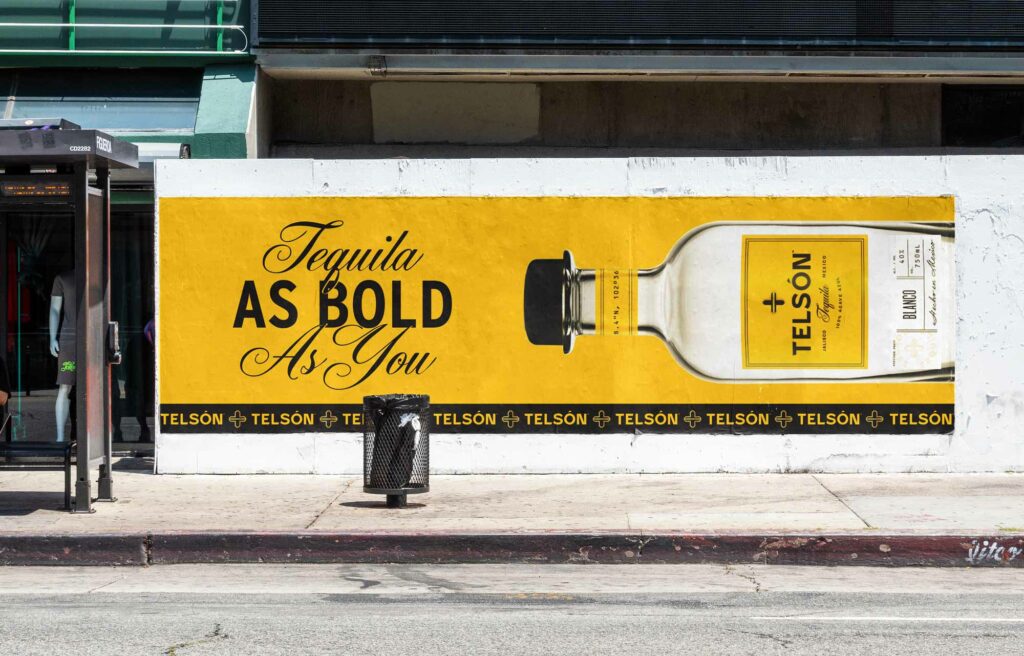
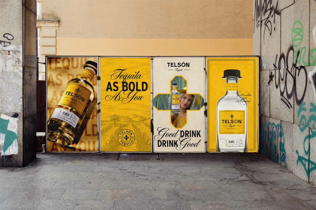
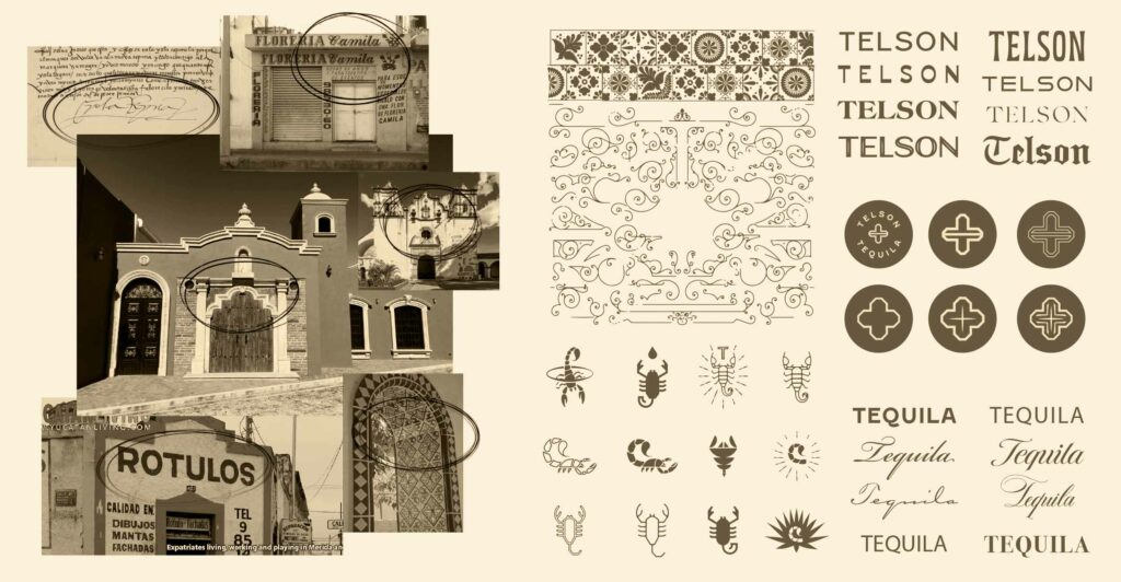
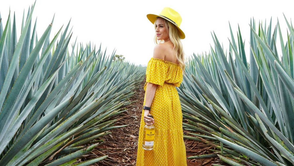
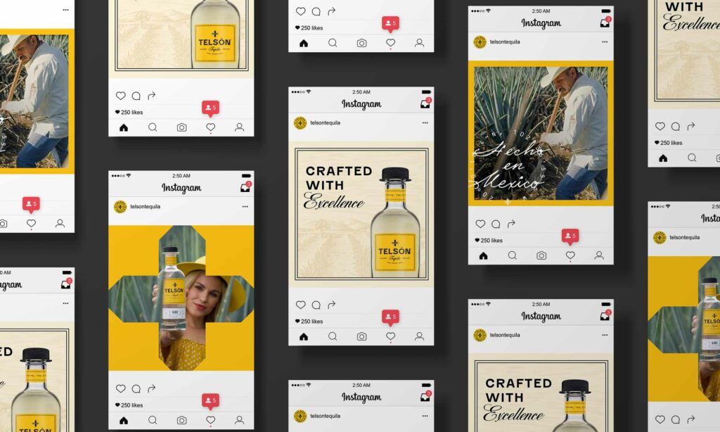
Vicarel Studios’ work for Telson Tequila grabbed my eye on LinkedIn as I was doomscrolling. It’s bright orange-yello color jumped off the feed and as I dug deeper into the full breadth of the work, it just got better and better. Sort of like a fine tequila.
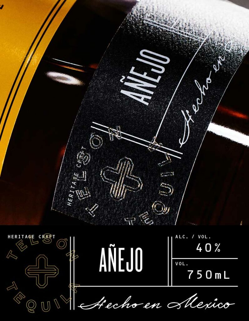
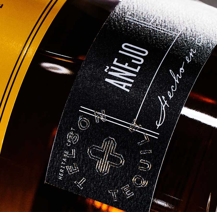
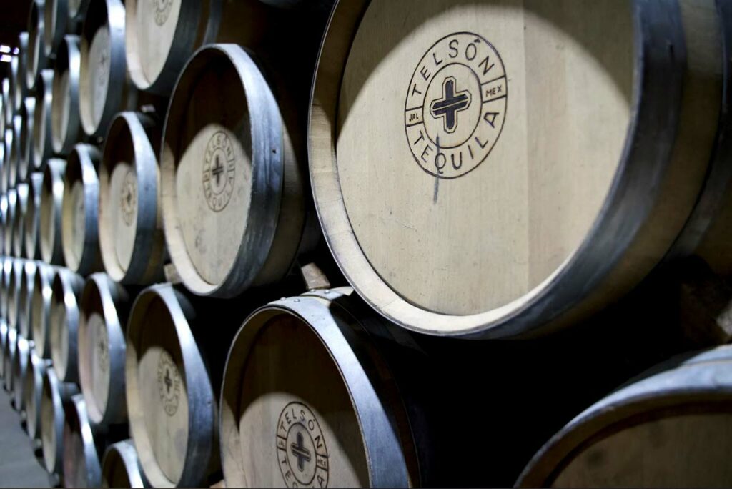
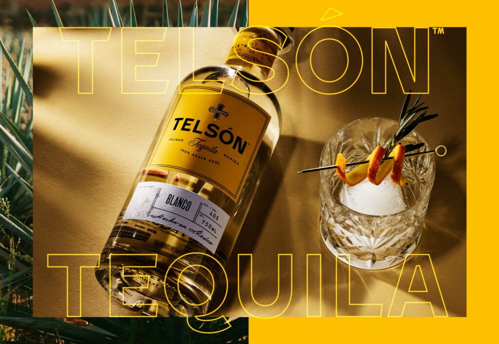
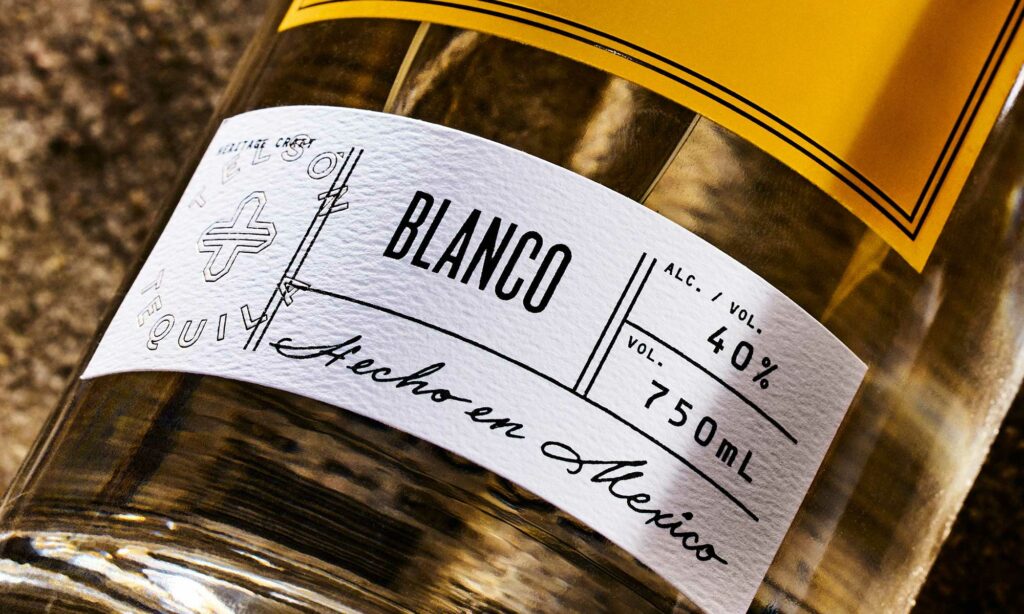
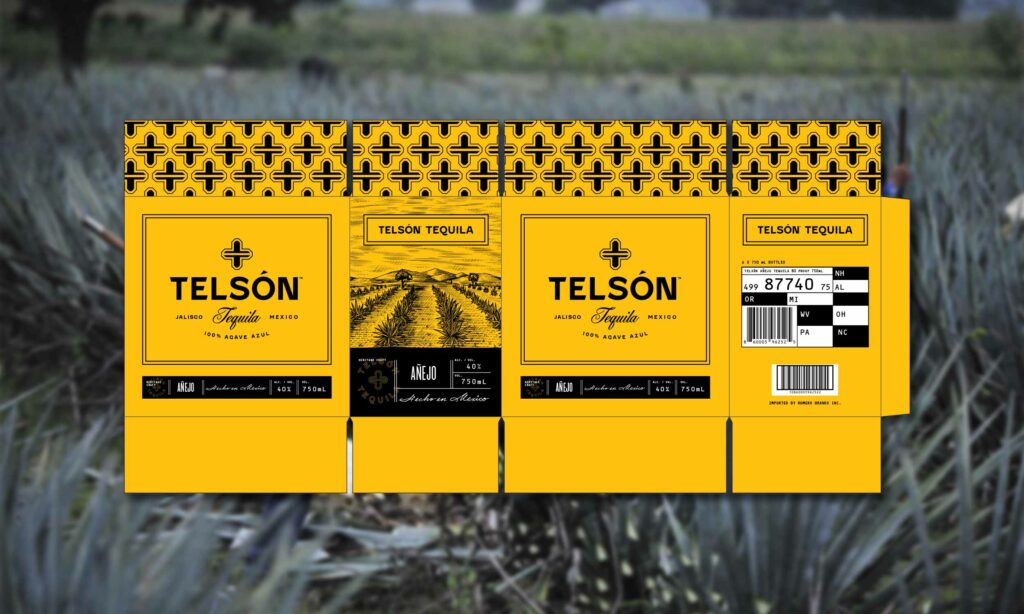
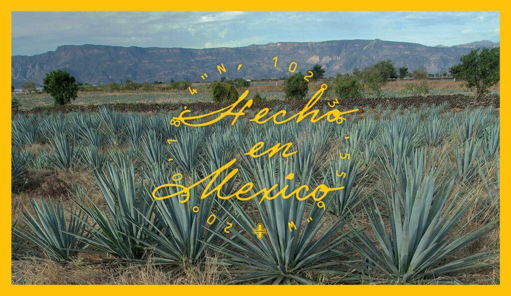
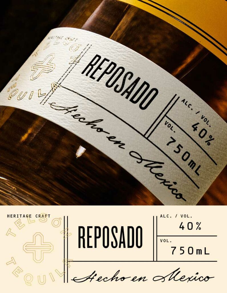
Pulling inspiration from Mexican architecture and history, the team identified some common patterns that easily translated to the “T” letterform while rooting the brand in authenticity. Building from that basis, the team established a mix of tradition spirits style layout with modern touches.
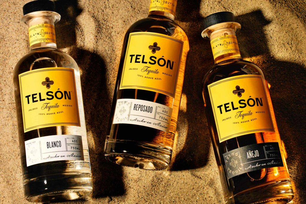
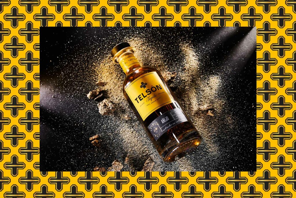
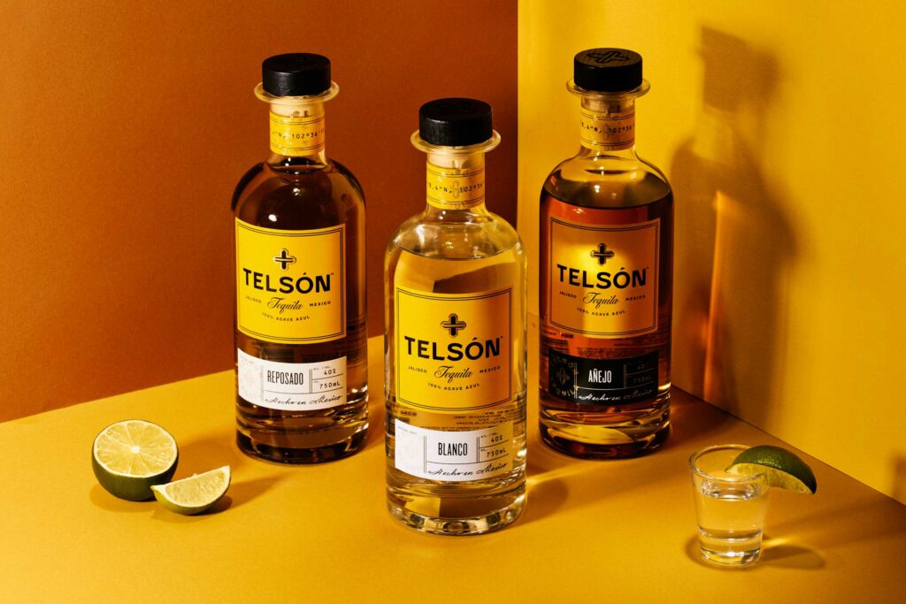
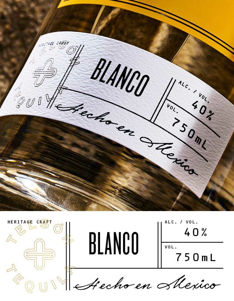
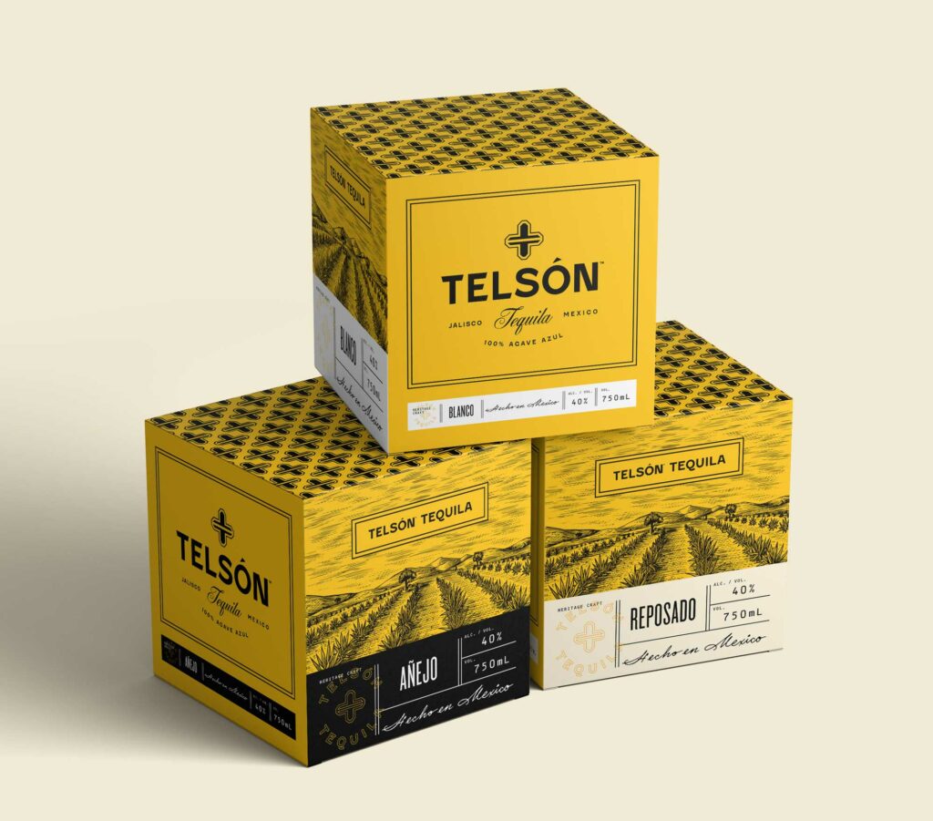
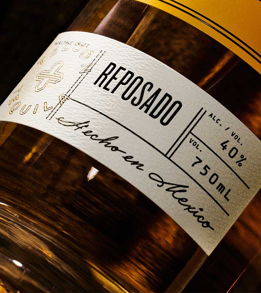
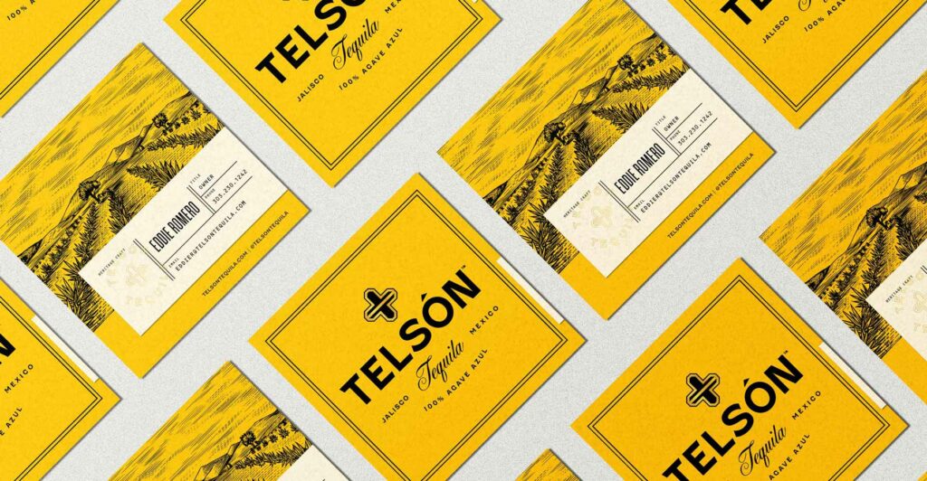
The balance between authentic and premium was executed with excellence using various type styles that created a high touch feel without losing the history. Multiple label applications creates a dynamic aspect to the packaging giving it that high touch feel as well.
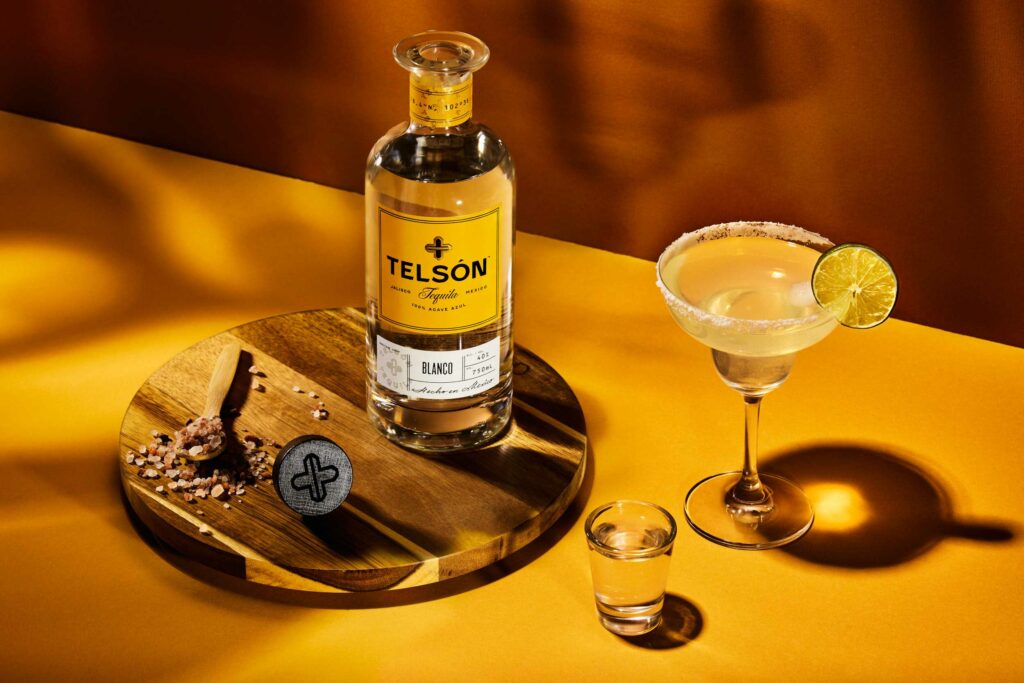
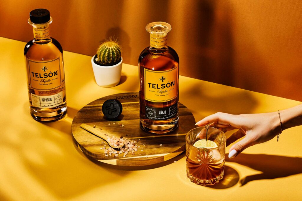
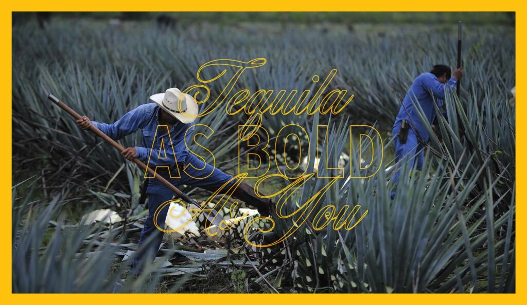
While this isn’t a complete deviation from tyipcal tequila and mezcal design styles, it is a step out of the box that pulls inspiration from other spirits and wine identities to elevate the feel. Overall it’s a triumph and worth celebrating with a sip or five.