If you haven’t encountered Jones Knowles Ritchie’s work, it’s because you simply didn’t know they did it. JKR have been creating amazing rebranding efforts for some of the most well known brands today. Dunkin Donuts, Burger King, Budweiser, and M&M’s are a just a few. Each one as good as, or better than, the last.
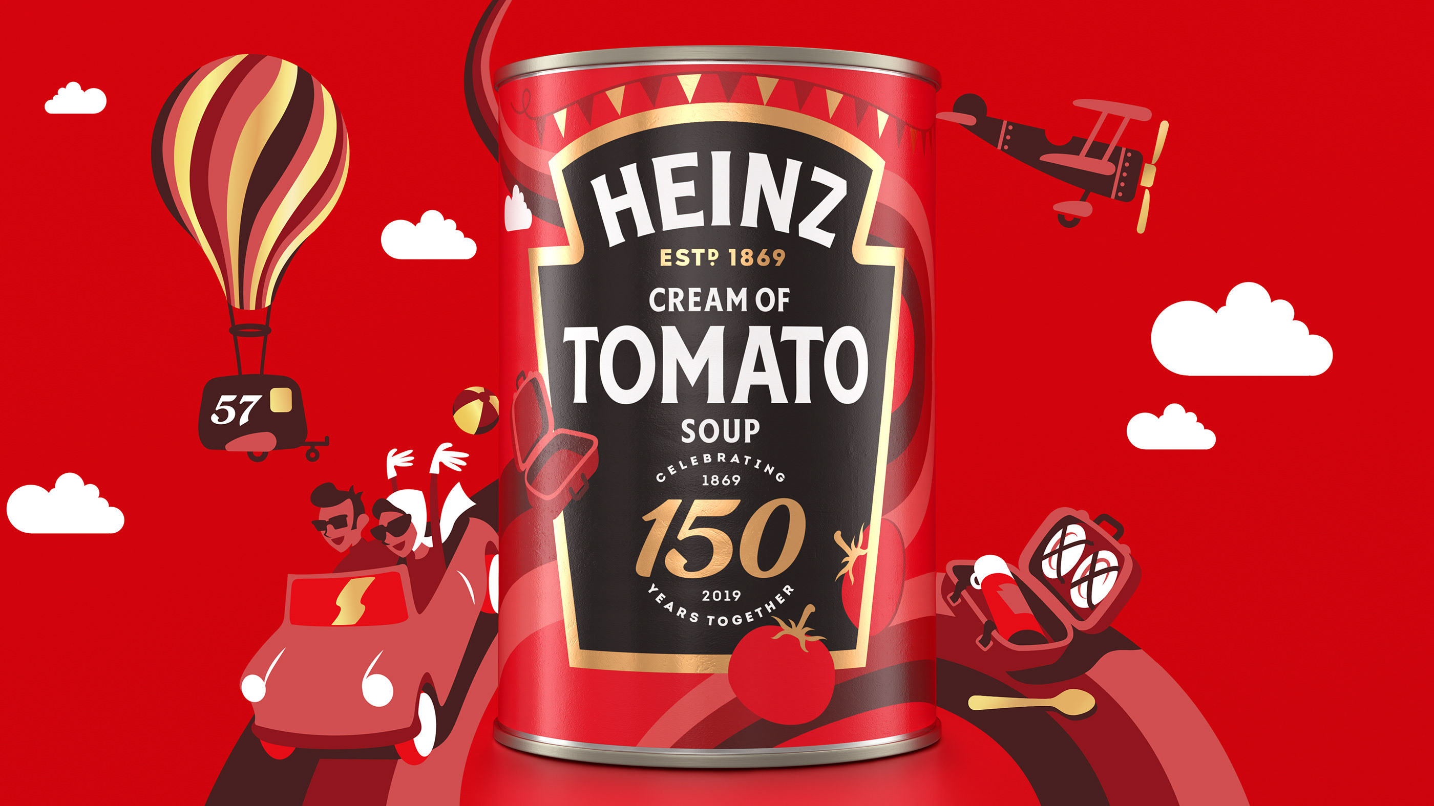
Today we jump into the agency’s work for Heinz to commemorate 150 years of the food giant. The design solution is a refreshed label design mixed with supporting illustrations that create a jovial, fun expression of Heinz. From hot air balloons to rainbows and clouds, each can and product gets its own vibe.
Heinz core label element is distilled to the most powerful, ownable graphic. The black background gold outlined keystone-like shape becomes Heinz’s defining brand element in this rejuvenated look.


