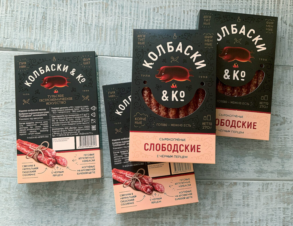
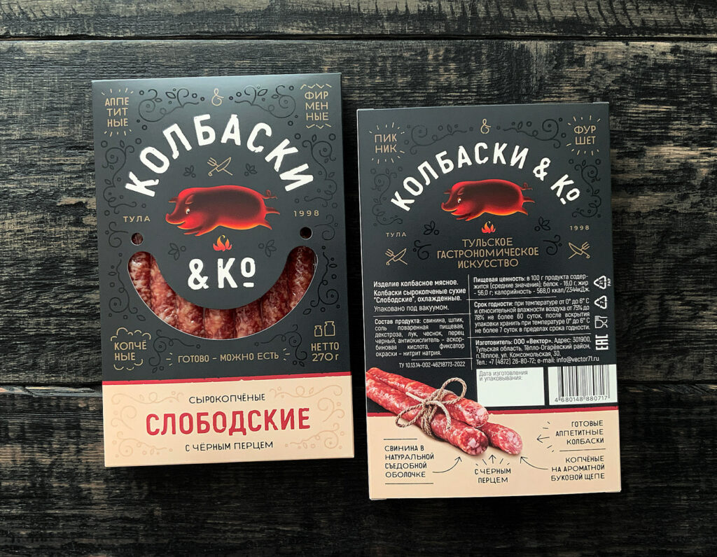
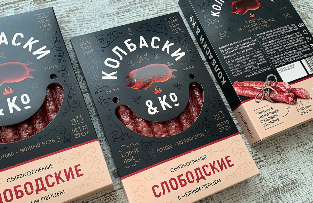
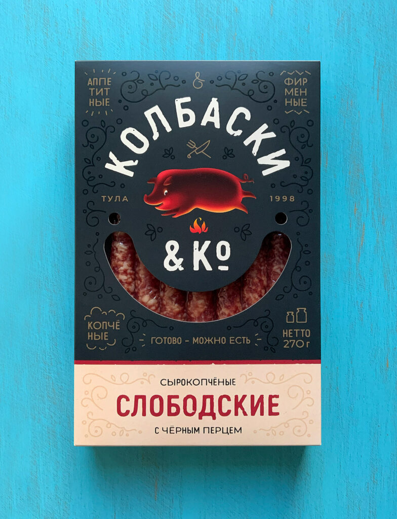
The packaging for Co & Co immediately struck me as interesting because of multiple elements. The illustrations were not the trending styles of moment, and the typography was in the not Latin script alphabet, but was still effective for a person who doesn’t read Cyrillic.
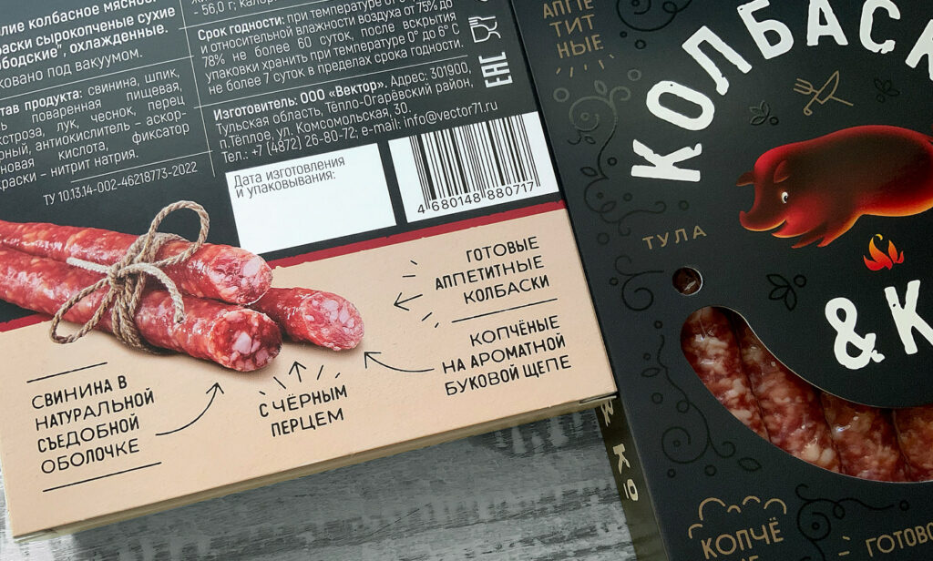
The deep black background creates a moody vibe to the piece. It allows for lighter typography to pop while creating softer midtone colors to take a secondary, but effective roll.
The illustration feels vintage in its style. It’s fun an can even draw a smile when one thinks that a roasting pig would be smiling and not screaming. The color treatment of the illustration is really gripping as it aligned with the dark background. Rather than making the shadows on the edges of the pig, the highlights are there instead. It’s intriguing and fresh.
The remaining parts of the composition make great use of typographic hierarchy and strong color usage to create a well concerted packaging design.