Crisol Empanadas food branding & package design
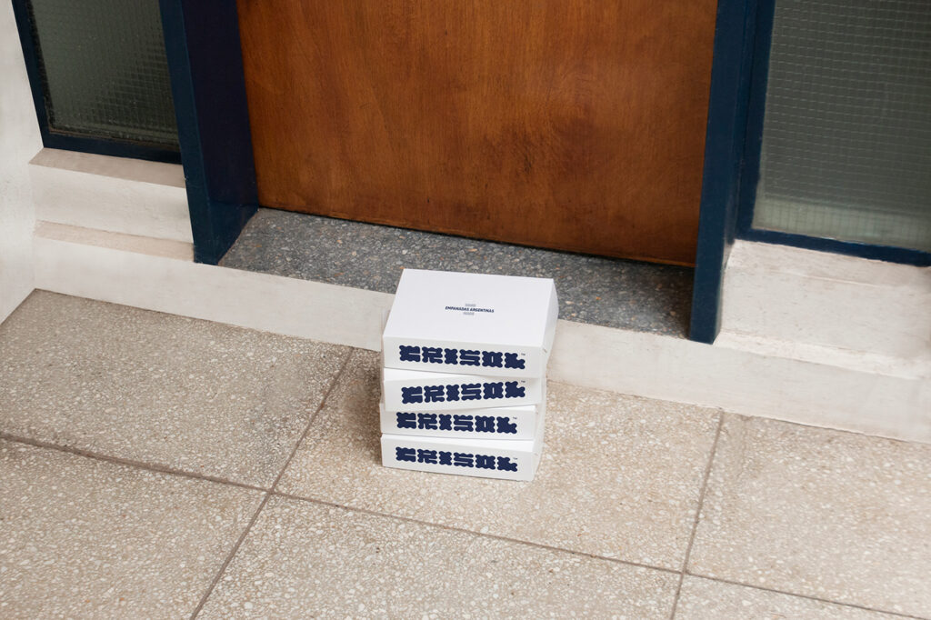
I’ve really enjoyed the reclamation of Art Nouveau typography and experimental typography. Stemming from an era where the sans-serif simplicity reined supreme, this new movement brings forth beauty and life. Crisol is another example of the daring and smart typographic design that’s leading the charge today. Crisol is an empanada restaurant and food brand based in […]
Reclusa Parda restaurant branding
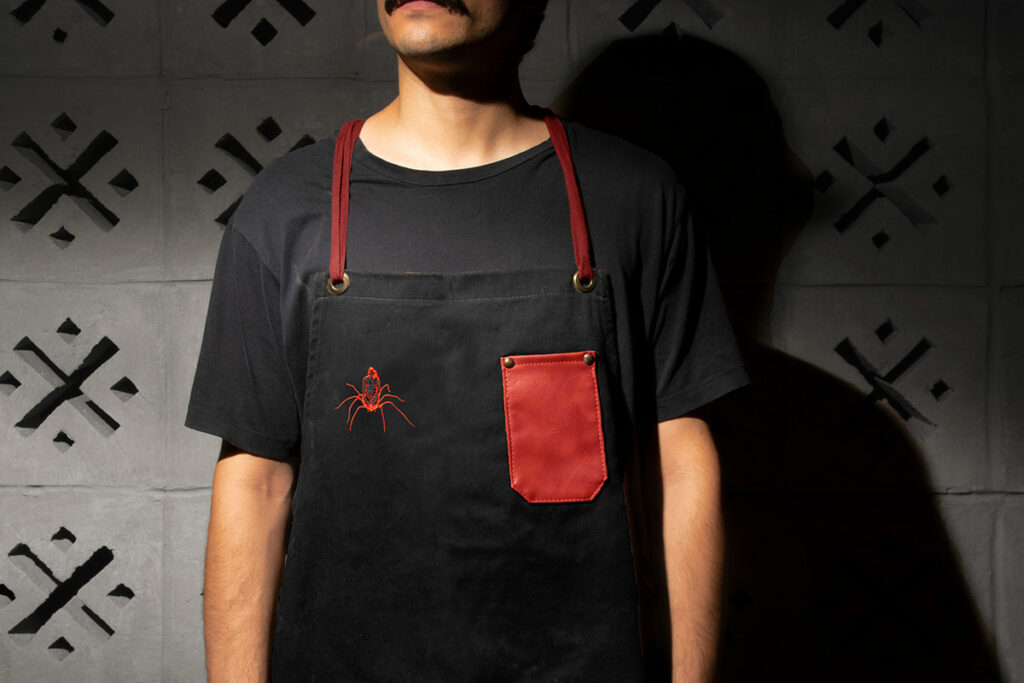
First, and possibly most important, I am simultaneously frightened and enamored with spiders. Maybe that’s why this restaurant brand identity is so striking to me. Located in Mexico City, Reclusa Parda is a restaurant and bar where Mexican food, Mezcal and the art scene converge. The brand name, Reclusa Parda, translates to Brown Recluse, the […]
Liquid Love restaurant branding
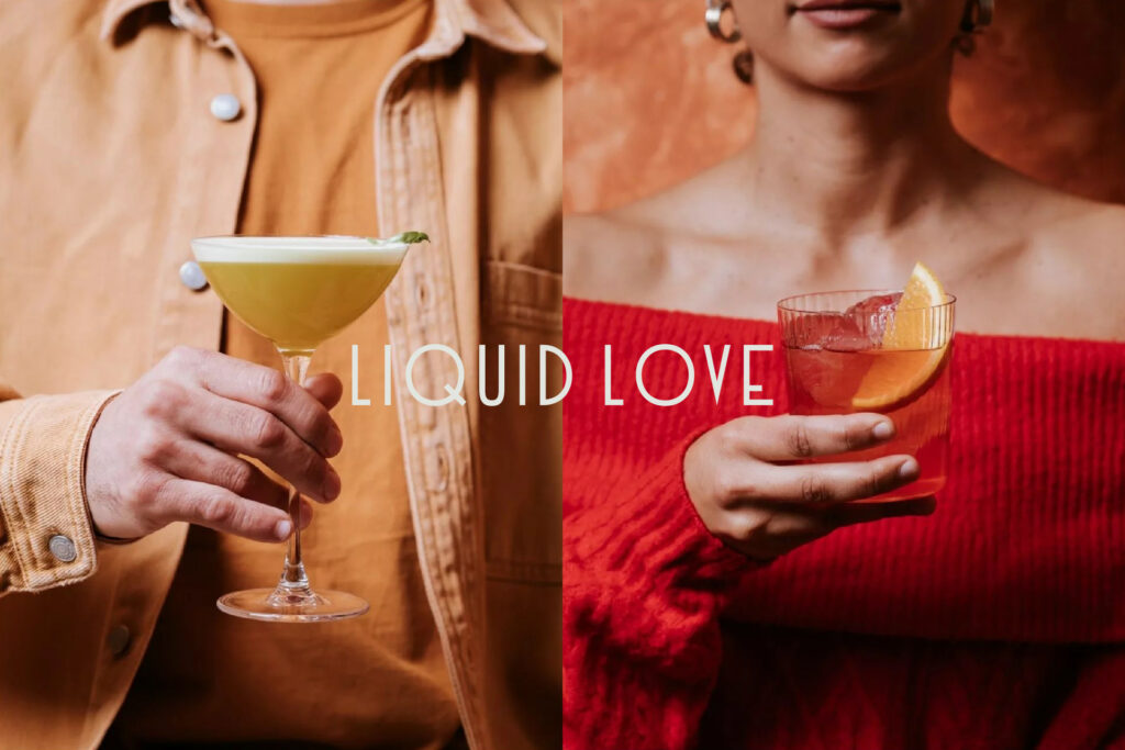
If Wes Anderson were a restaurant brand, I think he’d be Liquid Love. Melding Art Deco typography with voluptuous patterns and gridline layouts, Ceren Burcu Turkan creates a nostalgic, vintage look that’s fresh and unique at the same time. Liquid Love is a gastrobar inspired by 80’s era Italian trattori. The designer took this inspiration […]
The Creator

From the forthcoming book, Mass Behaving: Unlocking the Secrets of Shifting Behaviors with Archetypes. Learn more here. The third archetype within the quadrant of stability and control is The Creator. Everyone loves to think their brand is a creator brand. It only makes sense since most companies actually create things. However, Creator brands aren’t automatically the archetypal […]
South House hospitality branding
Maximum meaning, minimal means, to me, has always been the hallmark of remarkable design. Despite the rise in popularity of Maximalism design movements, this still reins supreme in my head and heart. Kate Zest’s design work for South House, a vacation rental property in Perth, Australia, is exemplary of this adage in action. Led by […]
Bushi Ramen restaurant branding
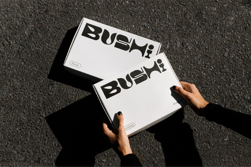
Exploring color is one of my favorite parts of designing brand identities for restaurants. However, sometimes, color is simply not needed in order to express the foundations of a brand’s personality. Such is the case for Estudio Nuar’s design work for the restaurant Bushi. Bushi is a ramen restaurant found in the Villa Crespo area […]
PADDO bakery restaurant branding
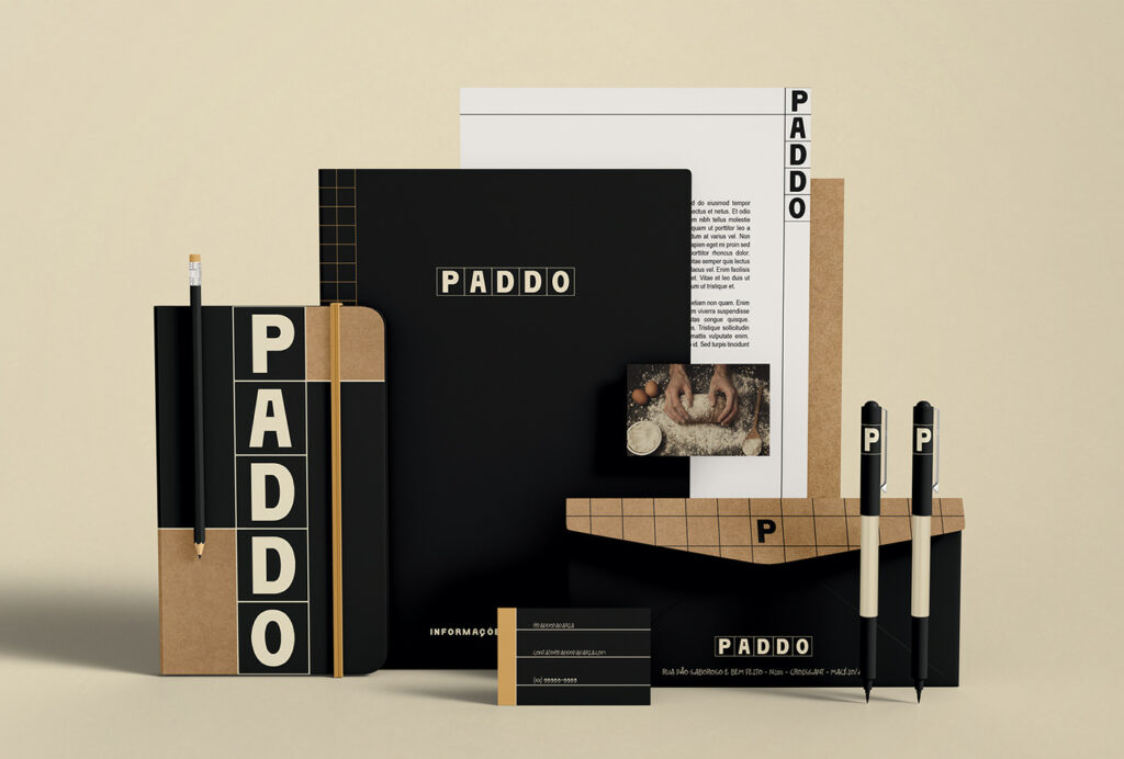
Bakeries tend to have a certain look about them: rough and crafted typography, classic illustration, and raw/natural papers. Paddo diverts from this trend a bit to create an intriguingly engineered look. Precision is the word that comes to mind when looking at the brand identity for Paddo by the team at Kon Studio in Brazil. […]
The Citizen

From the forthcoming book, Mass Behaving: Unlocking the Secrets of Shifting Behaviors with Archetypes. Learn more here. The third archetype within the Belonging quadrant comes with a sense of “we’re all in this together.” The Citizen, oftentimes called The Everyman or The Everyperson, celebrates the differences and idiosyncrasies of everyone. The come-as-you-are attitude makes it a warm, […]
SOF Hotel branding
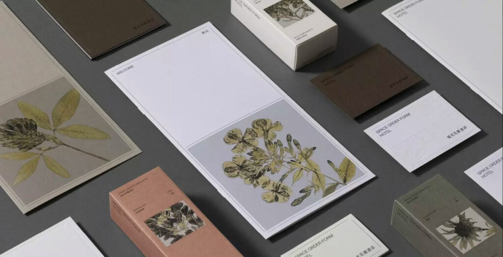
SOF Hotel is hidden among the ruins of the Central District of Taichung City, Taiwan. The area is a showcase of raw materials in their most beautiful form, naturally worn away. The hotel takes inspiration from this as does the brand identity work created by Pop & Pac. The hotel’s brand is rooted in earthy colors […]
Cloud Kitchen restaurant branding

Cloud kitchens and virtual kitchens caught fire and gained traction during the pandemic. What was great was they seemed to be more daring in their brand foundations with fun naming and design. What was bad was how mindlessly they were created and launched and as a result we’ve seen them struggle to keep traction. The […]