Café Emil restaurant branding
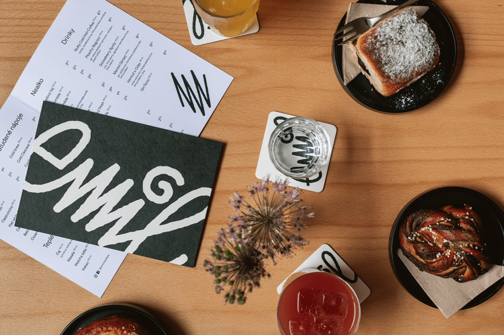
Handscrawl doodles make this café brand standout in a world of design that’s usually marked by a mix of minimalism and kitsch. Starting with the core logo which is the handy work of the cafe’s founder, the brand takes on a semi-whimsical vibe in a high contrast black and white color palette. The contrast between […]
Nanu food branding & packaging
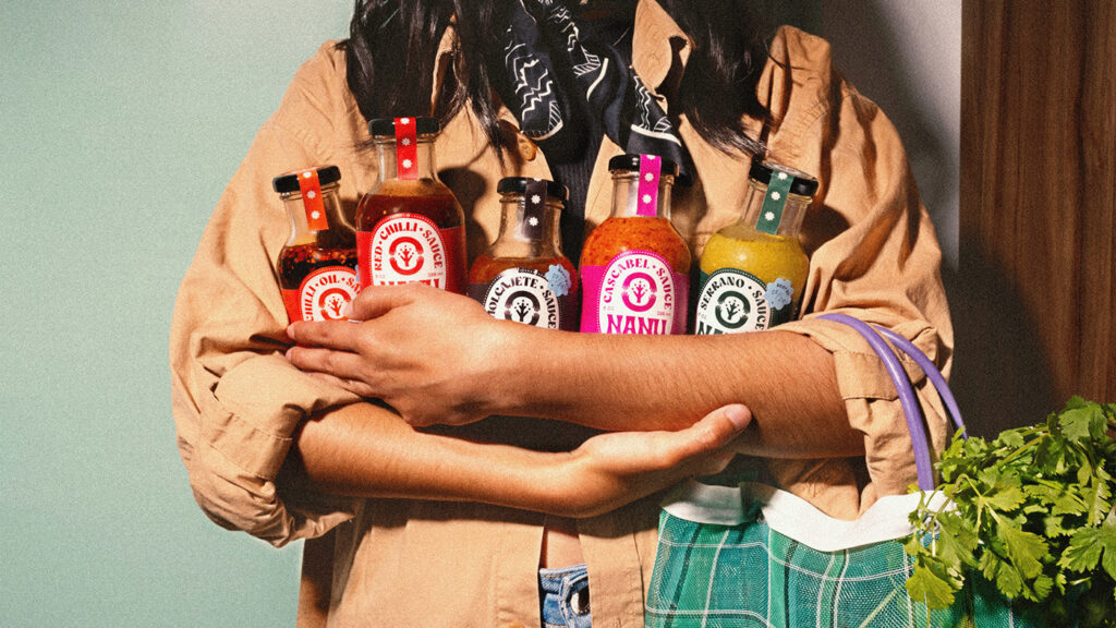
Nanu is a food brand with a deep heritage in Mexico. The team at Cherry Bomb Creative took the brand beyond modern and into a place of timelessness where the heritage is honored while the vibe is over the top fun. Nanu’s defining characteristic for the logo is it’s curved, thick typography. It’s bold and […]
Twenty Grams café restaurant branding
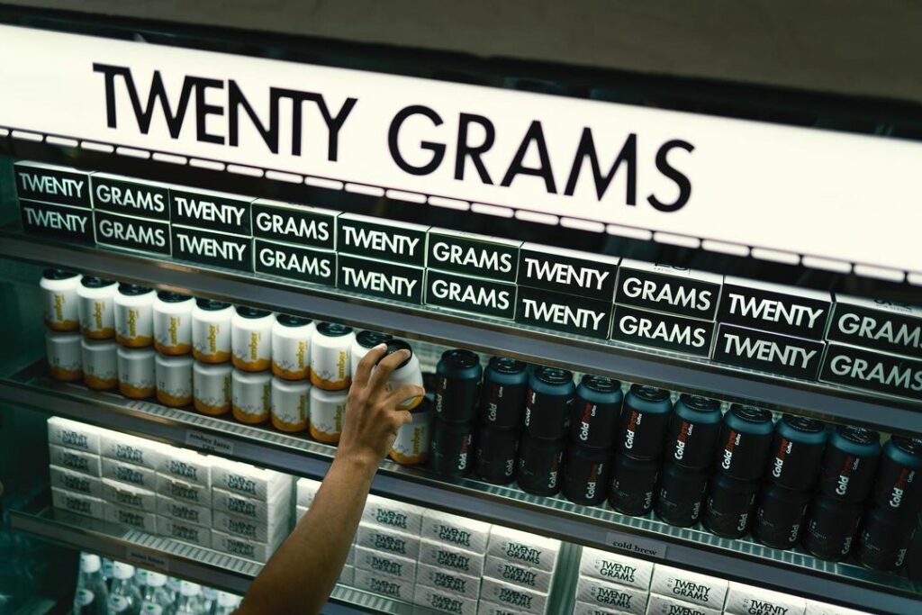
Bold simplicity tells the story of 20 Grams in a high contrast color palette. From the modern typography as a basis, the design team adds a dash of disruption with a hand drawn script that carries a pop of color. The dichotomy of the two creates a brilliant merging of perfection with high creativity which […]
Moustache cookie restaurant branding
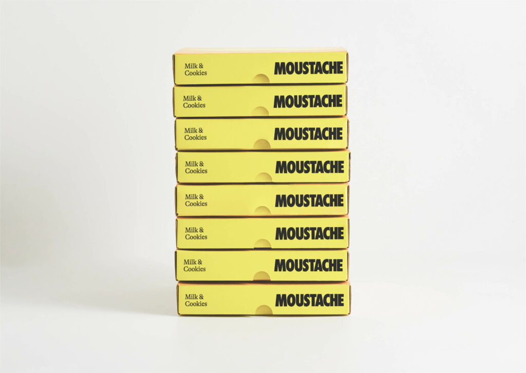
Studio South’s brand identity redesign for 10 year old cookie and milkshake restaurant is absolutely eye catching. From the soft yellow primary color through the highly iconic moustache brand mark, the new look and feel establishes an attention grabbing brand. Moustache’s thick typography complements the mark nicely with similar weight in execution. It stands out […]
Brew coffee restaurant branding
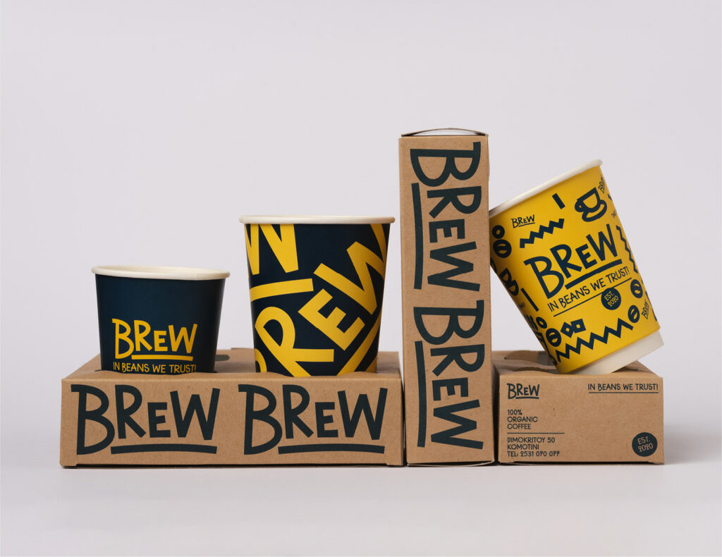
Whimsical, bright, and playful are the traits I’d use to describe Studio Hervik’s work for Brew, an organic coffee brand located in Greece. Led by bright yellow with strong, soft navy blue, the brand’s palette feels like a bright Grecian day. The unique approach to illustrations with thick, solid lines and hard corners feels upbeat […]
Kokomo restaurant branding & packaging
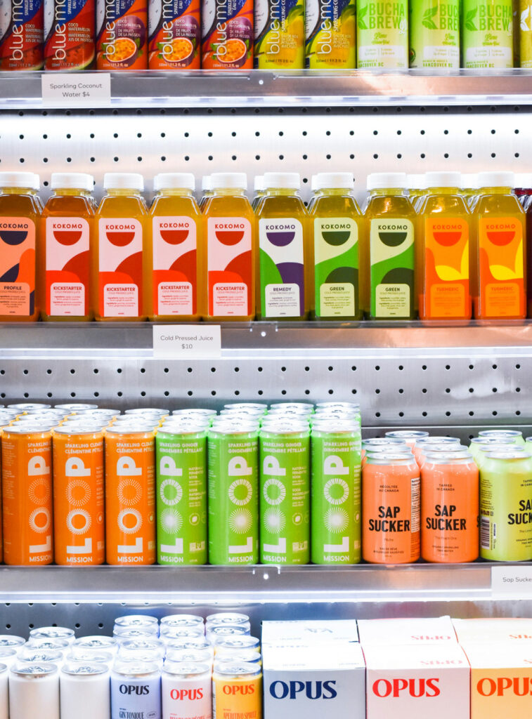
Fresh colors and strong geometry lead the visual identity and packaging for Kokomo, a health food restaurant in Vancouver, British Columbia. From the core logo through the packaging and even the environments, the team at Zak established a well orchestrated design language that was ultimately flexible in color ways as well as illustration. The brand […]
Pitú – Promesso Advertising Campaign
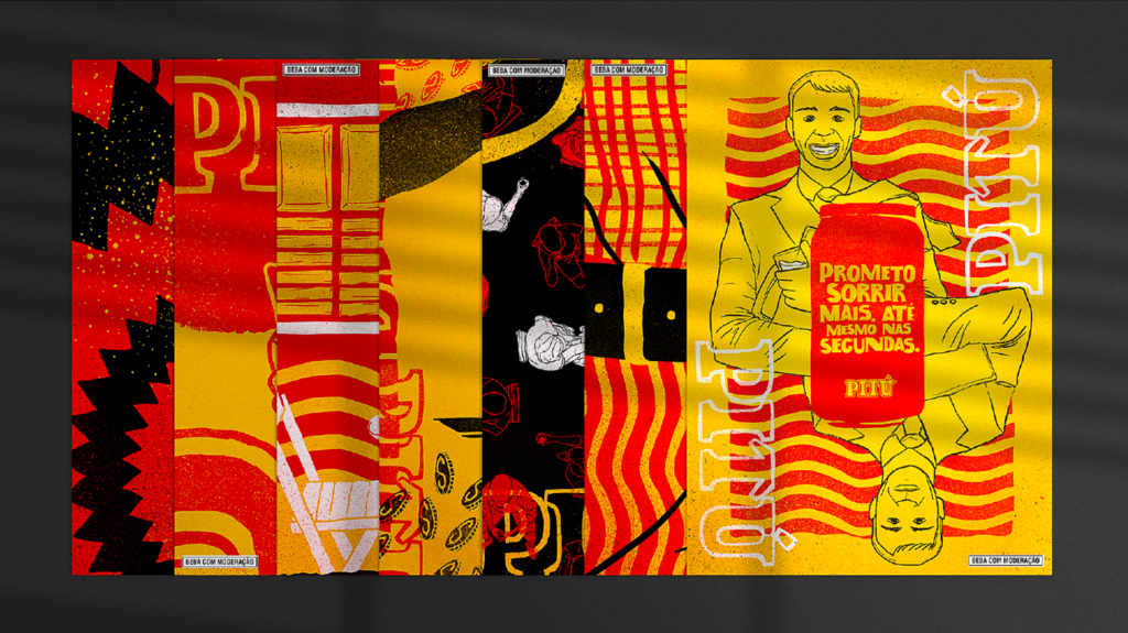
Rough and gritty, street and urban, this campaign steps out of advertising creative norms. Most beverage brands demand shots of the product, especially pouring into clean glasses. To step away from that standard is an act of boldness not only creatively but also from an account perspective. The account team HAD to sell this in […]
Sealing Success: The Vital Role of Contracts in Graphic Design and Agency Processes

When I first started my former agency, I was adverse to contracts. I thought they symbolized distrust and a poor way to start a relationship. I was 100% wrong in that thinking. Since then, I’m constantly reminded of how important contracts are for ESTABLISHING TRUST right out of the gate. Contracts play a crucial role […]
Fratelli Rosso wine branding & packaging
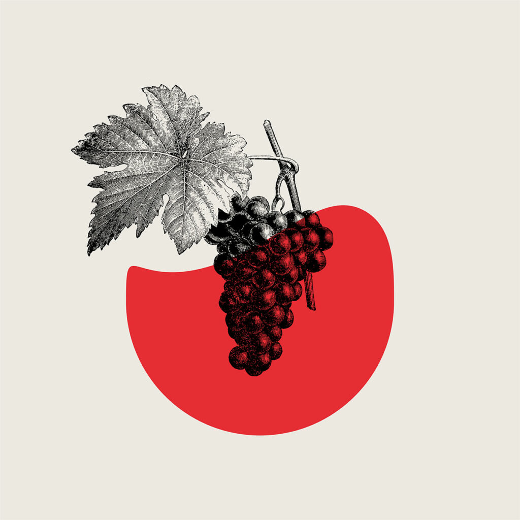
A lot of classic Italian design styles fall into two camps: the ultra vintage style of stucco textures and aged papers and type, or the Art Deco beauty of Vespas and modern typography. Fratelli Rosso falls into that second category with a bit of the first to add some vintage flavor. Art Deco style typography […]
Blend hard seltzer branding
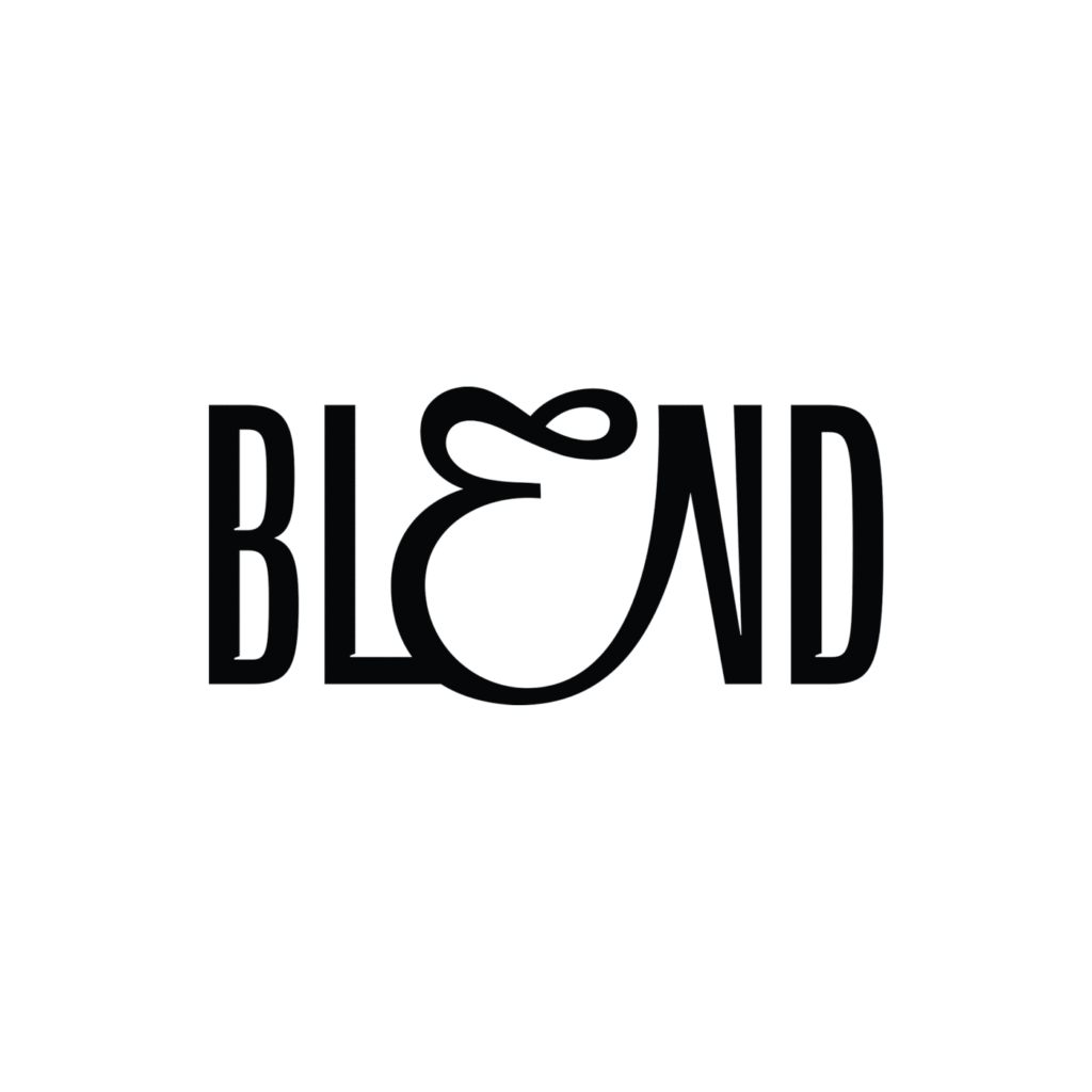
The bold, large typography trend has been everywhere lately. However, most stick to compressed typography with some character, rarely do you see one that breaks out of the standard. However, Blend takes a different approach with a unique, organic shift in the E letteform thereby breaking the mold. This elegance disrupts the compressed typography but […]